Mission
This was one of my case studies at the UofT SCS UX/UI Boot Camp for a nonprofit organization.
Stuff. Lots of it! Whether people sitting on clothes they don’t wear anymore, or in the middle of moving house and need to declutter, or even if we’re parents whose kids have grown out of their clothes and toys… Where do they can put it all? Well, we think we have the answer for that. Donate it!
By donating it, people can do two wonderful things:
No. 1: Giving back to our communities by helping those in need, and
No. 2: Being environmentally friendly by recycling our gently used items.
Problem
Could it get any better?
Finding an easy way to donate items can be a challenge. At times, users are not even sure some organizations will accept it. Not only that, but it can be time-consuming and a hassle trying to get our items to the right place. Pretty frustrating, right?
We set out to explore possible solutions, but first we needed to really understand our users and their pain points.
Collaborators
Diego Fuchs, Sahra Taghipour, Carol Tena, Charmaine Foon, and Diana Hamilton.
My Role
Research > Design Thinking > Problem Definition > Ideation > Early Prototyping
- Created a proto-persona
- Conducted five user interviews
- Completed four interview transcripts
- Analyzed data by creating one affinity diagram
- Synthesized data into a user persona or empathy map
Prototyping > Testing > Low-Fidelity Prototype Iteration > Testing
- Defined problem statement
- Conducted a competitor analysis
- Synthesized the ideas down to one to three key features using a feature prioritization matrix
- Completed a user flow for your team’s mobile app prototype
- Got feedback on the user flow from the users
- Created an iterated user flow
- Complete a clickable prototype in Figma
- As a group, we tested each prototype and then collaborated on how to combine all of our key learnings into a mid-fidelity prototype
- Worked on low-fidelity sketches (paper prototypes/wireframes)
- Created UI templates, clear labels, simple colours; also, developed interaction and clickable prototype
- Completed a user testing plan
- Provided and conducted usability test analysis
Case Study Production and Presentation Prep > Presentations
- Iterated user flows based on the feedback from user testing
- Created a rebuild of the Figma prototype
- Implemented the iOS or Android Material Design Guidelines
- Worked interaction and clickability with no prototype dead-ends


The Research Phase
In the Research Phase, we conducted Qualitative and Quantitative Research on the pain points of our users trying to donate their items. We had one-on-one user interviews and distributed a Google survey. Prior to that, we developed a proto-persona to help us describe our target users and audience, based on assumptions.
Our users came from all walks of life, in various age groups (from 23-45 years of age) and in different life stages, but in particular, busy moms.
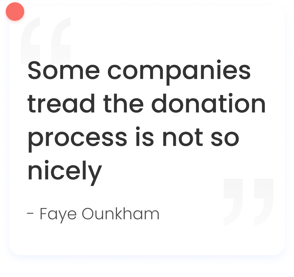
This is what we found:
- Many users wanted to help their community and recycle their goods by donating it, but if it was too difficult to do, they’d prefer to either throw it away or keep it for longer.
- They wanted to know which organizations would accept their donations.
- They would love to have reputable nonprofit organizations pick their items up for free.
- Some were even willing to pay a small fee for pick-up.
- All users used their devices to find resources and to do most of their research.
- They were willing to drop the items off themselves, but if it was too far or time-consuming to find a nearby location, they’d think twice about it.

The Define Phase
With this valuable insight, we entered the Define Phase. A user persona was developed and we defined our problem statement:
How might we improve the donation process by providing a resourceful, credible and efficient application so that our customers are successful, based on increasing the amount of donated items to the needy and reducing waste?
We conducted research to confirm there were no existing apps which addressed this problem. We also needed to know what we were up against and how our app would compare to similar ones out there. To ensure we maintained or exceeded standards of comparable apps, we conducted a competitive analysis.
For direct competitors, we reviewed and tested Geev and Goodwill. Geev is an app specifically designed for donations of food and items, but only between individuals. Goodwill is a well-known non-profit aimed at strengthening communities. For indirect, we reviewed GiveBlood and GoFundMe.

The Ideate Phase
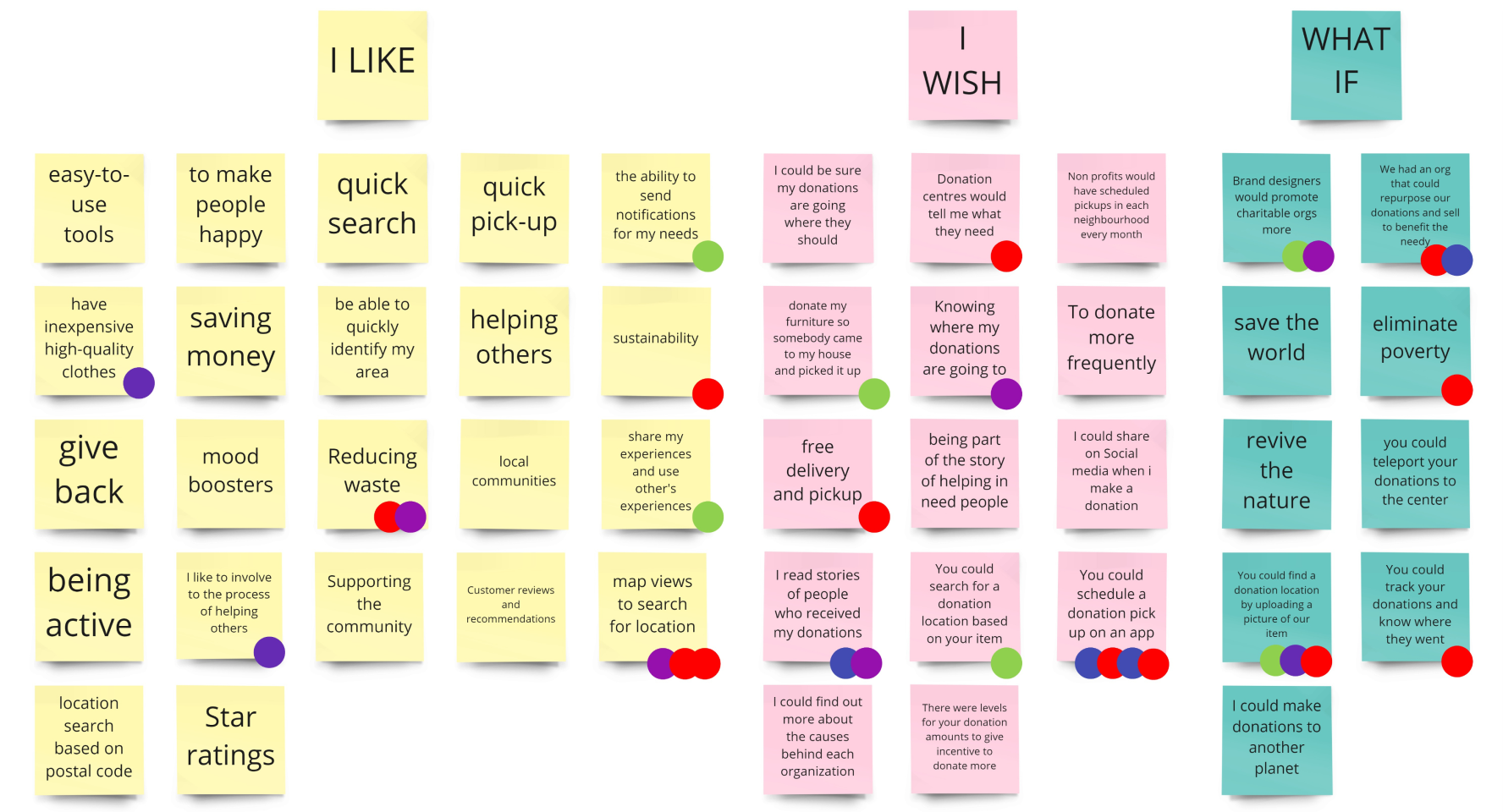
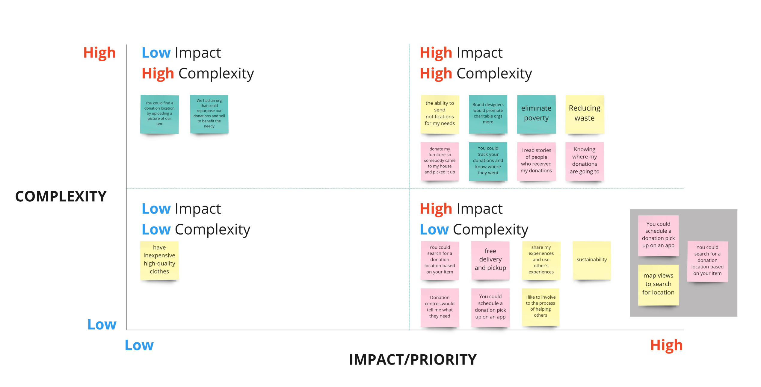
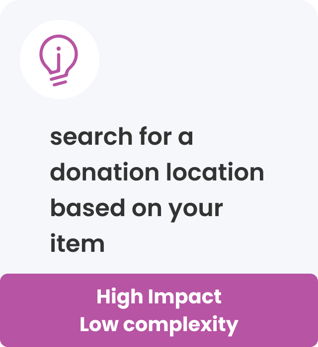
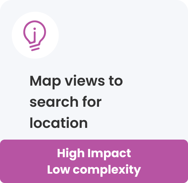
The ideate phase was the fun part! Using a Miro board, we brainstormed ideas for our app using the “I Like, I Wish, What If” method. Dot voting helped us refine our choices. We came across some pretty interesting thoughts, but we finally decided on 3 main features to push forward with. We plotted these as being high impact with low complexity on our Prioritization Matrix.
How can we make it better?
As a result, we have identified the main functions that will help us remove the main pain points of the user.

Prototype Phase – Digital Wireframes
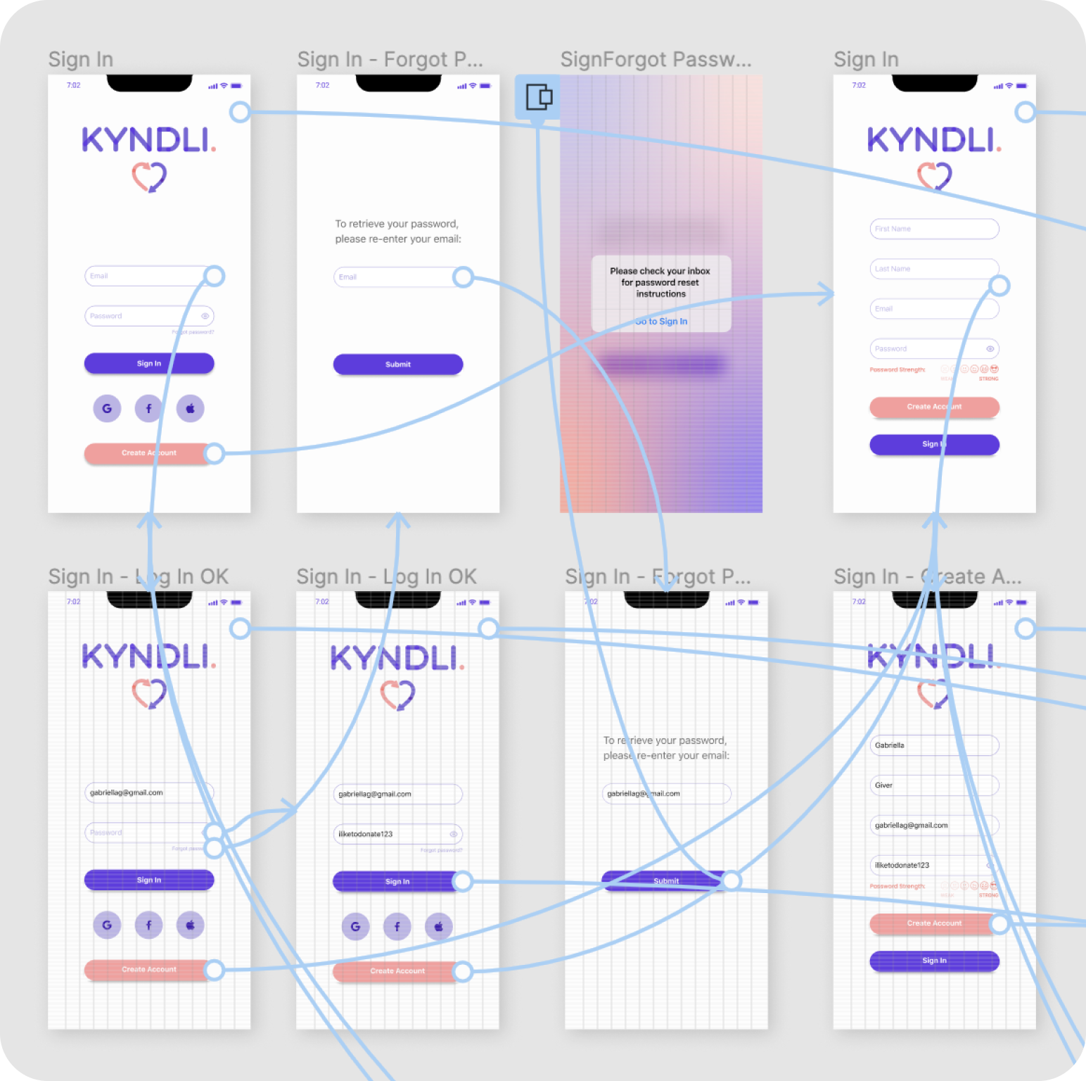
At this point, we were ready to develop our user flow.
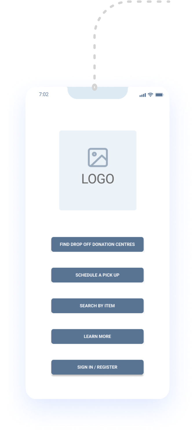
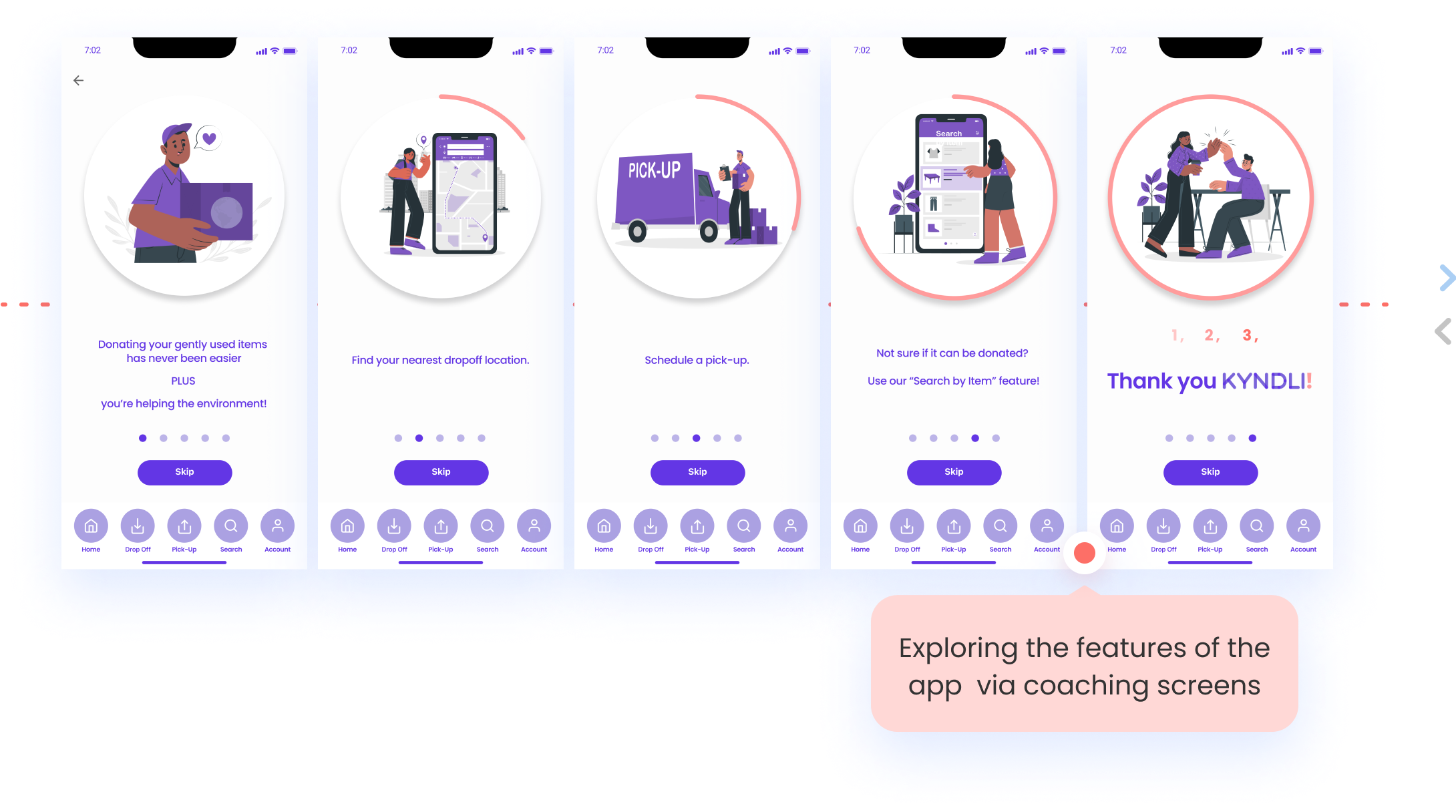
In regards to onboarding, our thinking was that we wanted users to draw value from the app by first experiencing the features.
Solution development
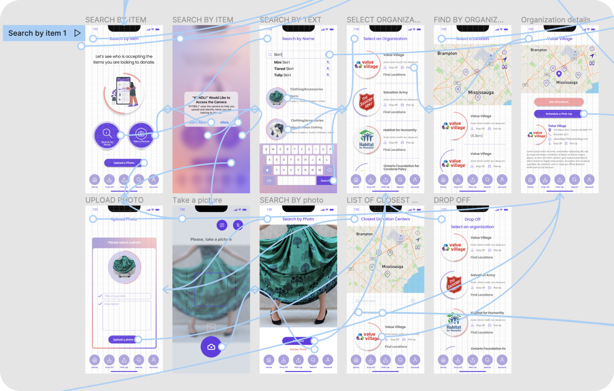
- Finding a Drop Off Donation Centre
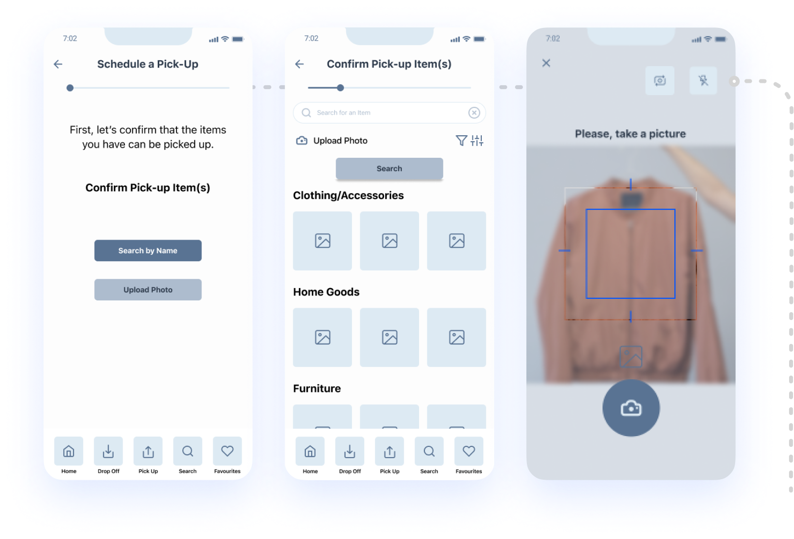
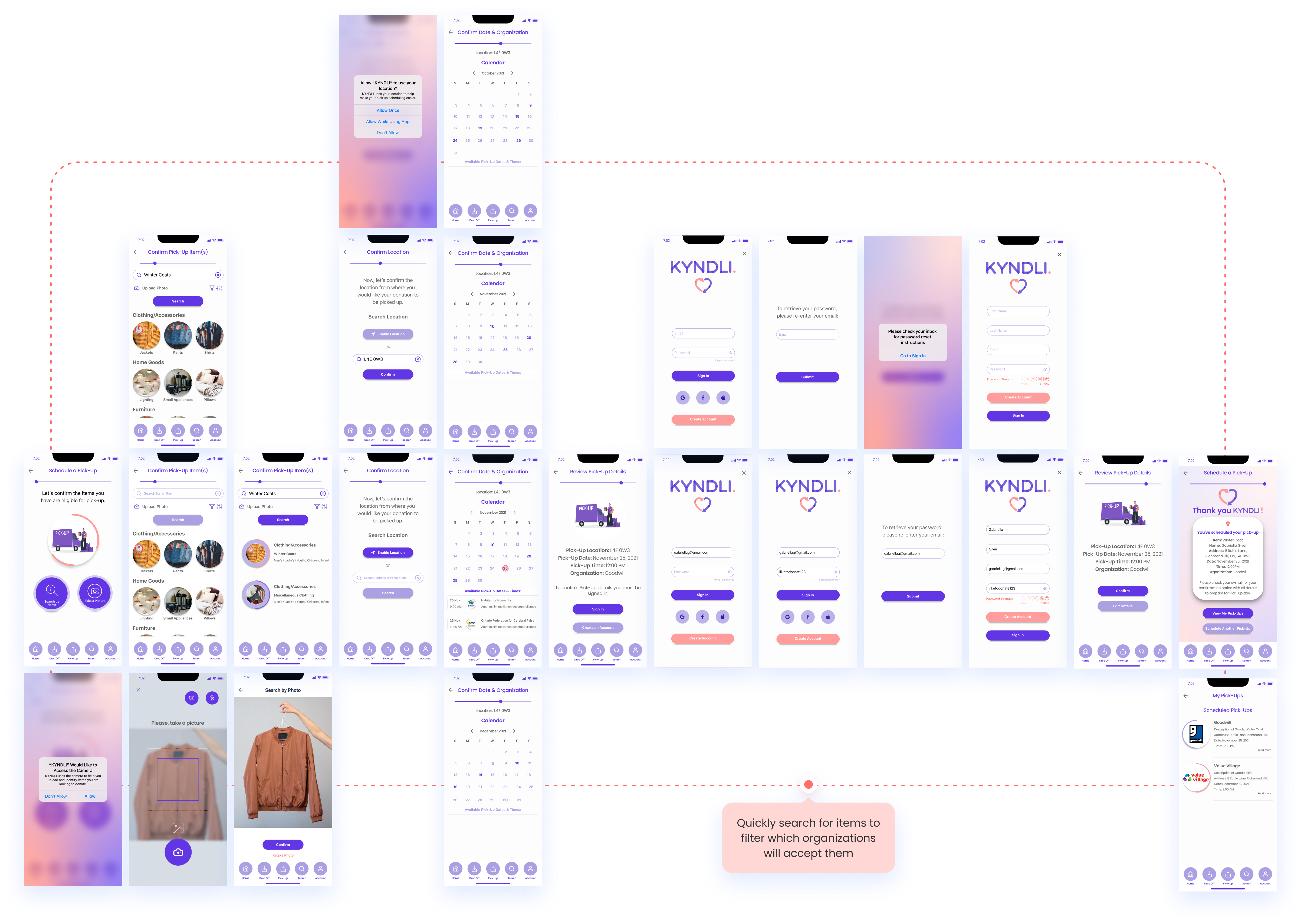
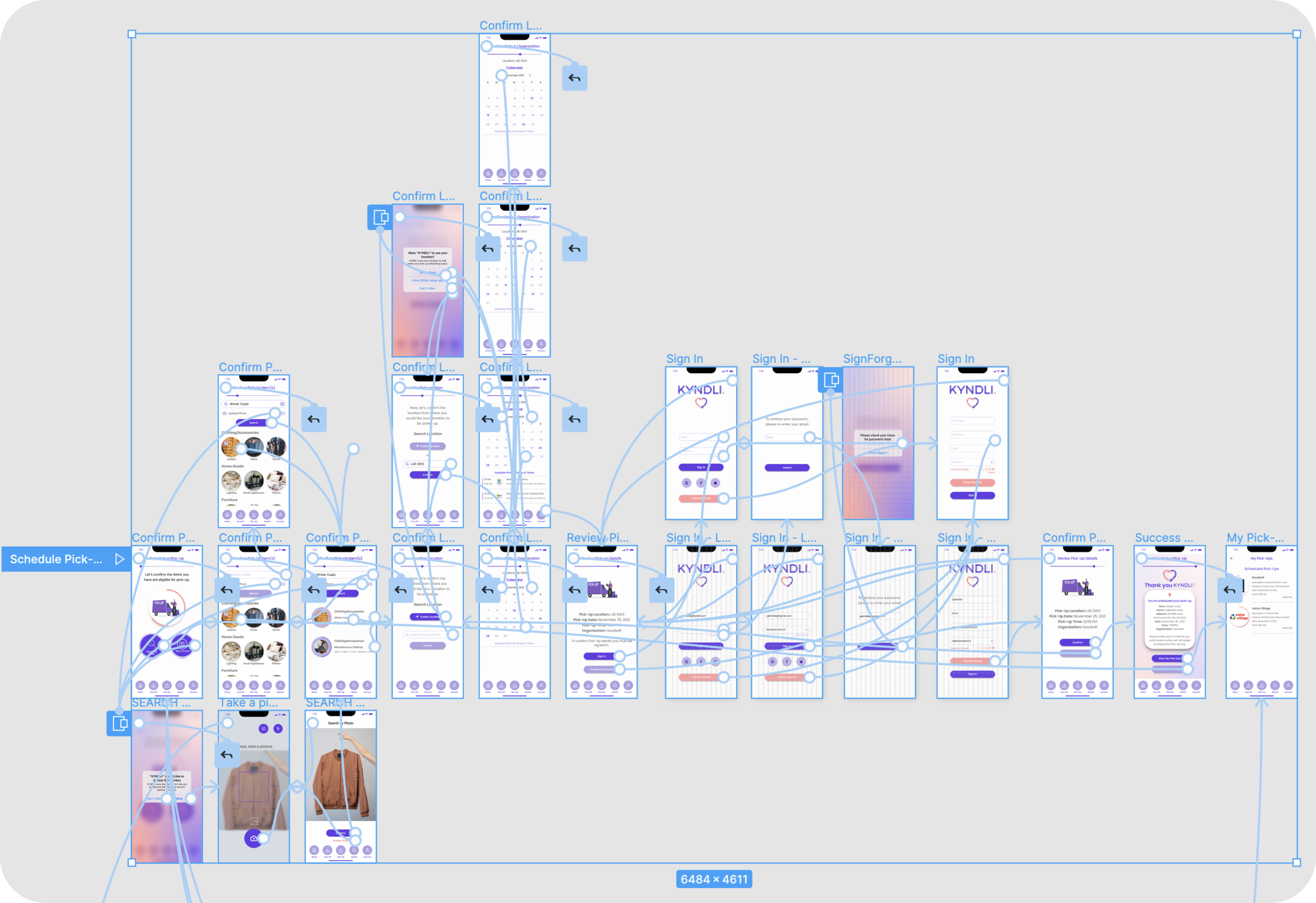
- Scheduling a Pick-Up
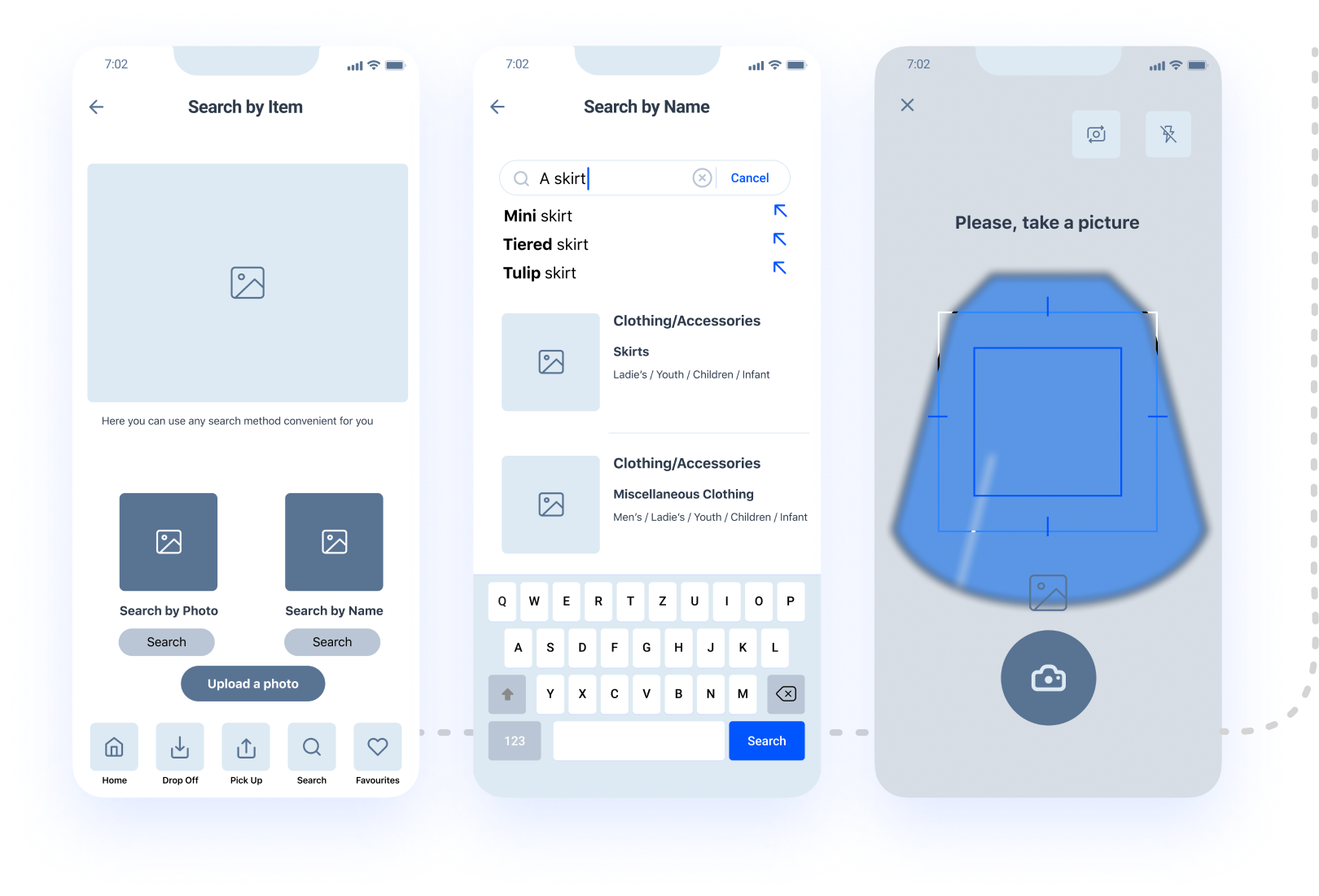
- Doing a Search by Item
- Exploring the features of the app via coaching screens
Once we were happy with our wireframe, we proceeded to create a clickable prototype.

Prototype Phase – Digital Wireframes
We developed a Usability Testing Plan, outlining 5 different tasks for users to complete
- 80% of users were able to complete all 5 tasks successfully the first time
- All user feedback was recorded, transcripted and then documented on a Miro Board
- We assessed and prioritized based on the frequency of response
- All users had a favourable response. They were able to understand the main features of the app, easily navigate it, find what they were looking for and onboard.
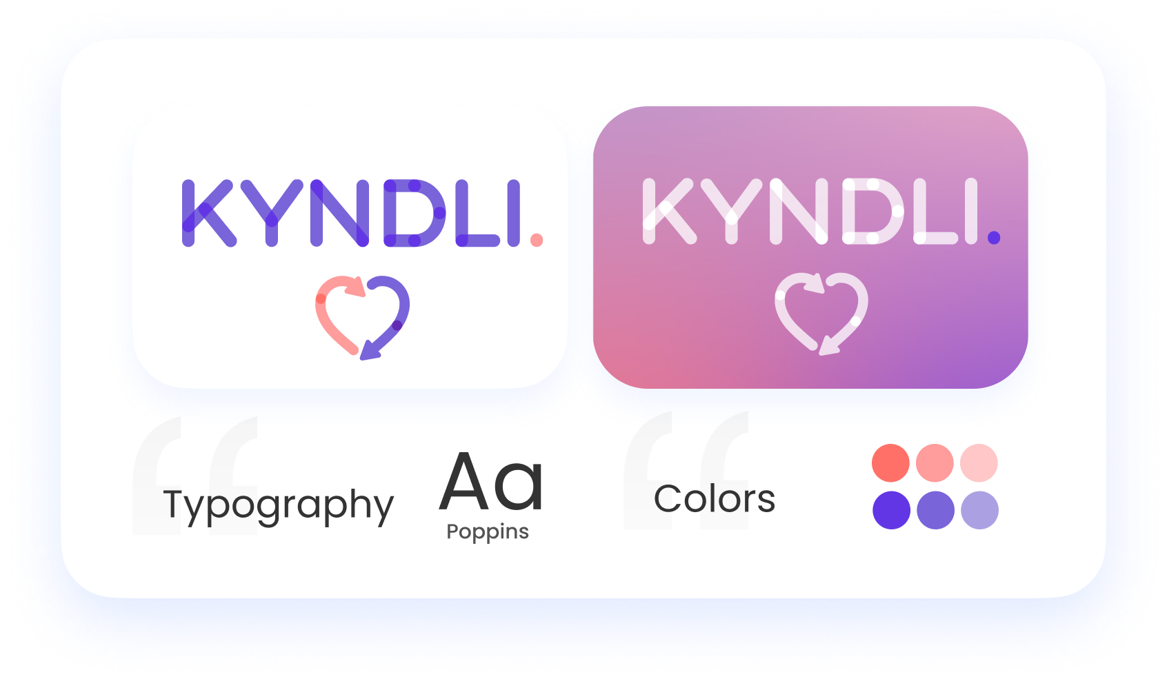
We were now excited to start our mid-fidelity prototype! We named our app “Kyndli”, and created a logo and colour theme, which set the tone for our new app.
Welcome to KYNDLI
The app made to simplify and streamline your donation process to help you save time and donate more frequently.
A couple of major updates we made from our user’s feedback on the initial prototype were the animation of the splash screen to help users land on our homepage faster and more importantly, we incorporated symbols into our buttons to both minimize the time to select the task by providing visual cues but as well to familiarize the user with our key feature icons in the bottom navigation bar. These changes were able to help our users cut their time to perform tasks by up to 50%.

Sign In Screens
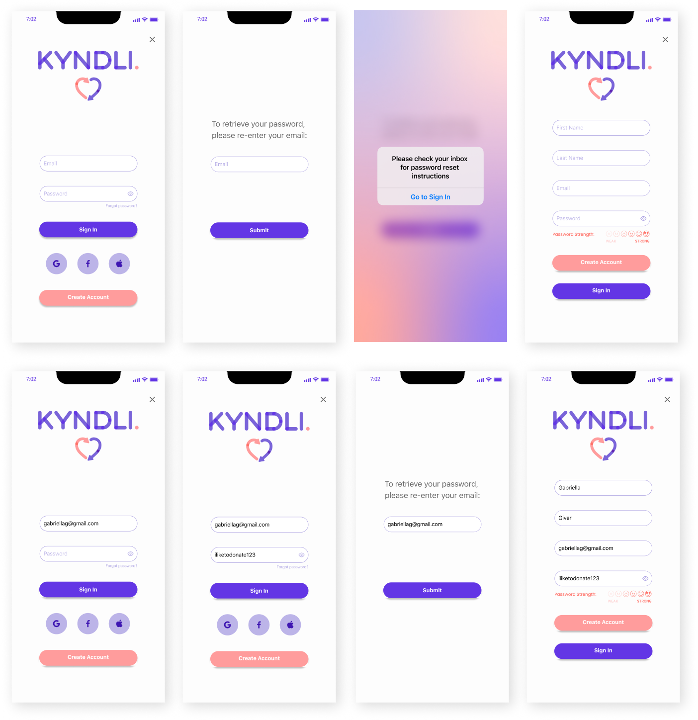
.
Coaching Screens
Learn More Screens
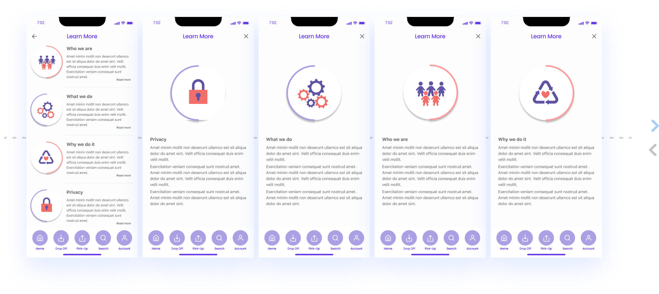
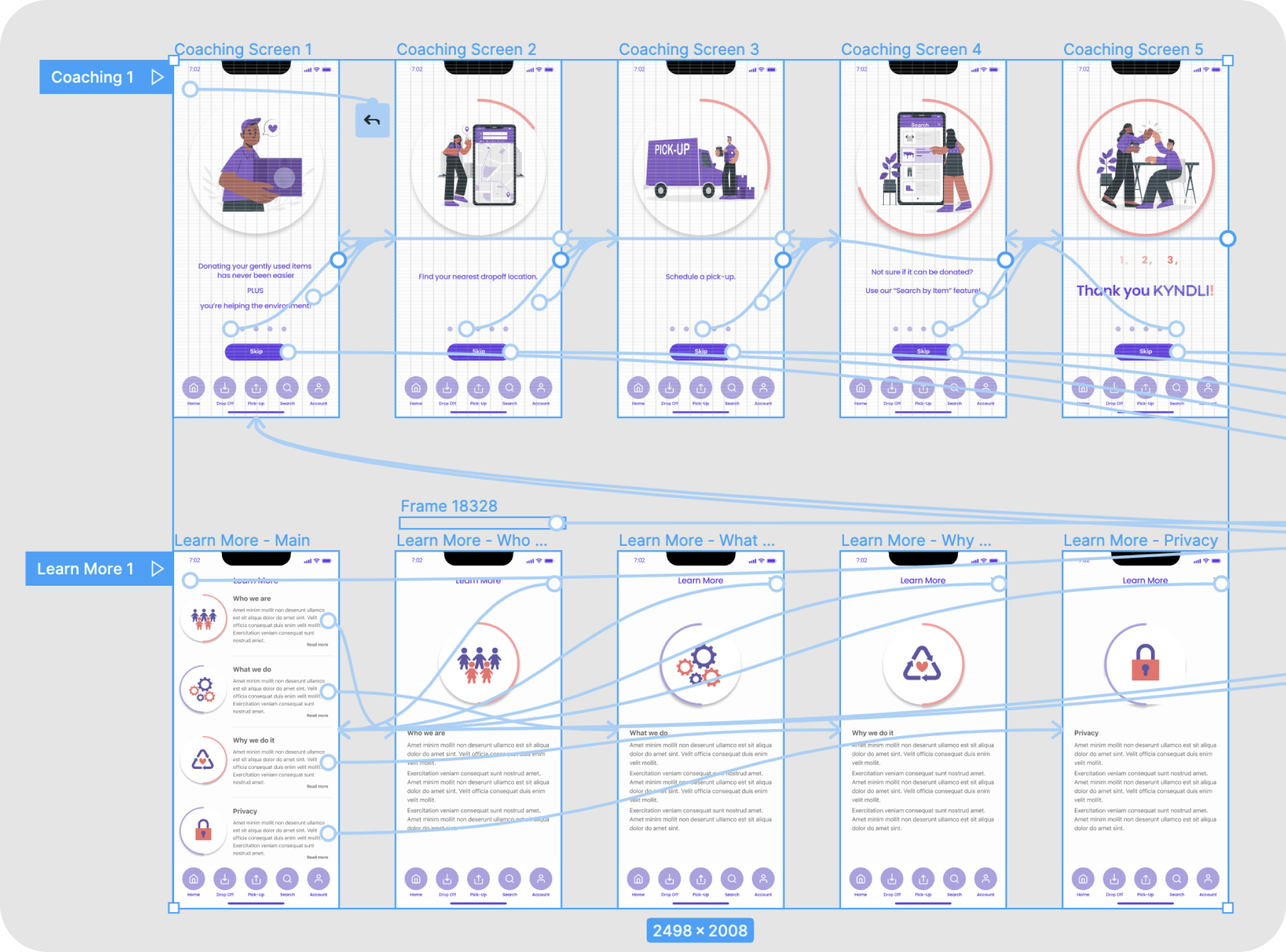
Confirm Location Screens
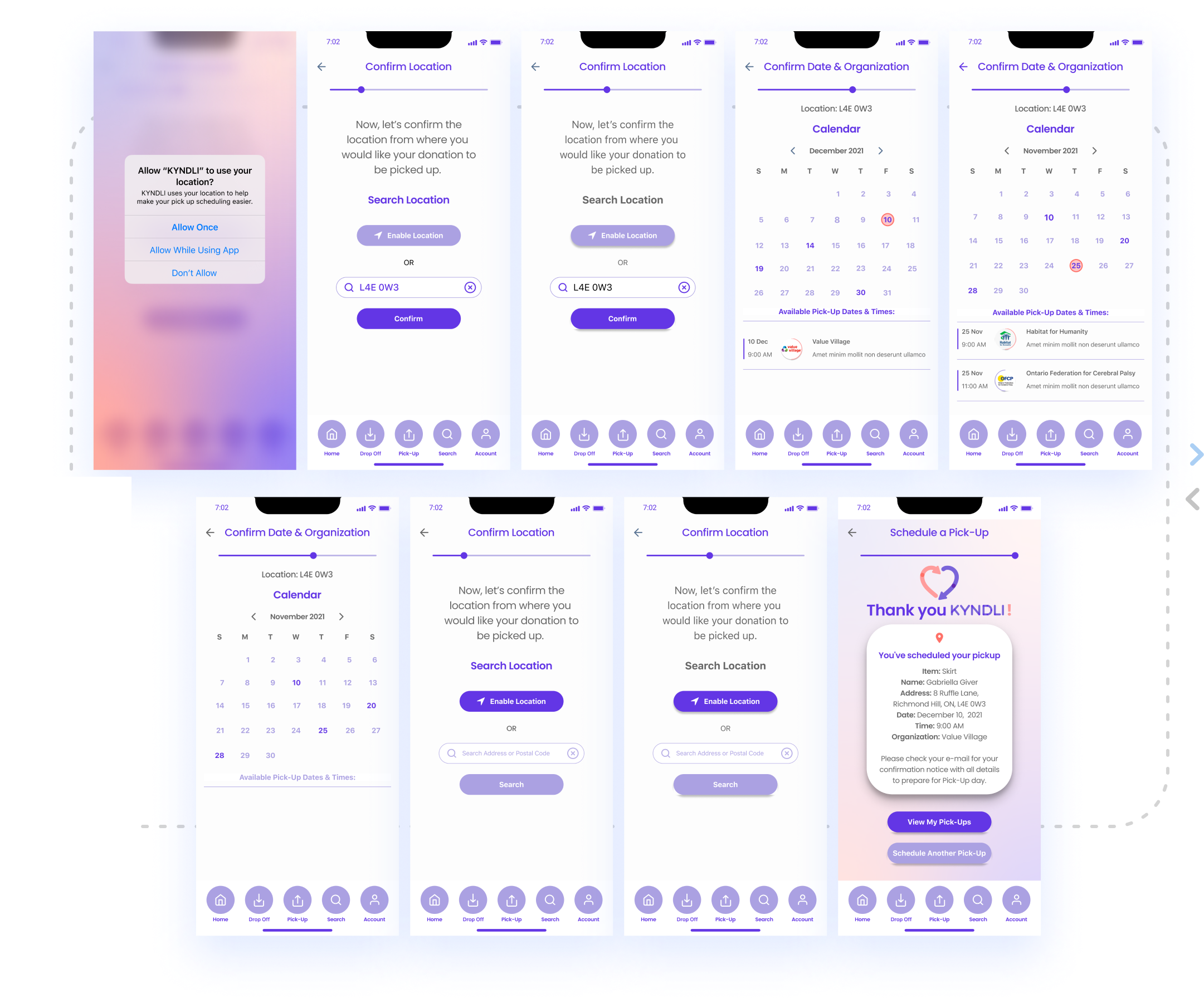
.
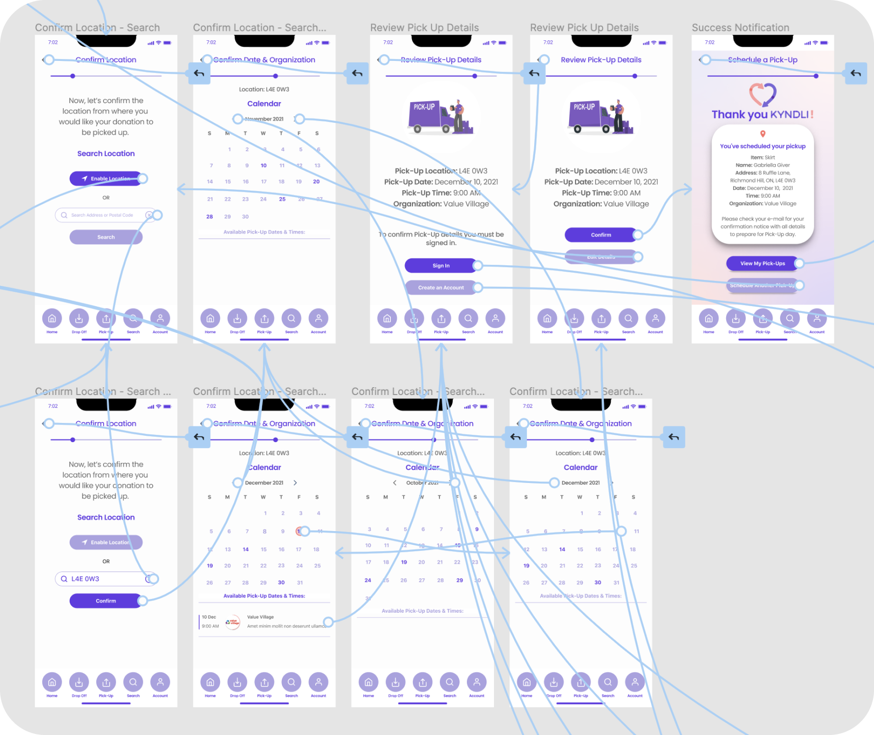
Confirm Location Screens
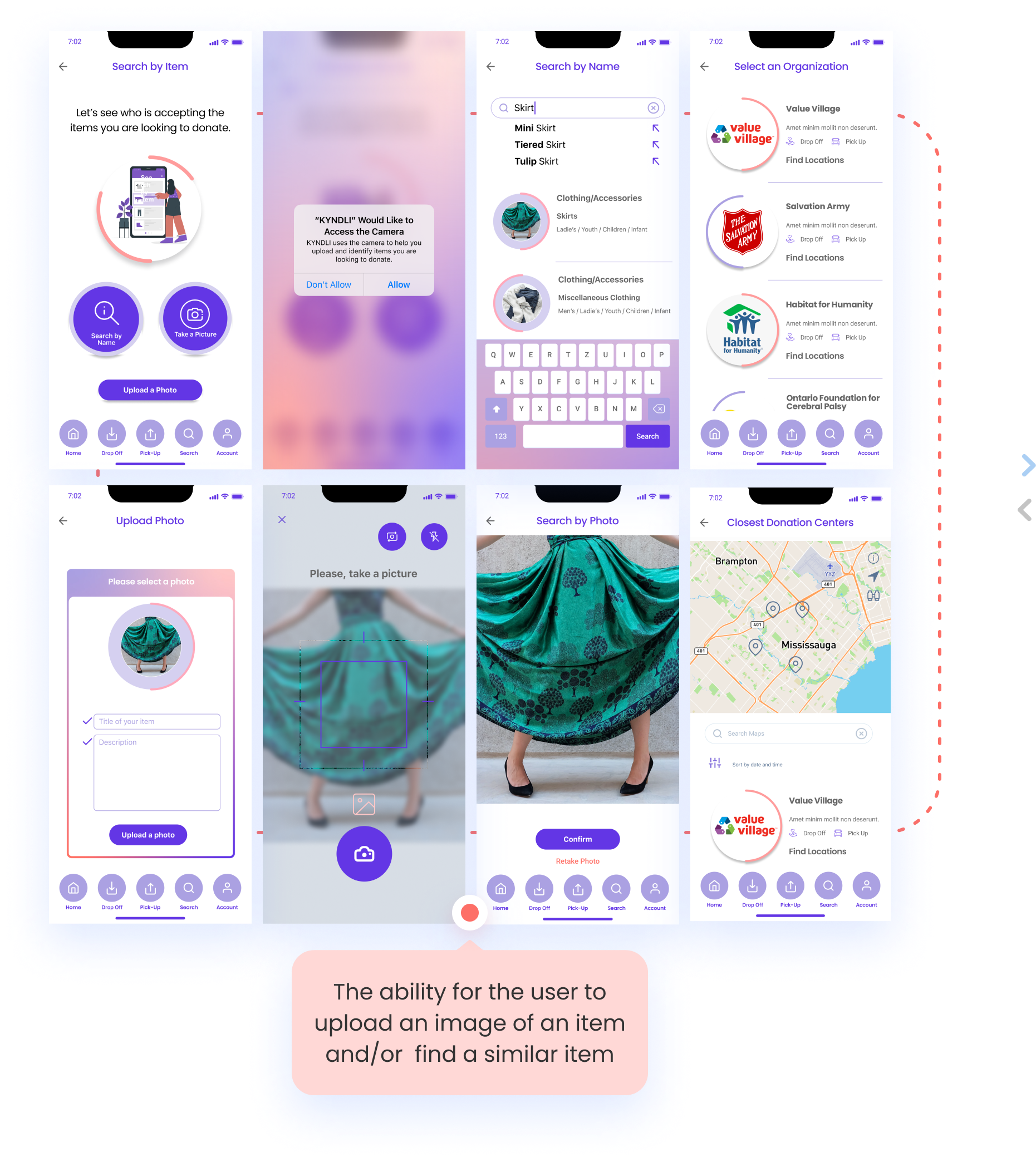
.
Scheduling a Pick-Up Screens
Future Opportunities/Next Steps
In the future, we’d like to develop Kyndli further, by implementing the following features:
- Allowing users to favourite their organizations
- Users being able to receive updates and/or stories of how their donations were used or repurposed
- Create a marketplace-type interface, where users could post their gently-used items “for sale”, and prospective buyers, in lieu of payment, would instead make a donation to the “seller’s” chosen non-profit organization
- Create a customized alert/reminder function within the app, asking the user if they’d have anything to donate within a 3, 6 or 12 month period
