Mission
This was one of my case studies at the UofT SCS UX/UI Boot Camp for a nonprofit organization.
The Yellow Brick House (YBH) website is a place where victims of abuse can come to get help, support, and healing. The original YBH website was designed to bring more awareness to the domestic violence issues in our community and to provide a convenient way for donors to show their support.
Problem
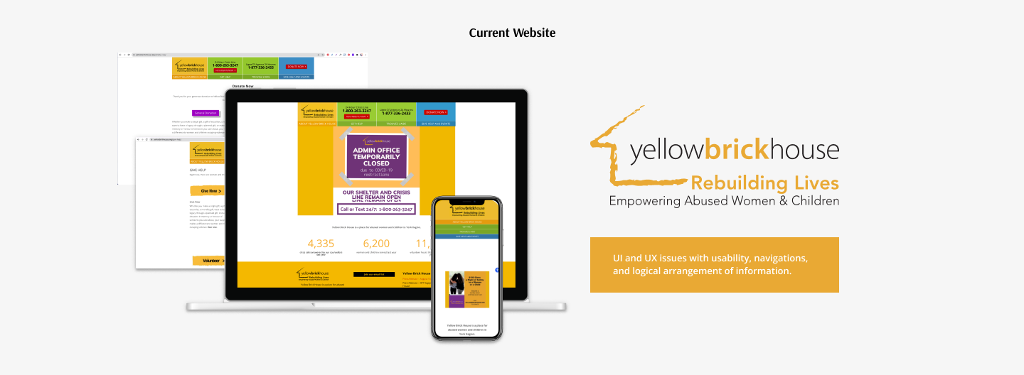
My team and I have observed that users don’t trust non-profits because they don’t show credibility or accountability, which is preventing them from wanting to donate. The original YBH site has multiple UI and UX issues with usability, navigations, and logical arrangement of information.
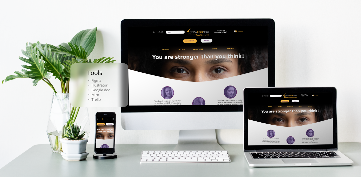
Collaborators
Charmaine Foon, Sahra Taghipour
My Role
- Creating heuristics evaluation
- Conducting preliminary user interviews (5 participants)
- Receiving constructive feedback on your research/interview plan
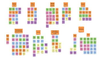
- Card sorting and analyzing user data by creating an affinity diagram
- Create a user flow and research plan as a guide
- Analyzing YBH UI system for redesign opportunities
- User flow diagram
- Low, mid, and high-fidelity wireframes (design and prototyping)
- Testing and analyzing and iterating prototype after usability testing
Protect Duration
2 weeks
The Research Phase
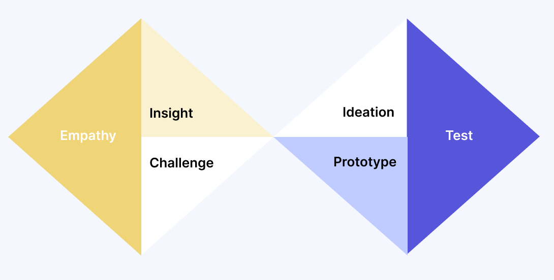
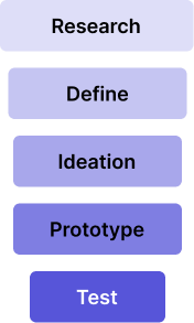
We started our site redesign work with a research method:
- Quantitative
Quick interviews and a short survey to get a general understanding of how users felt about donating online to nonprofits and if they understood the cause - Qualitative
Detailed interviews and survey to help us define the problem
We also developed 2 separate proto-personas to help us describe our target users and audience, based on assumptions. Our two proto-personas were the victim persona and the donor persona. Because of time constraints, we focussed on the donor persona, but it was important to consider the victim persona for our user path.
This is what we found:
- 67% of participants had never heard of Yellow Brick House.
- All participants said they’d be happy to support the cause.
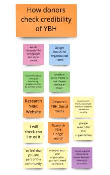
- An overwhelming 88% said that they would research this nonprofit either through google search, social media or the YBH website.
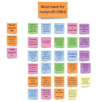
- Before willing to donate or help in some way, all participants said that nonprofits should show credibility and accountability. Most also wanted them to be transparent and to keep their donors updated on their impact in the community.
The Define Phase
- With this valuable insight, we entered the Define Phase. A user persona was developed and we defined our problem statement:
The Yellow Brick House website was designed to bring awareness to domestic violence issues and to provide easy ways for donors to show their support. We have observed that users don’t trust nonprofits because they don’t show enough credibility, which is preventing them from donating. How might we improve the user experience when visiting the YBH website so that donors are successful based on feeling good about donating to a worthy nonprofit with an important cause?
Competitor and SWOT Analysis
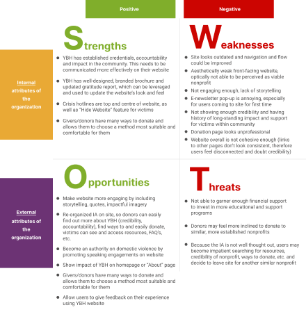
A Competitor and SWOT Analysis helped us assess the strengths and weaknesses of similar sites and a Heuristic Evaluation was conducted on the current site to see if it followed best practices.
The yellow Brick house is a very credible and accountable nonprofit. Their printed materials, such as their Gratitude Report and brochure are well designed and include vital information such as who their board members are, their mission statement and vision, as well as where their funding comes from, how it’s being spent, etc.
However, this crucial information wasn’t being communicated at all on their website – there was a big disconnect. This was one of the main reasons why many users were hesitant to donate. If more than half of our users weren’t familiar with Yellow Brick House, then we needed to ensure that when they did land on the website, the experience would be excellent with engaging storytelling and visuals and that they’d feel compelled to donate!
The Ideate Phase
Affinity Diagram
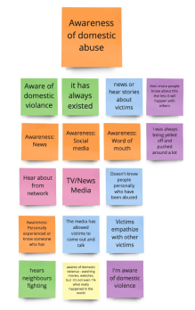
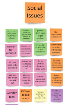
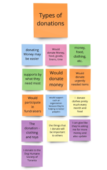
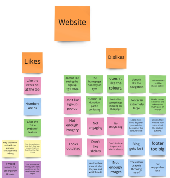
In the ideate phase, our Affinity Diagram and Empathy Map helped us isolate the pain points of users. A UX scenario and user flow diagram showed us areas of improvement we needed to focus on.
Ultimately, these areas were:
- For victims, to show them how to go about getting help from YBH
- Allowing users to easily see the services and programs that YBH offered
- To show the user that YBH was credible, accountable and transparent
For users to quickly and easily make a donation on the website
Feature Prioritization Matrix
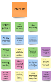
Affinity Diagram
Feature Prioritization Matrix
Usability Iterations
Empathy Map
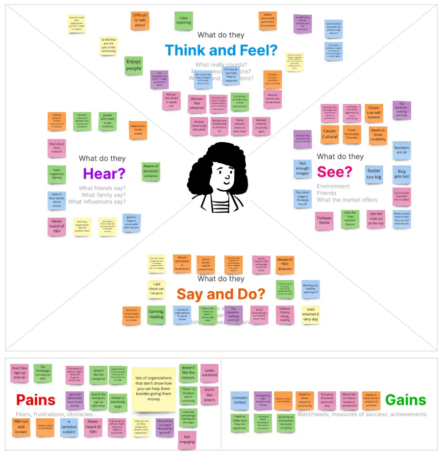
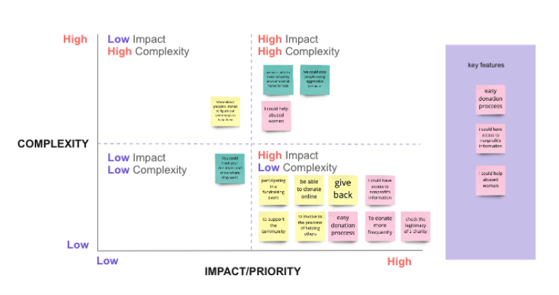
The Affinity Diagram, Feature Prioritization Matrixes, and Empathy Map gave us the right direction and helped us to build a new User Flow diagram.
Thus, that is going to give usability to the YBH site and credibility, which is no longer hidden for both user personas – victims and donors.
After gathering all the user feedback and sorting out all the data received, we streamlined and reorganized the sitemap, giving it a more logical arrangement of information.


Prototype and Test
User Flow
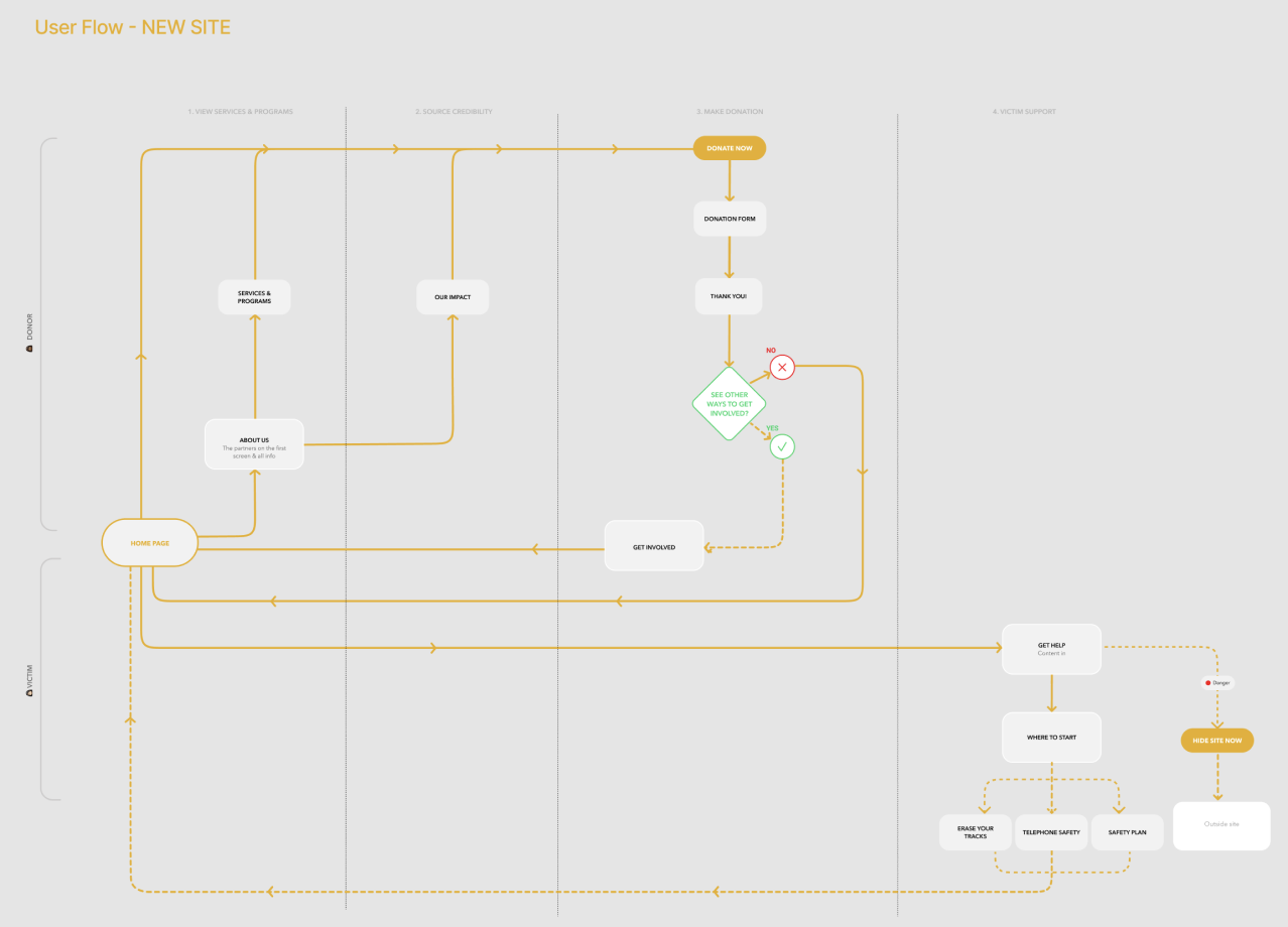
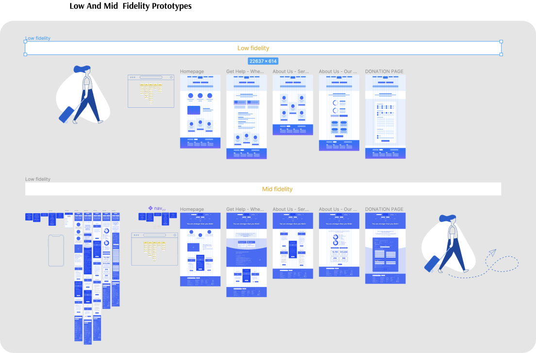
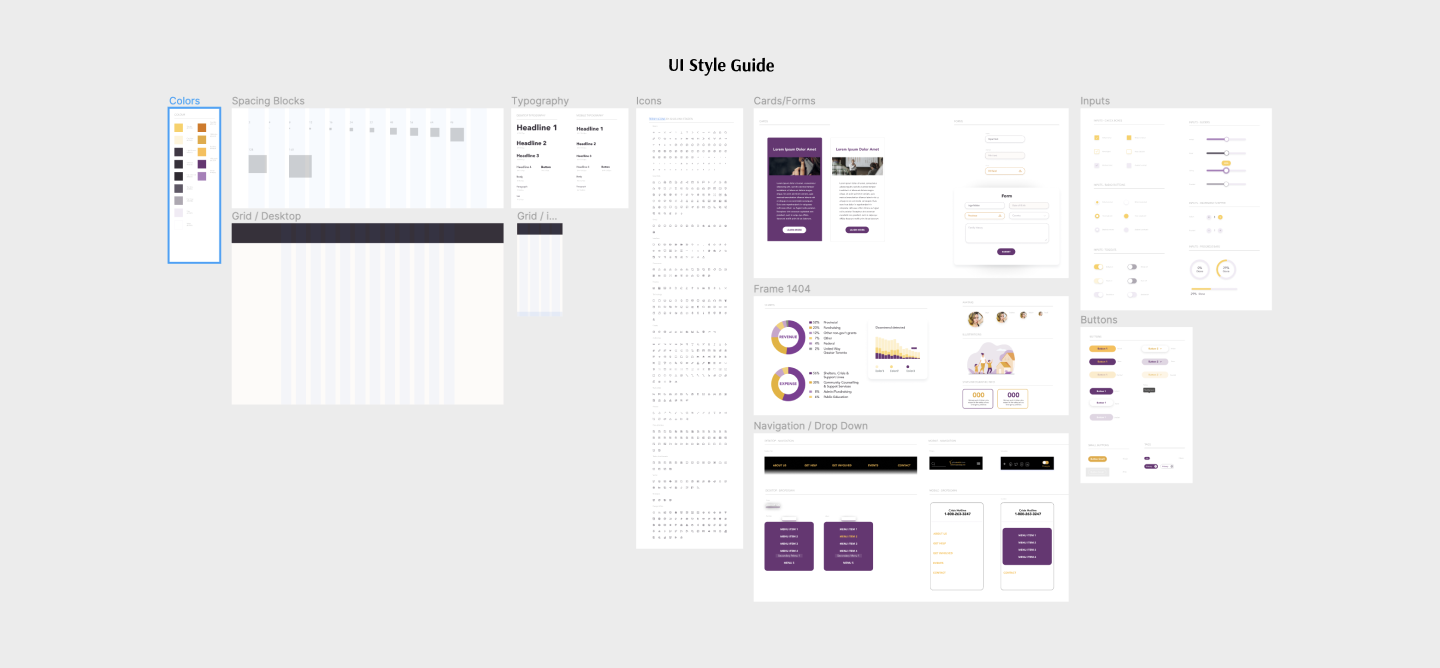
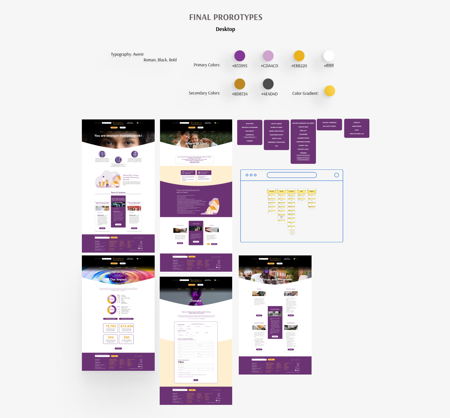
We developed wireframes based on our user flow. Once we were happy with it, we proceeded to create a clickable prototype. Our moodboards were the inspiration for our UI Style Tile and Style Guide.
Testing Phase
These tasks were:
1. How would the user start getting help from YBH?
2. How would the user check the services and programs provided by Yellow Brick House?
3. If the user wants to check the legitimacy and credibility of YBH, how would they do that?
4. How can the user make a donation through YBH website?
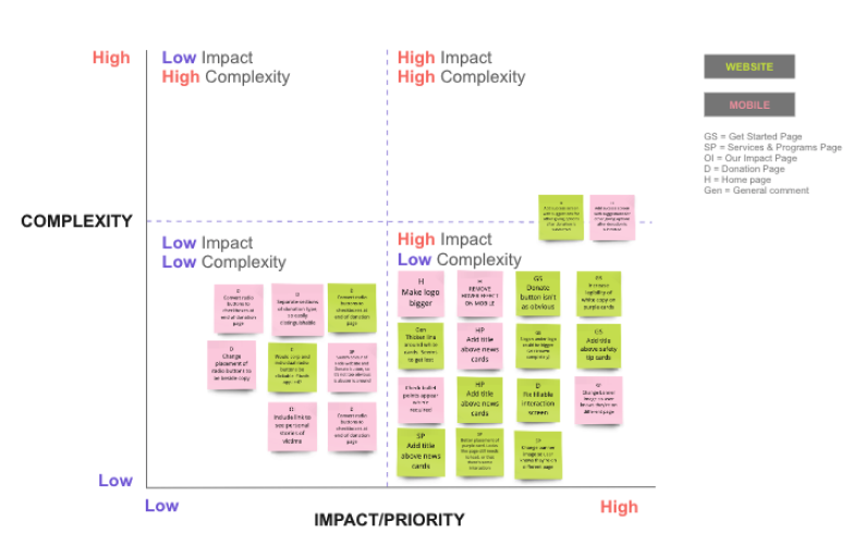
All user feedback was recorded and transcribed. We once again used a prioritization matrix to help us decide which iterations would be high impact and low complexity and updated our prototypes accordingly.
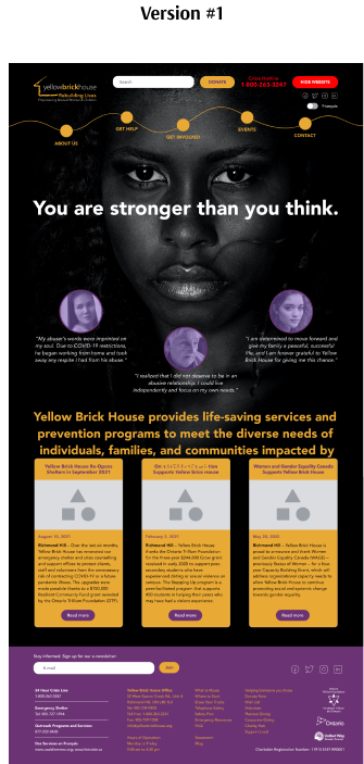
Here’s a funny story! When we started exploring imagery to use for our homepage, we selected strong images we thought were impactful and would compel donors to donate or help. However, soon realized that the imagery could be seen as “scary” by potential victims and some donors may have had second thoughts about donating because of the strong visuals.
We then had to take a step back and think about how to position the “flavour” and “tone” of the site. How could we make it look lighter and friendlier, but still engaging enough so that potential donors would be moved to donate or help, and victims could feel safe and comfortable using the site to get help and access resources?
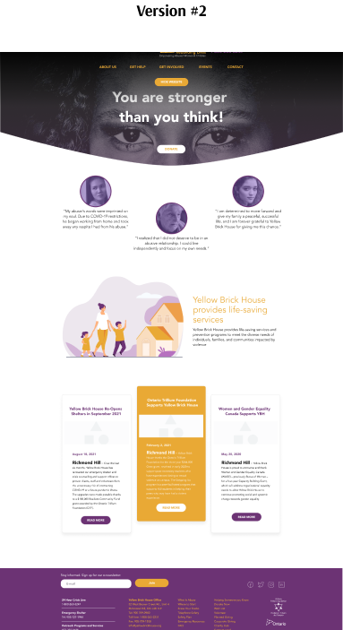
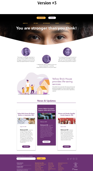
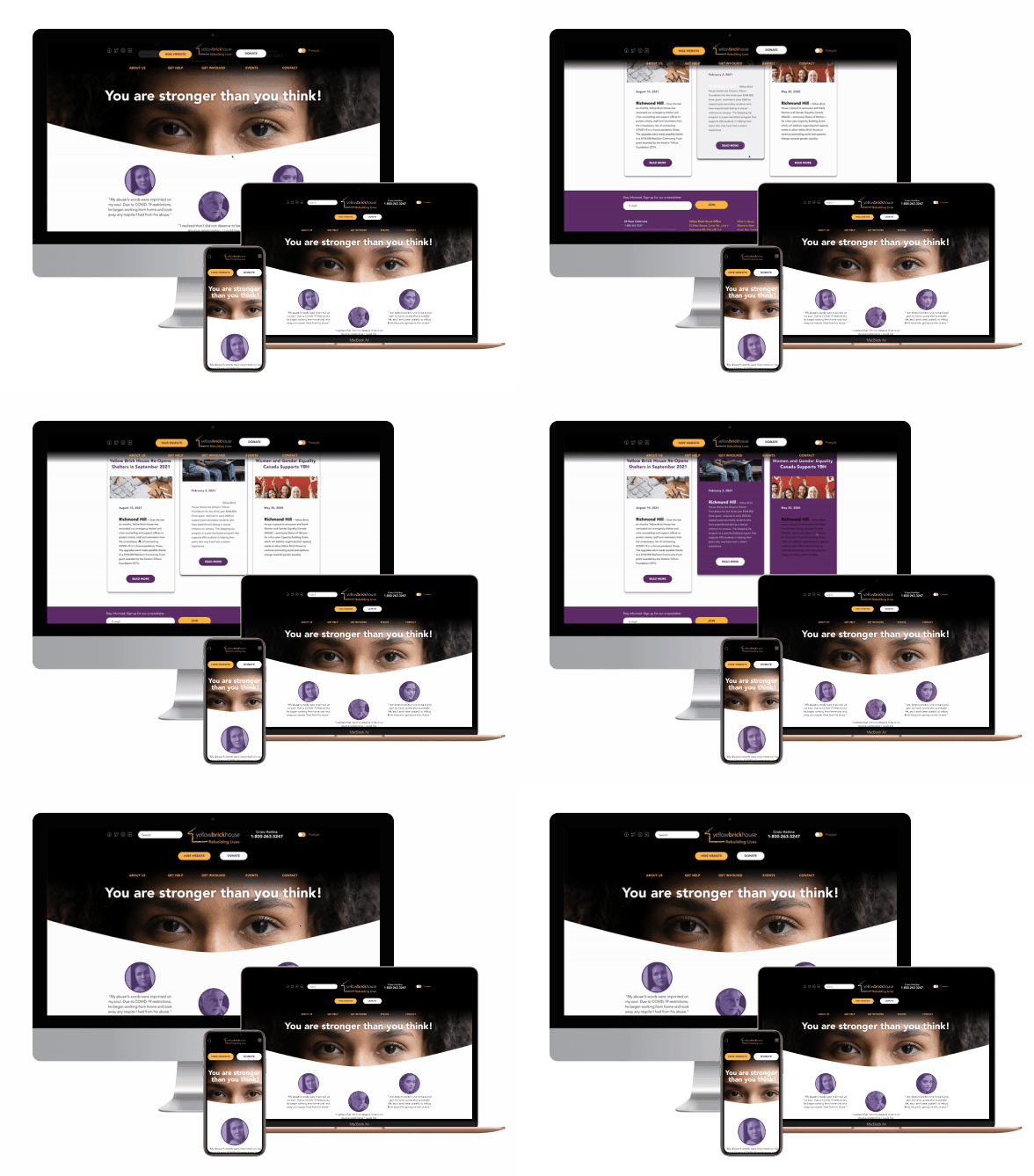
For convenience, the menu header was worked out; when scrolling down, it decreased and this way we could save the useful website space.
This, important information part of the site was not blocked or hidden from the user.

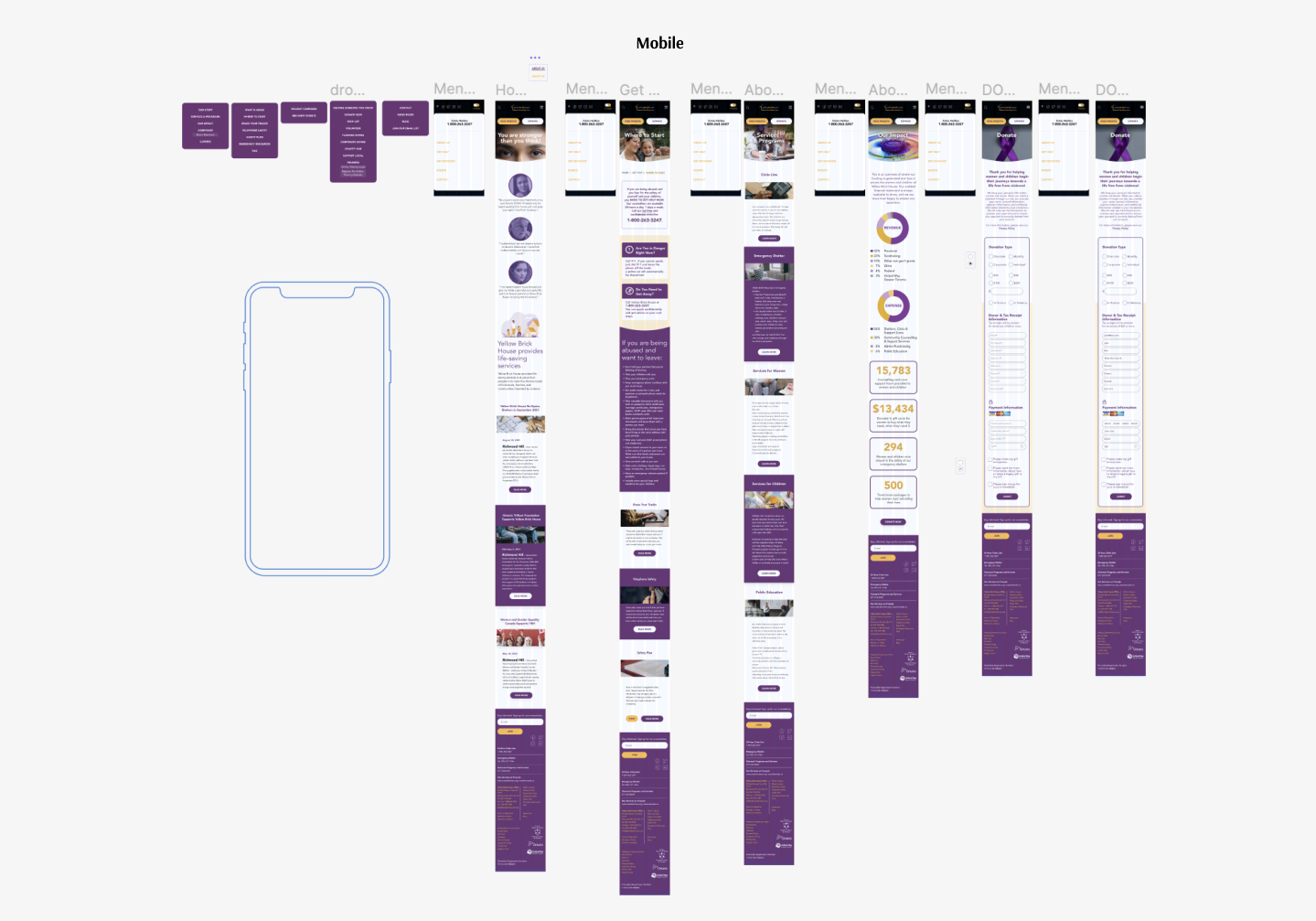
The mobile version has been reorganized and compiled according to the desktop version of the design
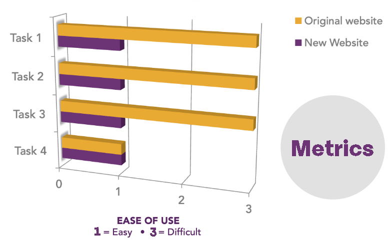
Our metric was ease of use and success rate completing all tasks. The average success rate of completing tasks on the original site was 70%, whereas it was 100% on the new site.
But when comparing how much easier it was to use and navigate, there was a noticeable difference. On a scale of 1 to 5, with 1 being easiest and 5 being most difficult, users found the new site much easier and faster to complete their tasks. Not only that, but they all commented that it looked more professional and was more visually in line with their branding, thus improving their credibility.
In the future, we’d like to develop the website further, by implementing the following features:
-Users being able to receive updates and/or stories of how their donations were used
-Help YBH become an authority on domestic violence by promoting speaking engagements on the website and using it as a platform/forum for bringing more awareness to the cause
-Allow users to give feedback on their experience using the YBH website in real-time
-Create an online store, so YBH could sell merchandise with empowering messages to increase awareness
-Partner with well-known brands to support the cause, like grocery stores to supply shelters with food and hygiene items, apparel stores for clothing and home renovation stores to outfit shelters with furniture and building supplies. These partnerships would be promoted on the YBH website to increase credibility, and on each respective retail site, demonstrating willingness to support their communities. It’s good for business!
-Create ongoing support structures, like having support groups and healing workshops and promoting them on their website, which provide support to patrons on their journey from being victims to healthy individuals, and eventually become mentors and donors themselves.
