Mission
The redesign of this website design thinking process was a problem-solving approach that focuses on creating user interface solutions that match the distinct Dolphin brand previously worked on by Canada Training Group.
Problem
Initially, the structure of the web site was created by backend programmers of Canada Training Group. The basic HTML and CSS structure of the functions confused for the users more than really worked. Additionally, no brand affiliation was displayed.
The priority execution of the site design was the Home page, login, and View My Profile pages.
The next priority was the My Profile page with the main functionality of the student’s personal account. It was necessary to create the ability to quickly and easily fill in all the necessary information. Convenience and beauty were the priorities in the design development.

Collaborators
I worked on this project as a user interface designer, in collaboration with a team from Canada Training Group.
My Role
Research > Design Thinking > Problem Definition > Ideation
- Project plan creation
- Competitor Analysis
- UI style tile
Prototyping > Testing > Prototype Iteration
- UI Inspiration
- Site Mapping
- Design Low-Fidelity Wireframes
- Usability Testing
- UI Style Guide Design
- High-Fidelity Prototype

The five phases of design thinking

Empathize phase
The research on the users’ needs was conducted Qualitative phase that was pulled from the data obtained by the researcher from participant observation and screen recordings.
Define phase
Competitor analysis helped me assess the strengths and weaknesses of similar sites, and a heuristic evaluation was performed on the current site to see if it followed best practices.
Ideation phase
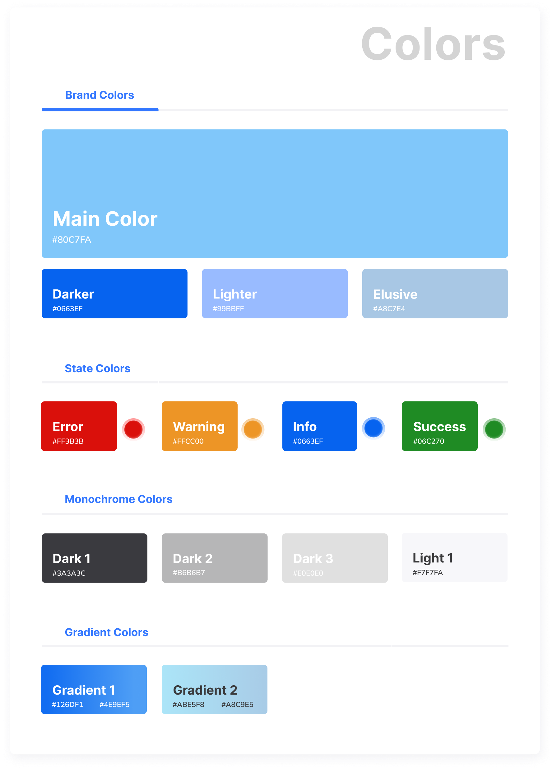
In the ideation process, we went through all the existing pain points of Dolphin87. The logical construction of the user flows (by the teacher and students), brand identity solutions of colours, typography and iconography styles to make sure that our product meets the user’s needs and meets all the stylistic requirements of the brand. The ideas have evolved through multiplay variants of sketching and prototyping.
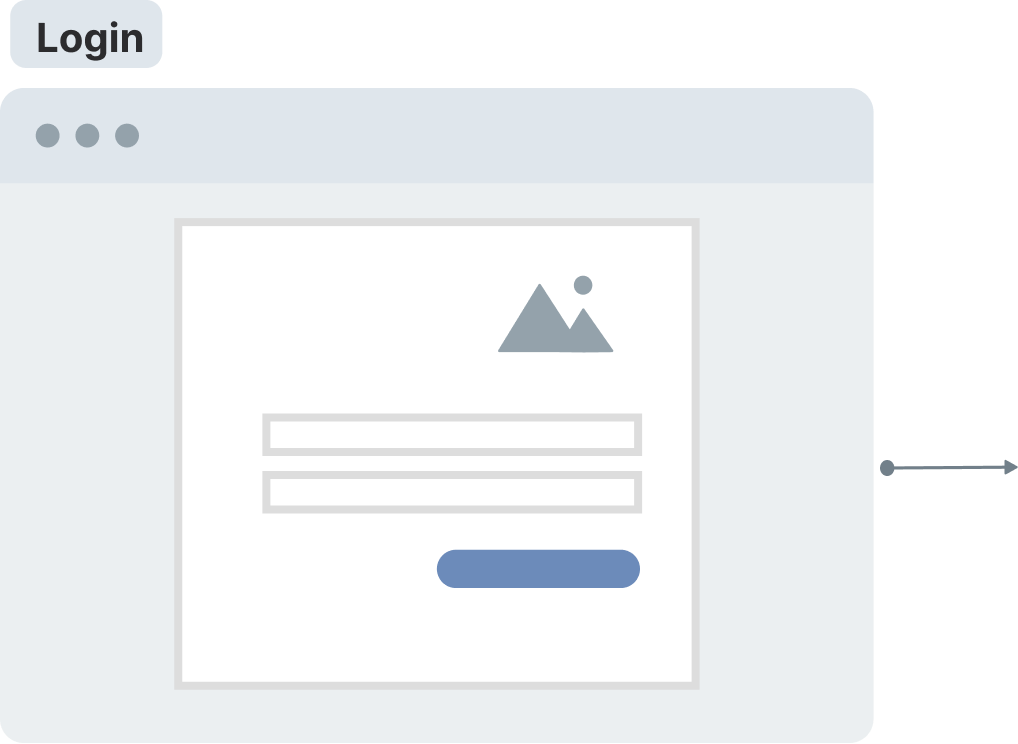
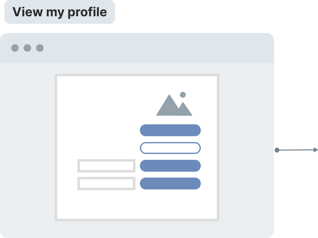
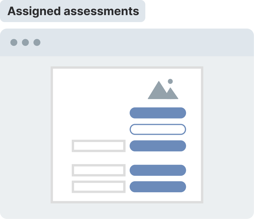
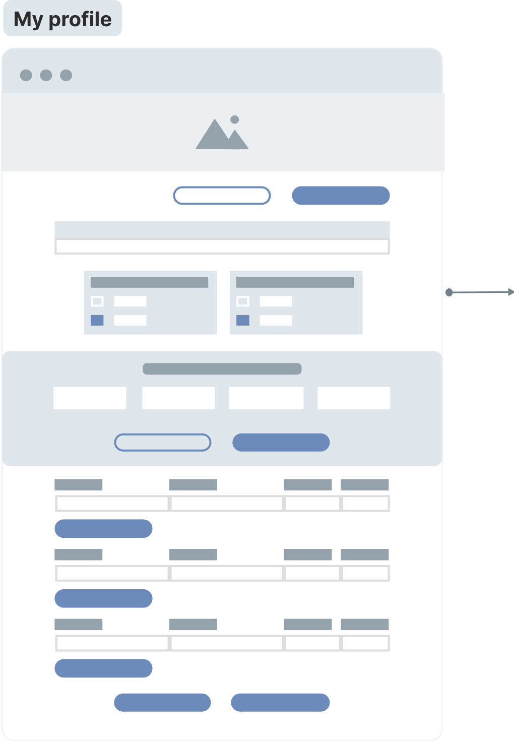

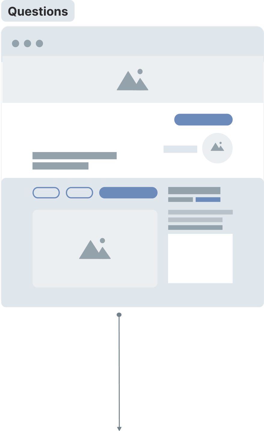
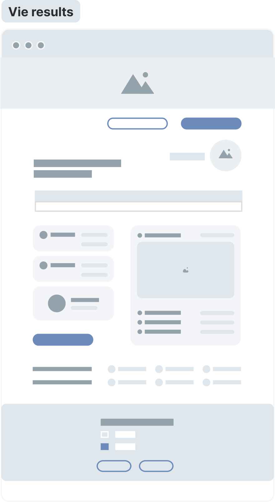
The user flow displays the path a student takes on the website to complete the login process, as well as several exam questions. The flow of users leads them from the entry point through a series of steps to a successful result and the last action – earning BrainCoin$. As a result, the passage of each stage is rewarded with another coin.

UI Style Guideline
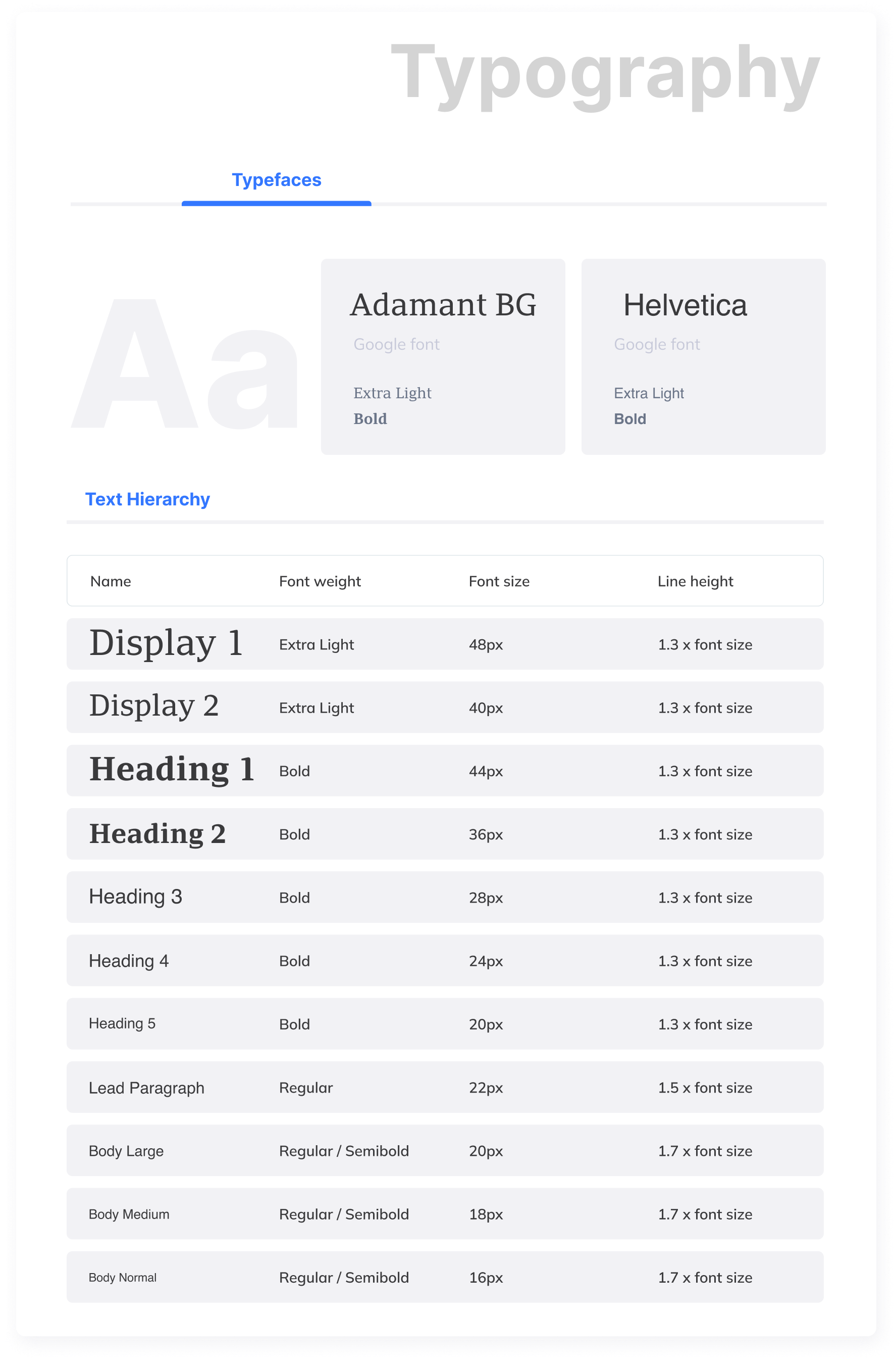
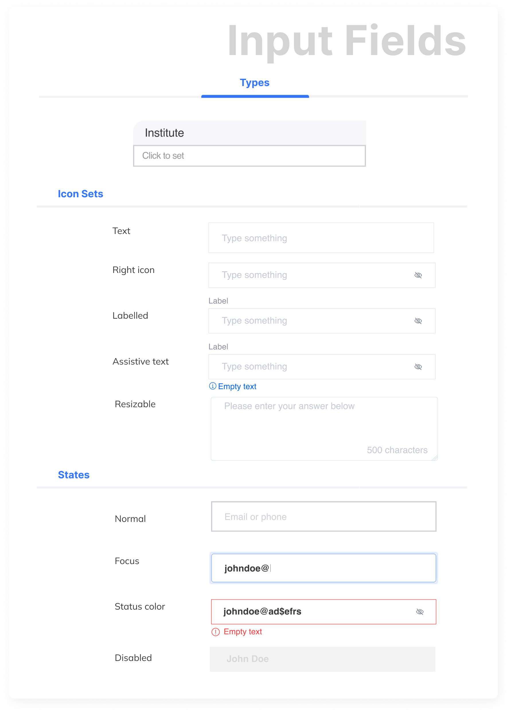
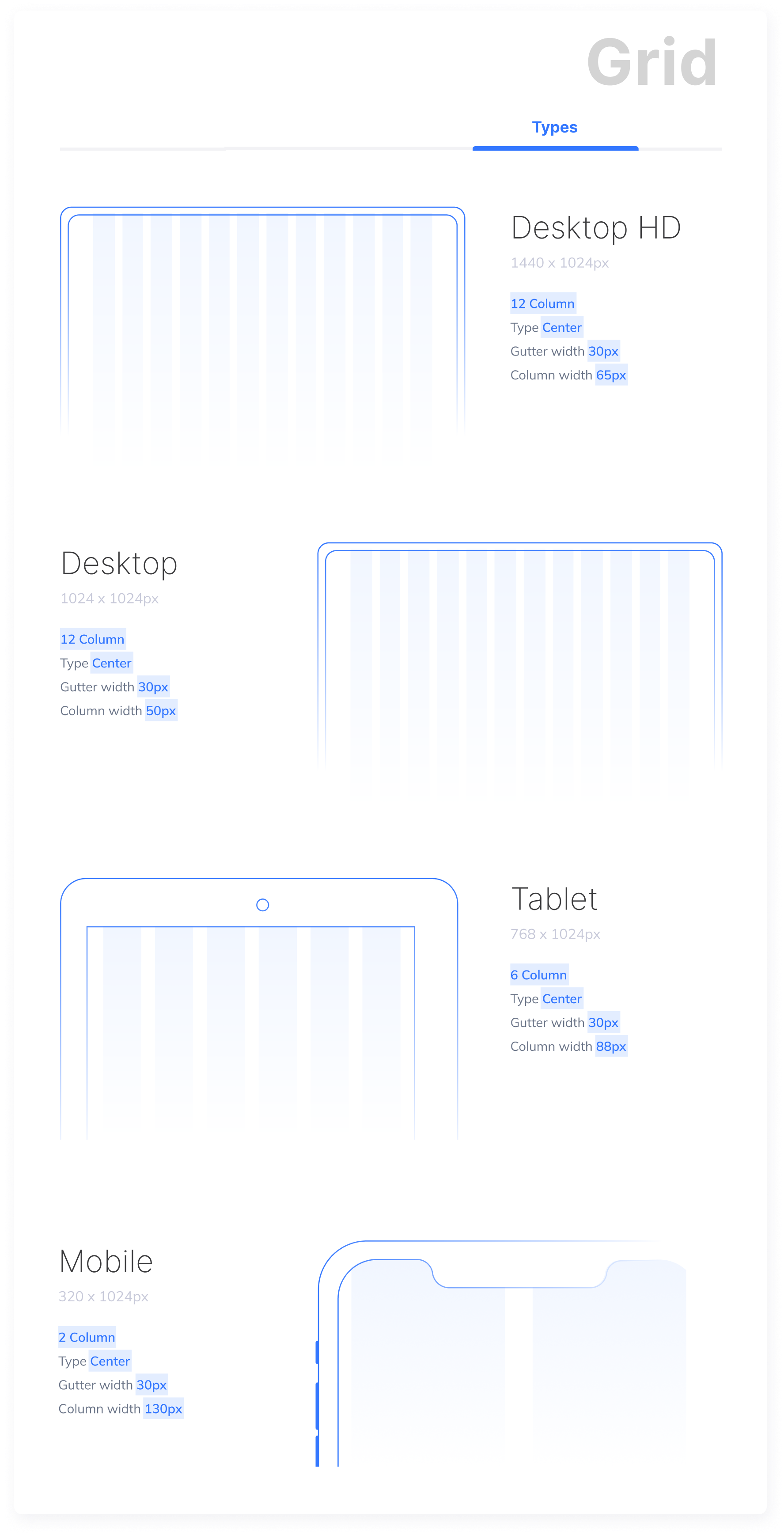
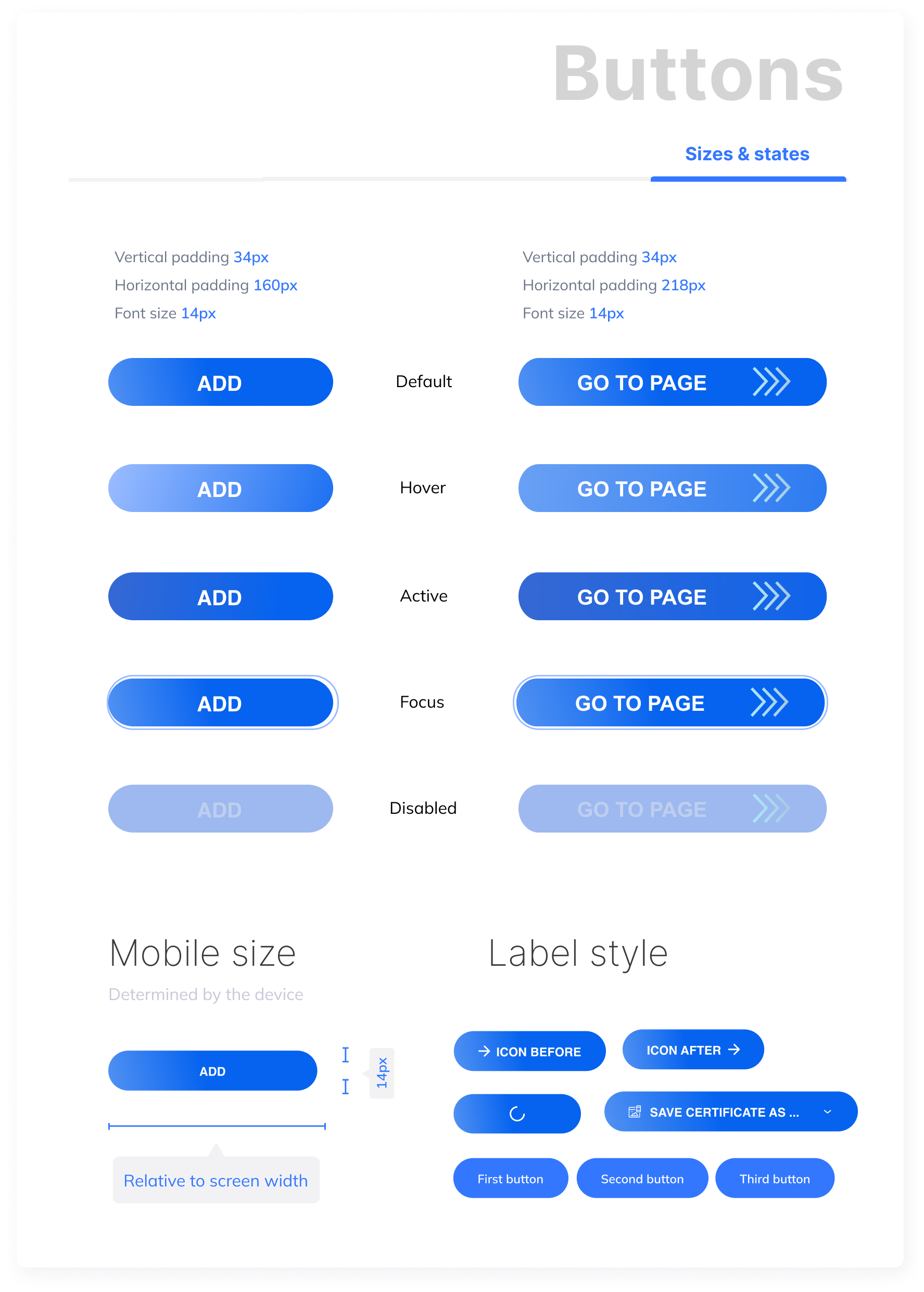
Prototype phase
In the prototype stage was created a low fidelity prototype to validate all our ideas that we could test in the next stage of the process.
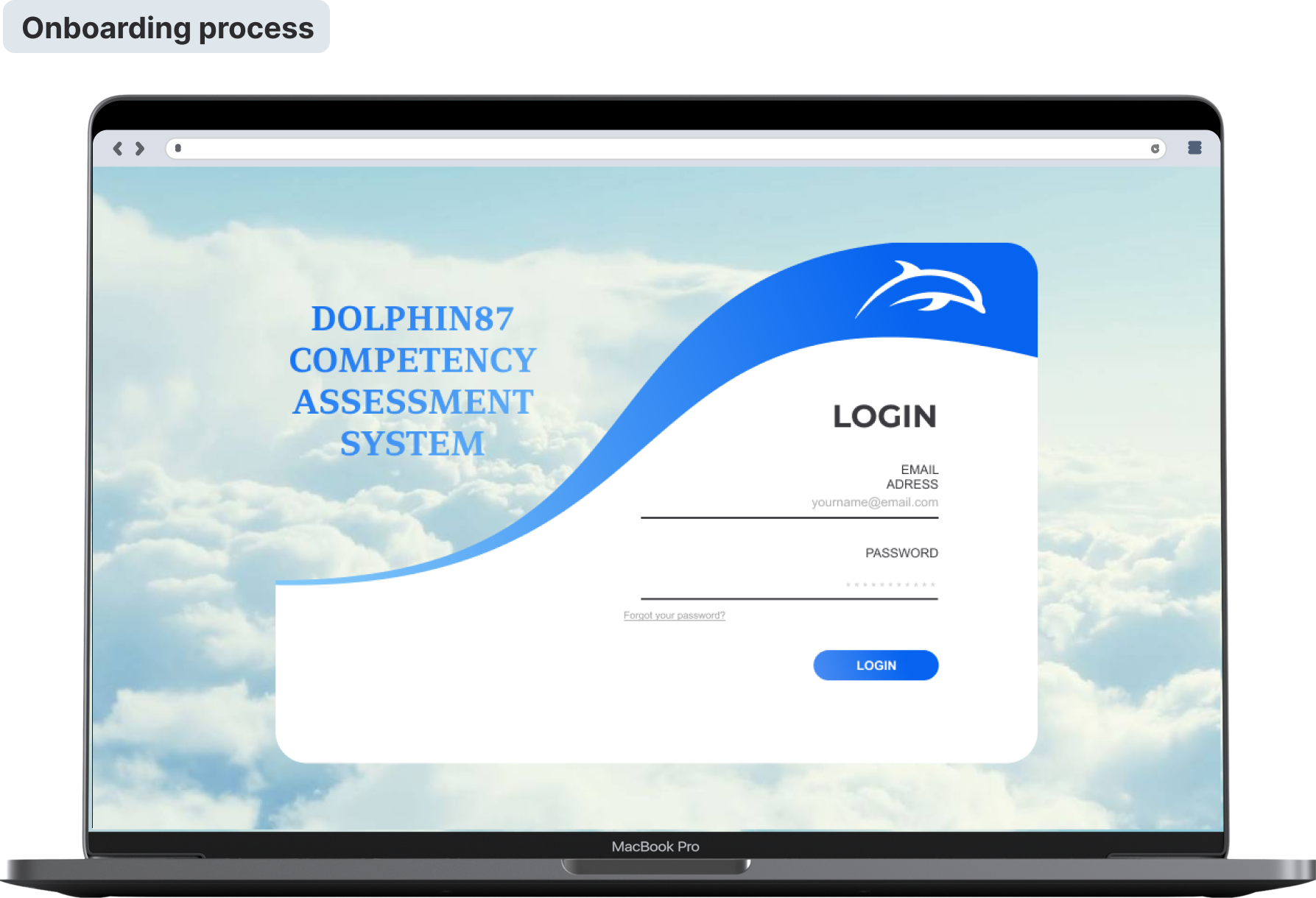
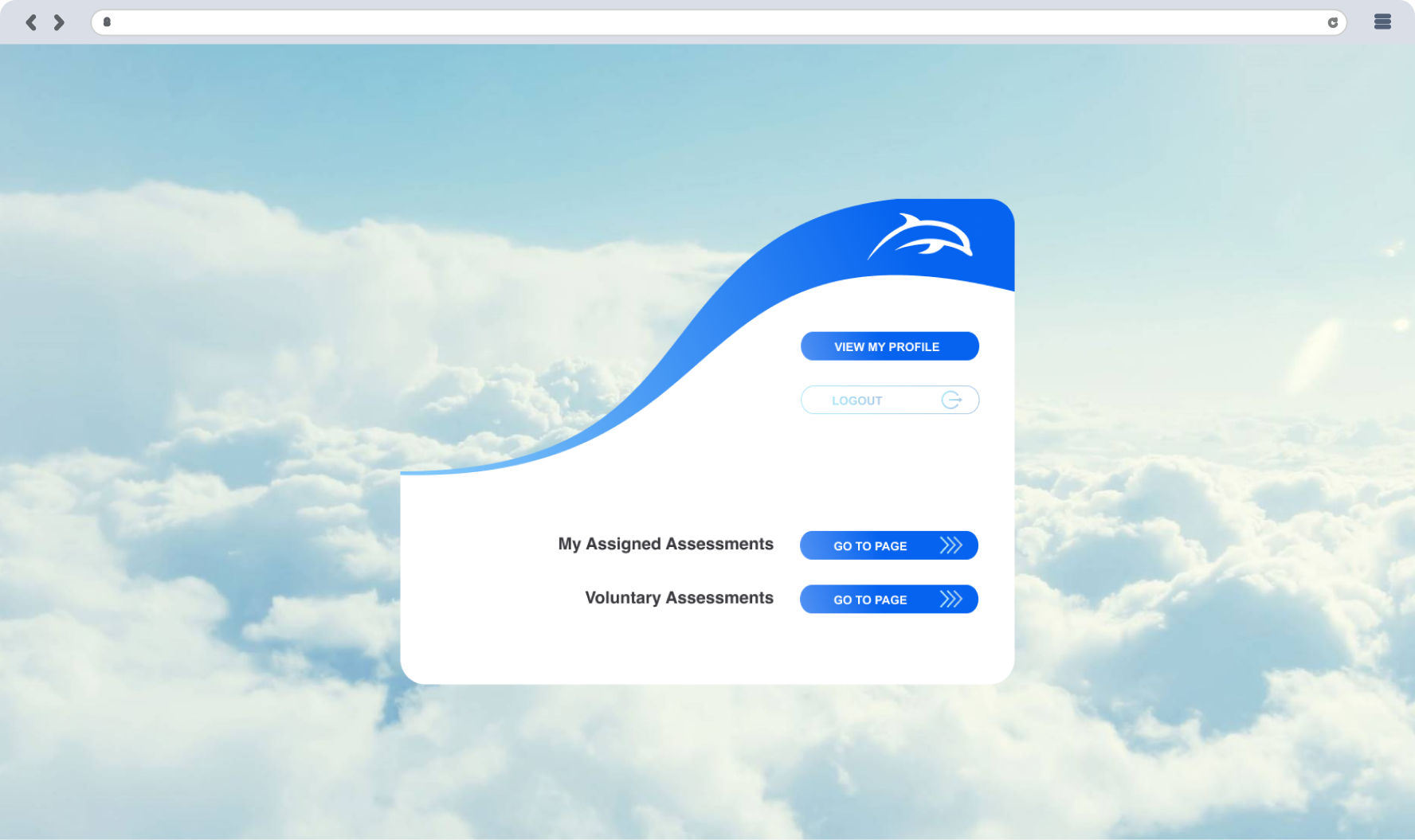
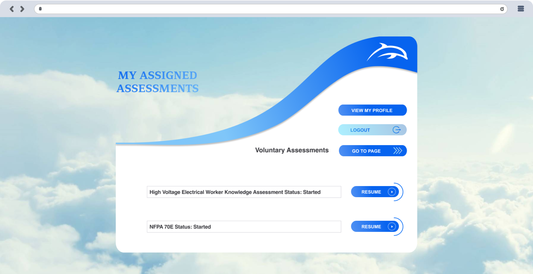
The onboarding process begins as soon as users land on the website; hence, leads the users logically, and includes a few simple and only necessary steps. I provided the most needed information in a few words and directed users only to what was essential to them.
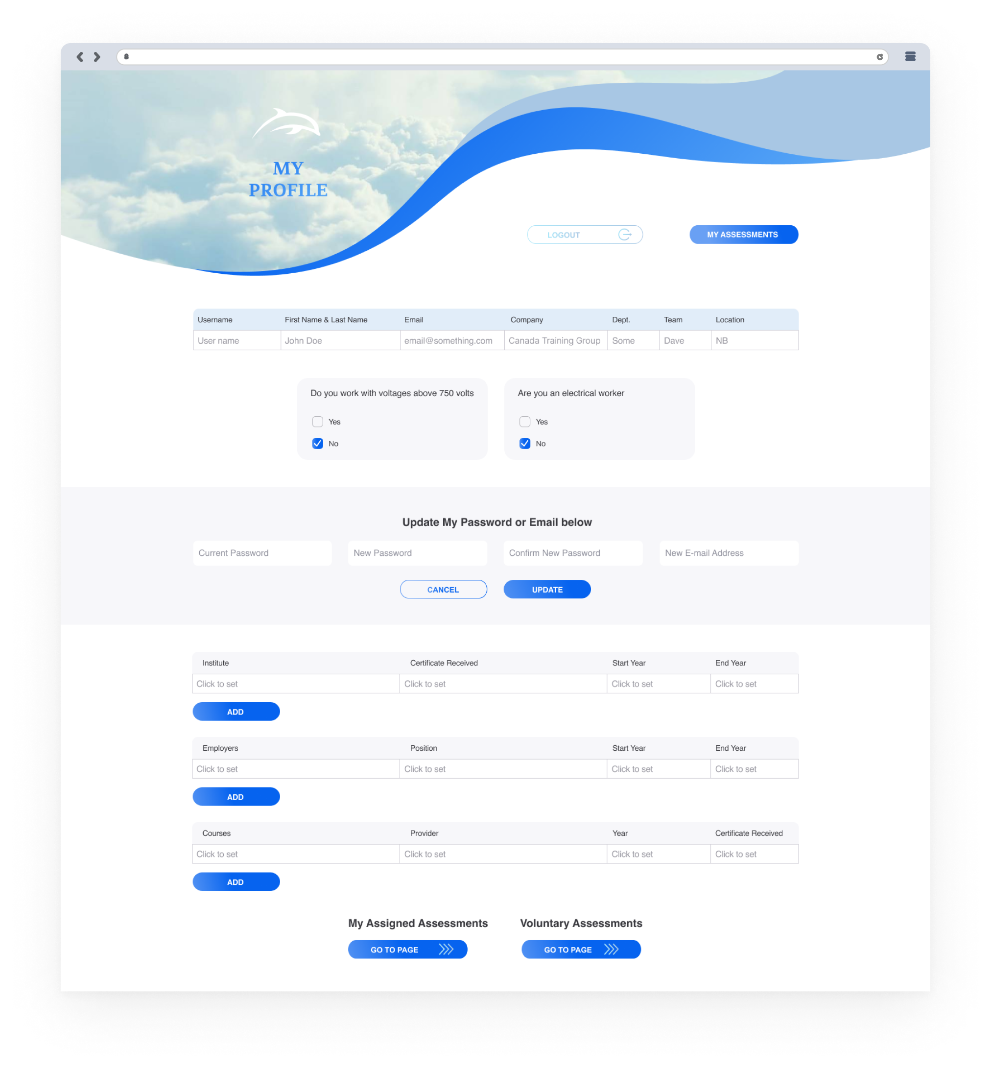
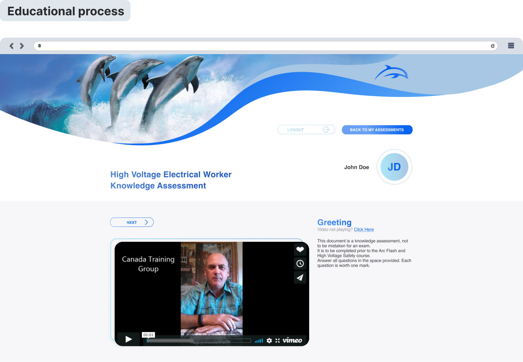
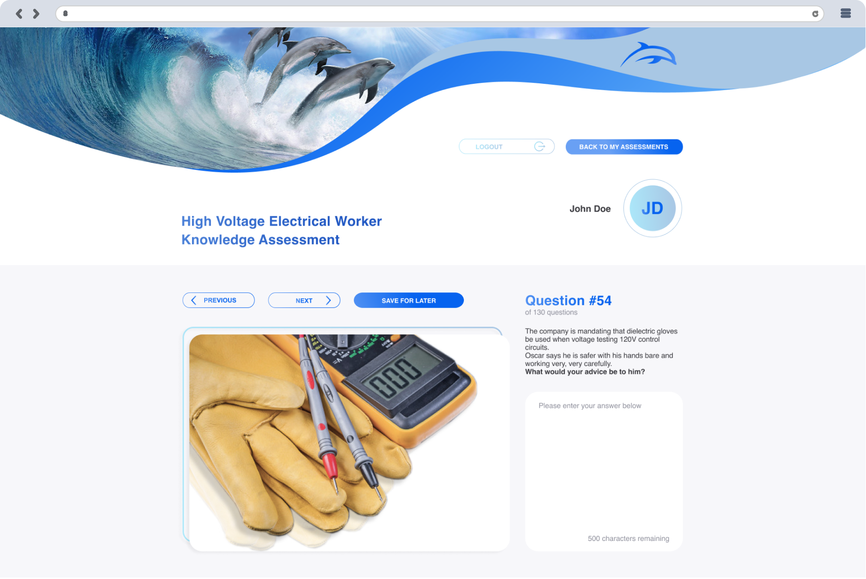
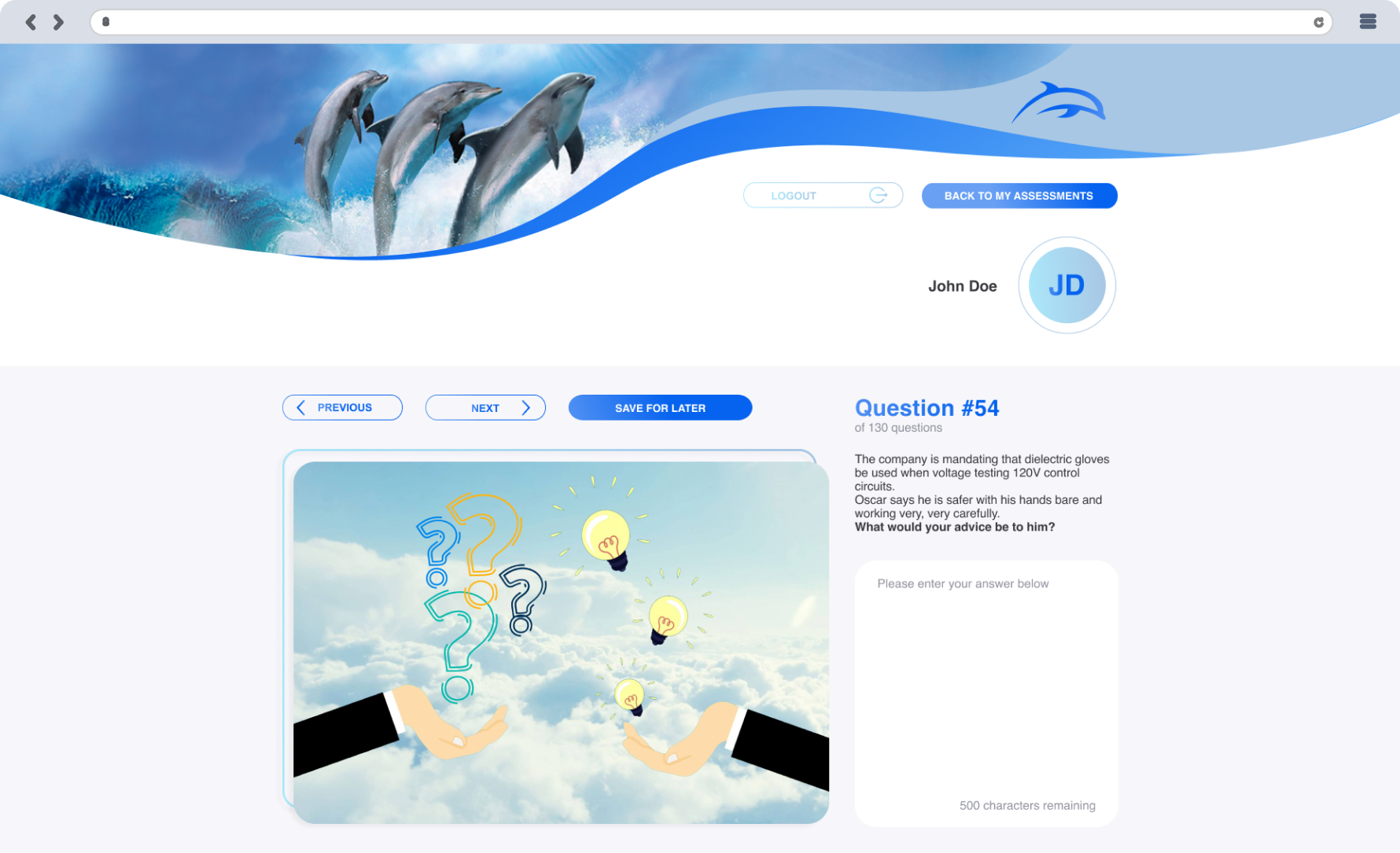
While creating the educational process flow content was created with the ability to briefly explain what kind of value users can find using your product in the Greeting part. Further, the users were followed by pages with questionnaires with pictures explaining the relevant question. Eventually, The Vie Results page showed all the user’s score
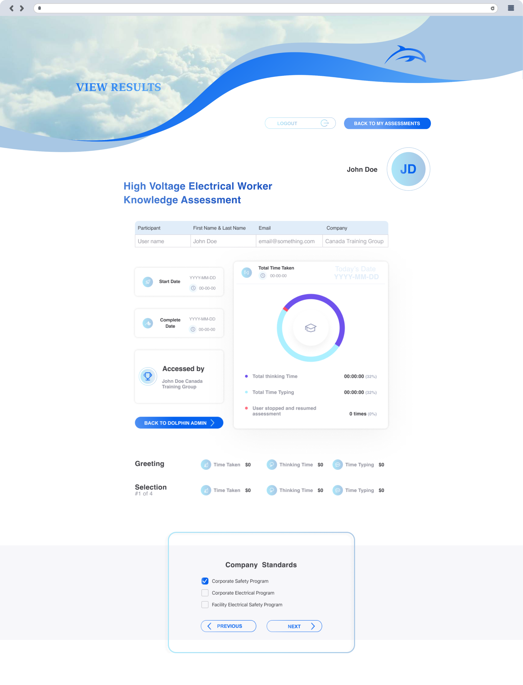
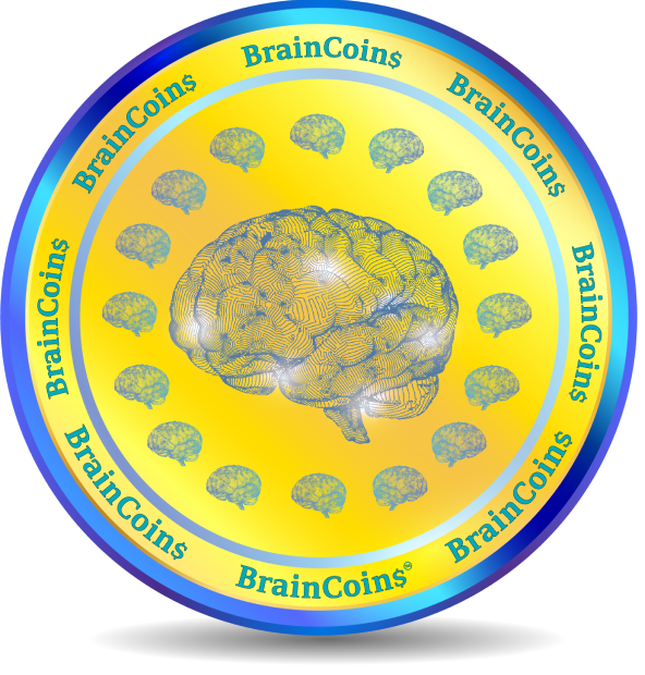
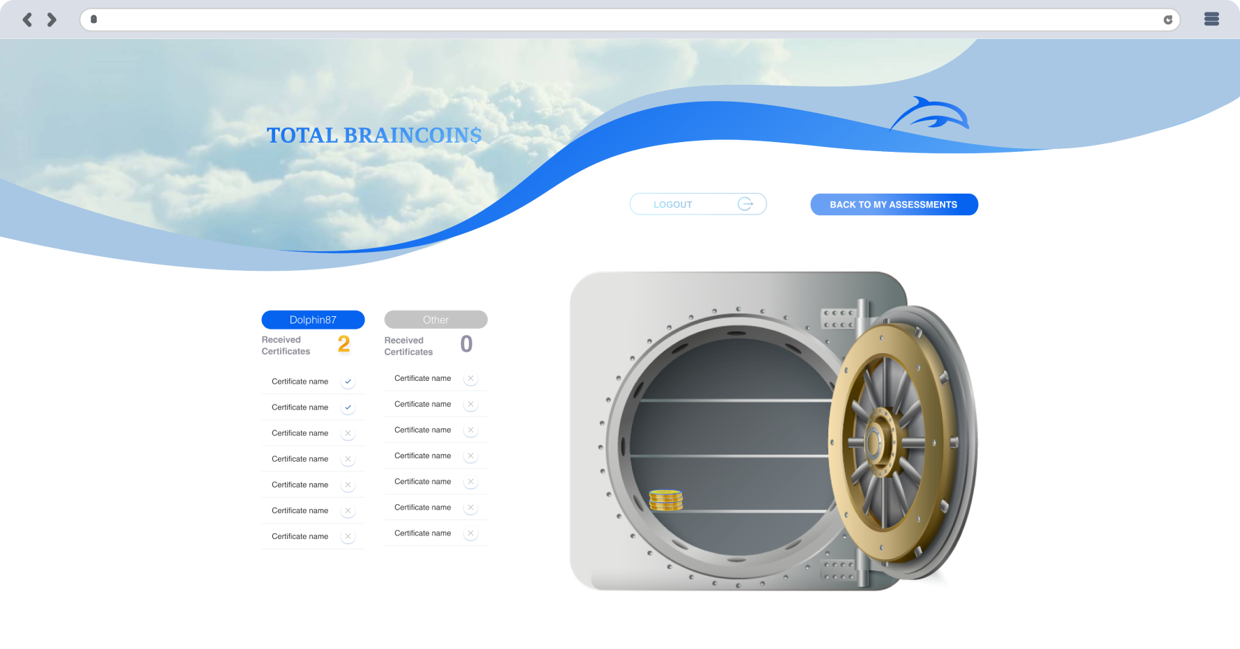
According to the earned score, it was converted into BrainCoins. Thus, encouraged to earn as many points as possible and replenish the user’s online vault by collecting coins in it. The success of the passed program depends on the number of accumulated BrainCoins.
Also, the design of the coin was made by me.
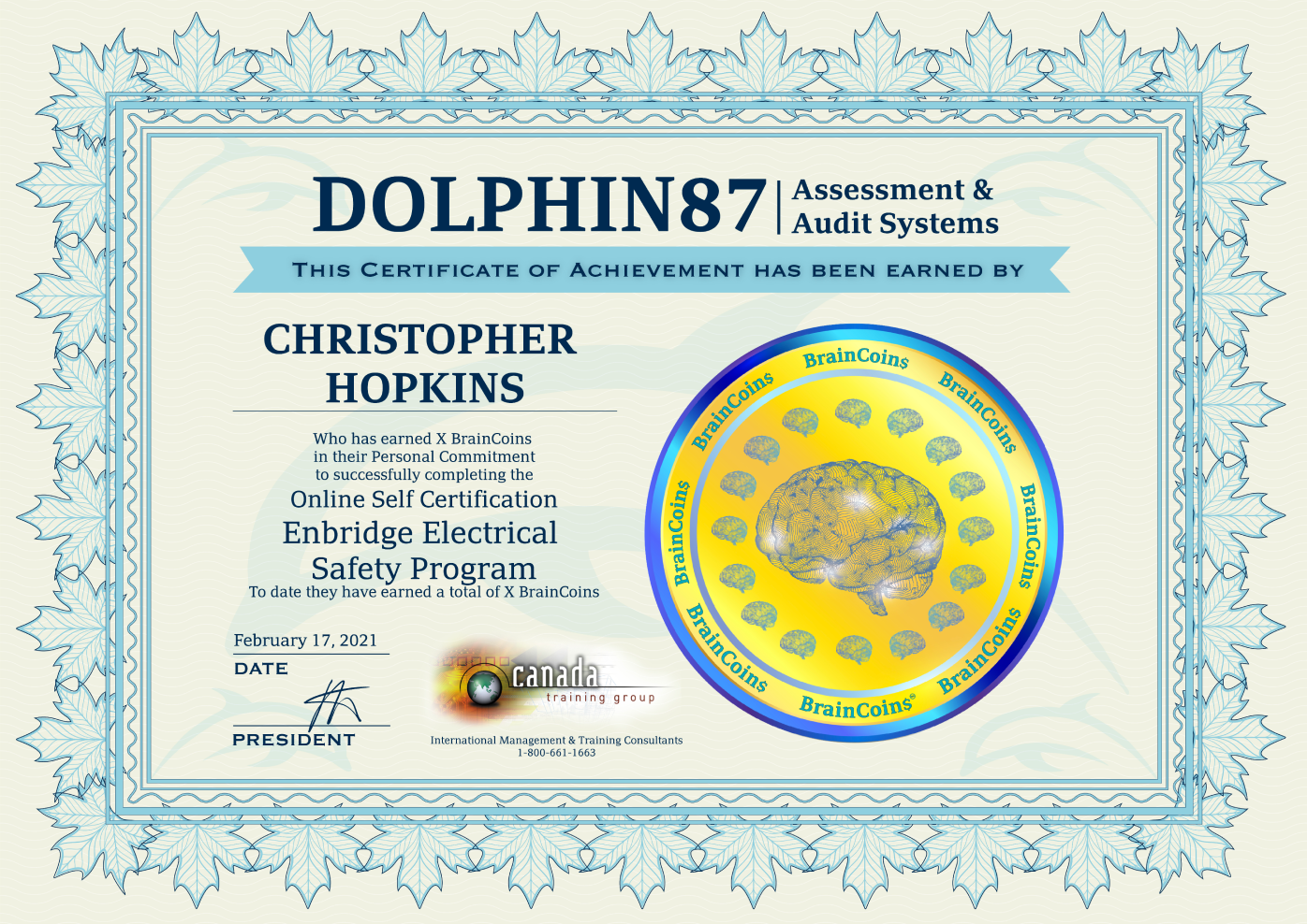
At the end of the educational and exam program, we have the option to download and receive a certificate directly from the site. The certificate was also created by me.
In the future
The site is still under development, so in the future, we are going to add more options that will allow the user (teacher) to collaborate with more students at the same time. Also, the need to simplify the registration process when filling in the student information in the database by the teacher.
