Fitness App
Fitness application created in 2020 for iOS and Android.
Mission
A creative application design for an integrated approach to fast and efficient fat burning. Users get fit through progress tracking and regular training. A compact, effective and vibrant user interface makes the design of this weight loss application stand out amongst hundreds of training apps for girls.
The Challenge
Decision
We focused on creating a convenient and creative application with a user-friendly interface that will allow girls whose age matches the target audience to conduct effective weight loss workouts.
Features:
- Animation and video tutorials were similar to a personal workout trainer.
- Full body training at home including buttock training, core training, leg training, weight loss, and fat burning.
- Trainer tips in each exercise help you use the right form for the best results.
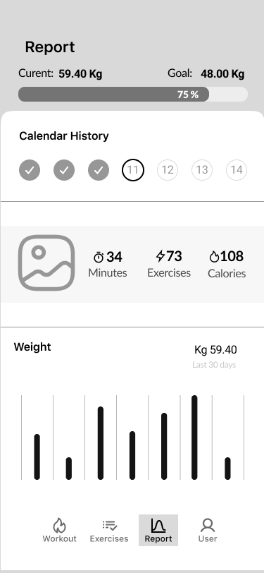
- Track weight loss progress and calories burned.
- Designed for both beginners and professionals as a personal trainer.
My Role
Tools Used
Google doc,
Adobe Suite
Protect Duration
Usability Testing
Process
Empathized and learned about our users
- User interviews
- Stakeholder interview
- Survey
- Data analysts
- Metrics
- Competitors
- Observation
- Clustering insights
- Context mapping
- Customer journey map

Defined our users’ needs, real problem and discovered our insights
- Personas
- Empathy map
- User journey
- Storyboard
- Problem statement
- Task analysis
- Comparative analysis

Ideated by challenging assumption and creating ideas for innovative solutions
- Brainstorm sessions
- Mind maps
- Affinity maps
- Storyboards
- Card sorting
- User journey
- User flow
- Information Architecture
- Business model canvas
- Design principles
Prototyped to implement the solutions and simulate user experience
- Detailed user flows
- Micro-interactions
- Mockup
- Interactive prototypes
- Wireframes
- High-fidelity design
- Design hand-off
- HTML/JS prototypes

Tested solutions. Validated with users
- Usability testing
- A/B testing
- SUS surveys
- Heuristic evaluation
- Quality assurance
- Analytics
- Performance testing
- Observations
- Desirability evaluation
- Metrics
My contribution:
Observation, persona creation, user flow, design principles, micro-interactions, mockups, wireframes, low-fidelity and high-fidelity design, a/b testing, heuristic evaluation, and observations.
Empathize Phase
Observation
Empathize was the first stage of our design thinking process. We conducted research to get a personal grasp of our users’ needs. I observed how they interacted with similar applications on iOS and Android and consulted with them on all my empathy interview questions. It was necessary to reject the approximate hypothesis to get a real sense of our users’ needs. This way, we could understand users’ experiences, motivations and problems.
- The main question I asked people was why they did or said something.
- To understand users’ behaviour I asked them to tell me about the last time they did the onboarding part at any fitness app and what exactly was useful for them and why.
- Looked for inconsistencies in their experiences because they often hid interesting insights. Some people said and reacted in a different manner to the same action.
- Every interview session was between 35 – 50 minutes. I’ve found that the best time is around 40-45 minutes to conduct effective research, as it gives me time to prepare for the next interview and doesn’t seem that long to the interviewer.
Observation results
Methods for the observation that I used.
1. “Day in the Life” Home Observation
With some users, I went out to where they were in real life, tracked how the interaction happened, and asked them questions about their experience.
2. Remote, online through Zoom, teems calls
Used online tools to conduct my research and record the data. I’ve found that it is best to audio record sessions, even if I have a video recording.
In either method, I used observation questions:
- How do users interact with applications in their home?
- What type of questions are they asking?
- What actions exactly do they struggle with?
1. Onboarding process
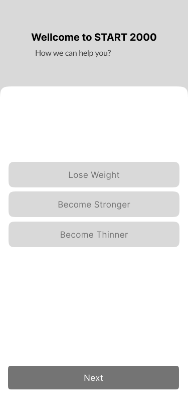
Users wished to have an opportunity to set up an individual program. This program should reflect the level of physical fitness of the body.
Also, a large number of requests were asking to create the ability to track their progress in the onboarding process.
- Physical fitness of the body 87%
- Tracking feature 78%
2. Preferences
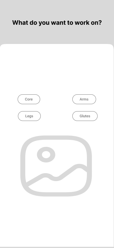
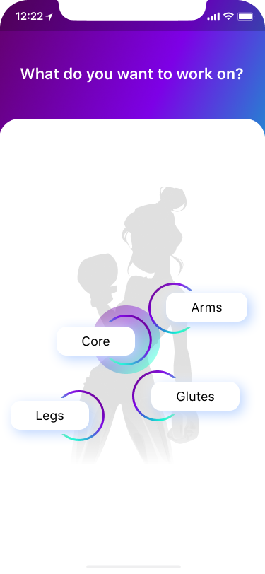
One of the highest priorities among all of the participants was a request to have the opportunity to work on individual problematic parts of the body.
- To work on individual problematic parts 98%
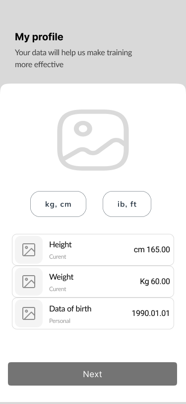
3. Profile settings
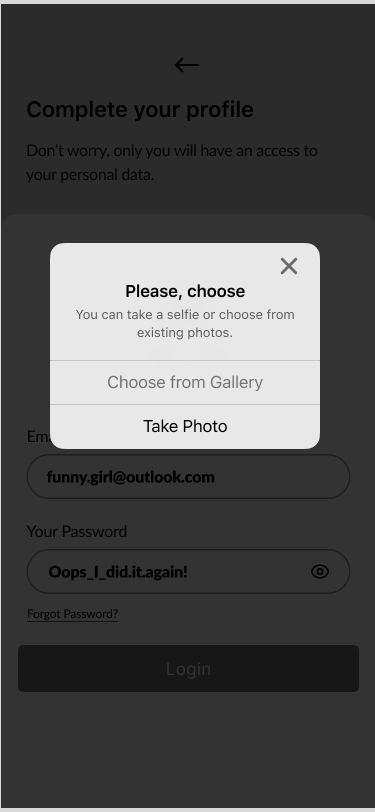
Some users mentioned the ability to manage their own profile settings. “Would be fun to have the opportunity to add/change my photo…”
- Pesonalize profile settings 68%
Define Phase
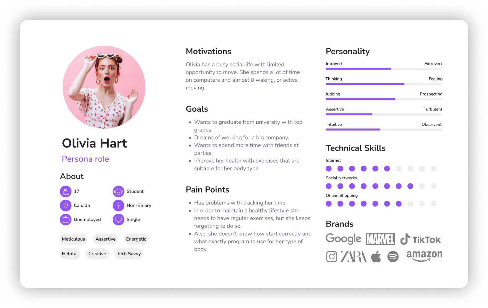
Persona creation
My next contribution was the creation of a user persona.
Ideate Phase
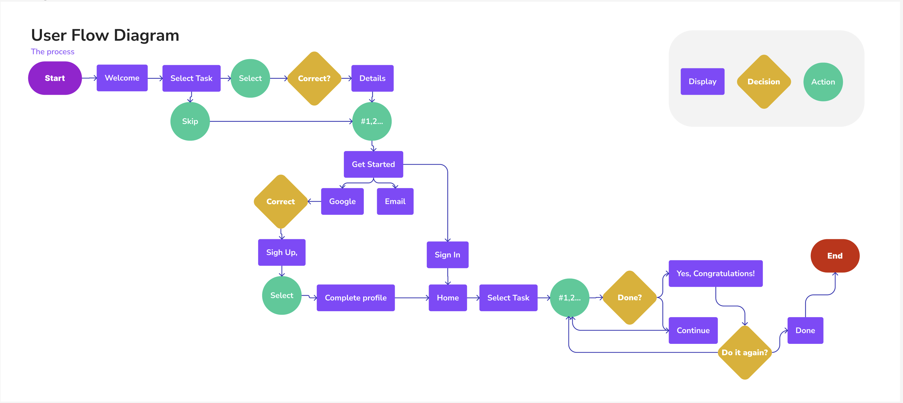
User Flow Diagram
User flows simplified our design process and paved the way for an intuitive user experience.
Design principles
Worked on design principles that should be applied to our app.
Prototype Phase
Wireframes with prototyping
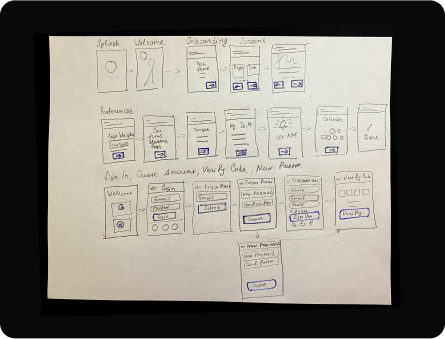
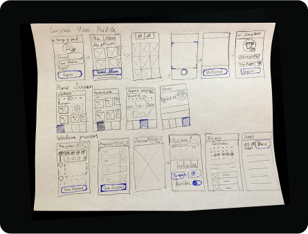
To implement the user flow, low and mid-fidelity wireframes were created, which outlined the drawings of the application screens. They helped us communicate the main idea of the product.
Low-fidelity wireframes
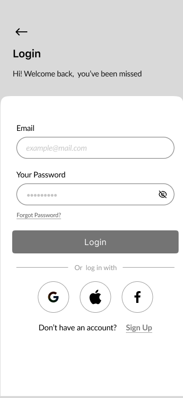
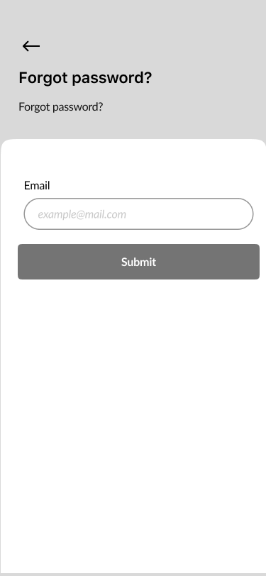
Splash screen, welcome screen, onboarding screens, preferences, sign in, create account, verify code, new password.
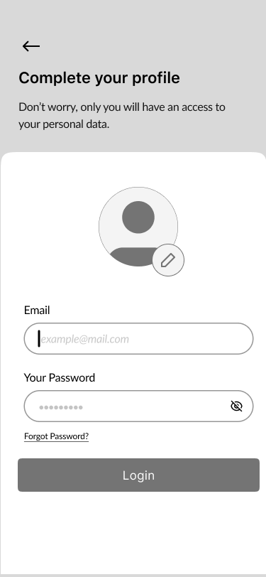
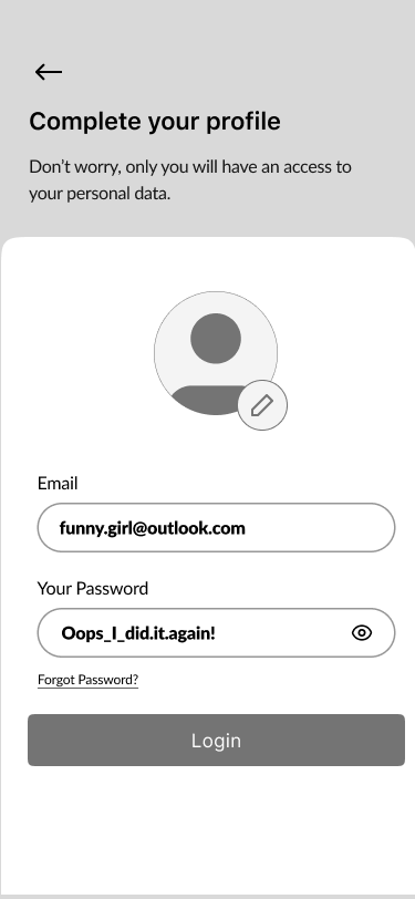
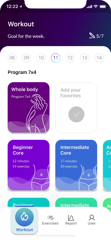
Complete your profile, home screen, workout process, and review screens.
Mid-fidelity wireframes
01. Splash Screen

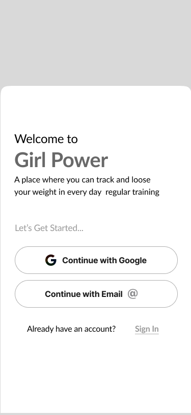
02. Welcome Screen

03. Onboarding
《 scroll gallery 》
04. Preferences
《 scroll gallery 》
05. Sign In
《 scroll gallery 》
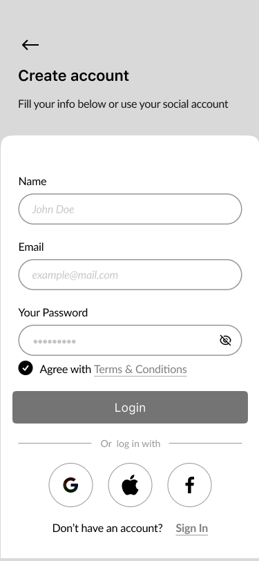
06. Create Account
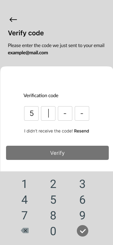
07. Verify Code
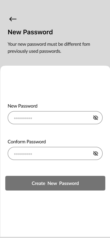
08. New Password
09. Complete Your Profile
《 scroll gallery 》
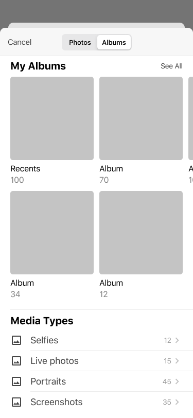
Choose from Gallery
《 scroll gallery 》
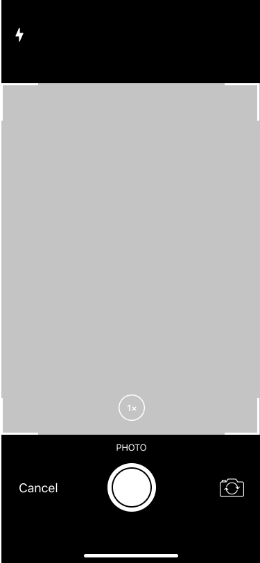
Take Photo
《 scroll gallery 》
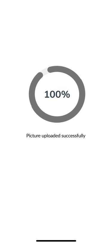
Success message
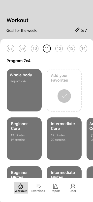
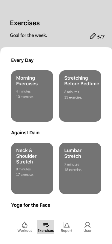
10. Home Screen
Exercises
Report
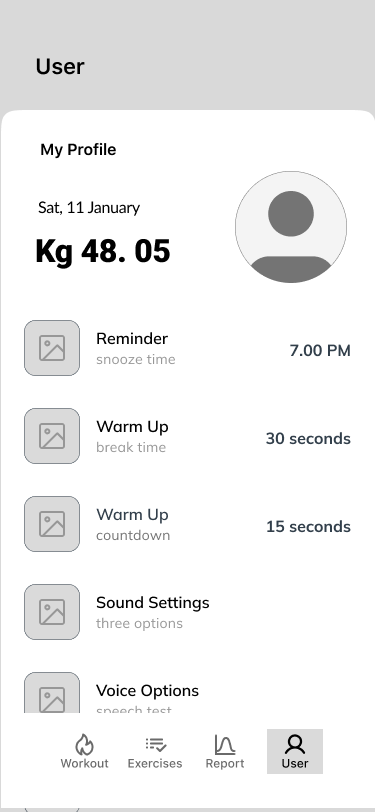
User
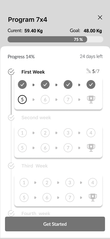
11. Workout process
《 scroll gallery 》
Congratulations
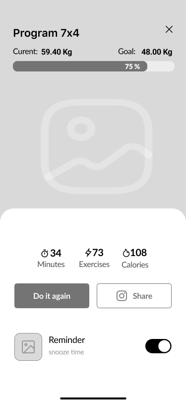
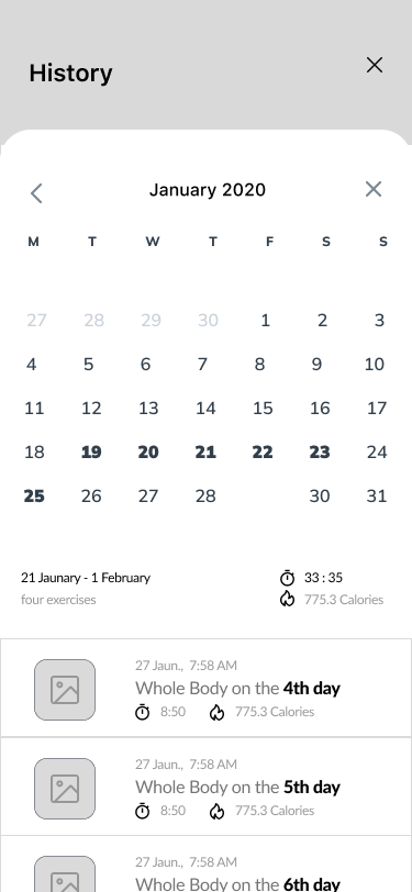
Training history
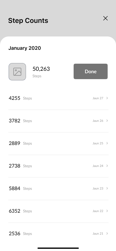
Step Counts
When testing the product, studies showed that communication interaction was successful. The success rate for all tasks ranged from 75% to 87%.
| Direct success rate
The number of completed tasks with direct success was 10 and the total number of completed tasks was 8 1/2
| Indirect success rate
The number of completed tasks with indirect success was 7 and the total number of completed was 5.
However, there was a repeated request to add a review function. When developing a high-fidelity version of the product, we additionally developed this function to satisfy the users.
High-fidelity wireframes

- Splash Screen 1%
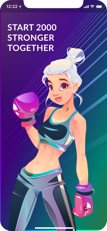
- Welcome Screen 3%

- Onboarding Screens 5%
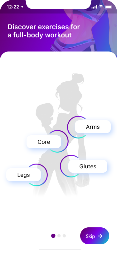
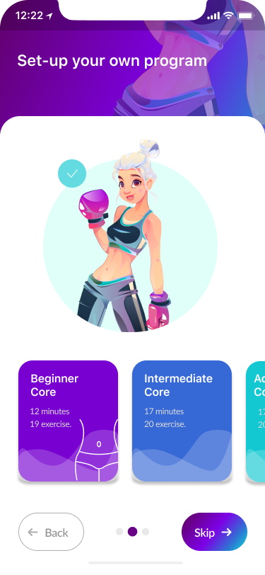
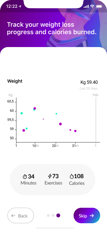
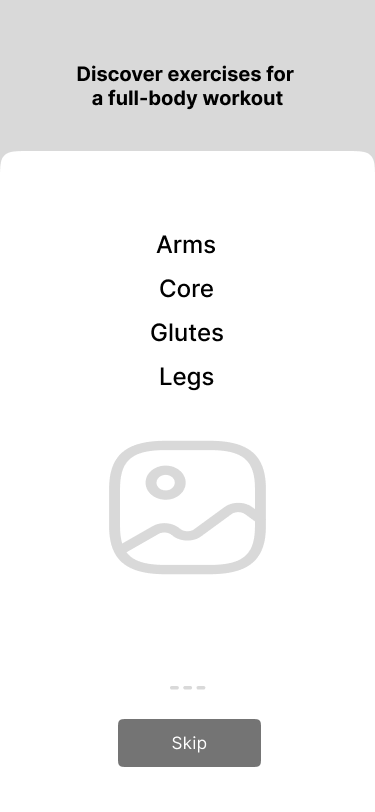
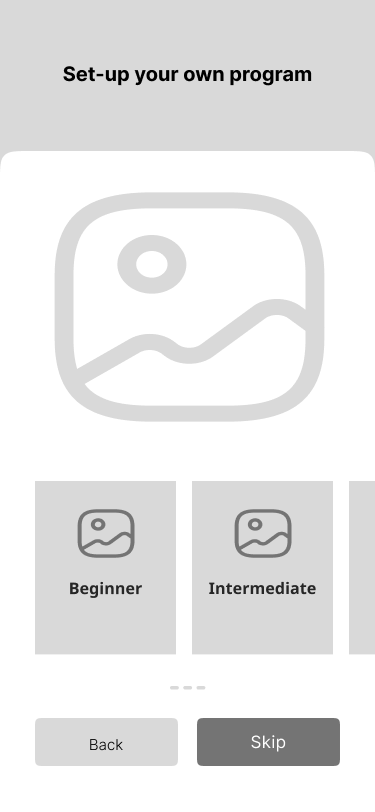
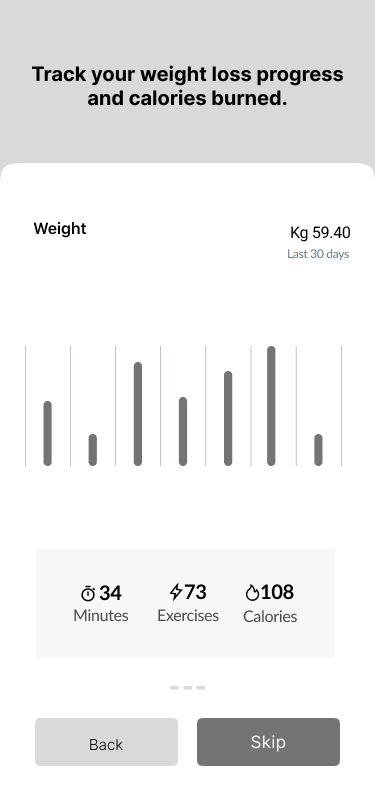
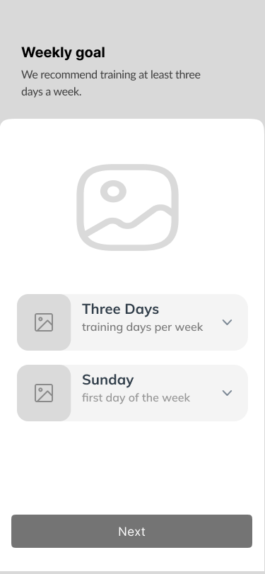
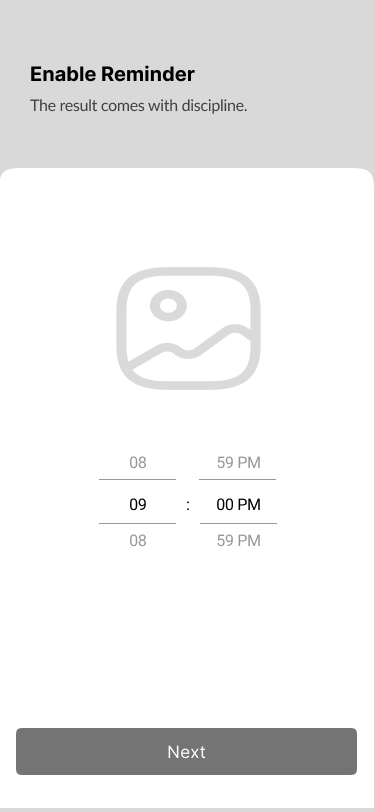
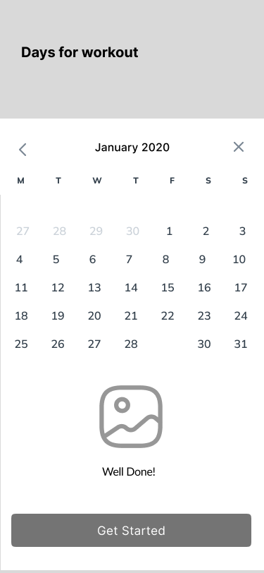
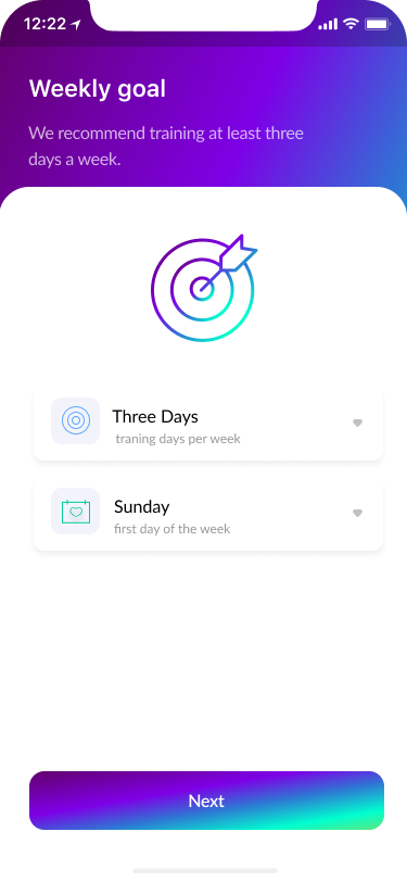
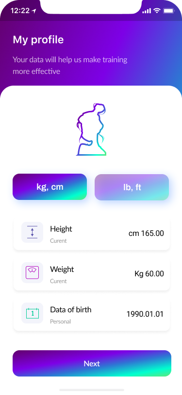
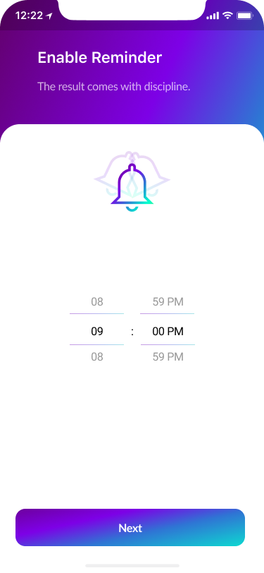
The onboarding screen was a necessary part of our product design. The structure was created for a logical and easy-to-use approach. It leads the user on and gives them the motivation they need to engage with the rest of the app.
We focused on a few screens for successful onboarding and what exactly the user should expect in the flow:
- Setting the problem targets
- Set up an individual program
- Tracking the progress
- Preferences 15%
The flow led to the seven screens that would allow users to manage their preferences.
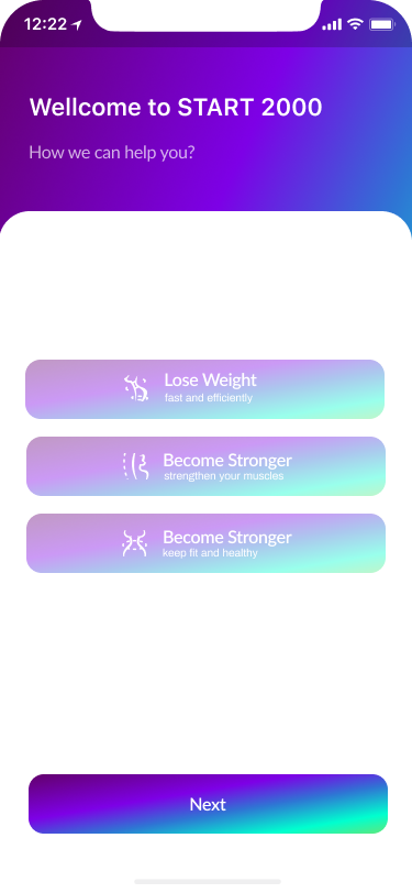
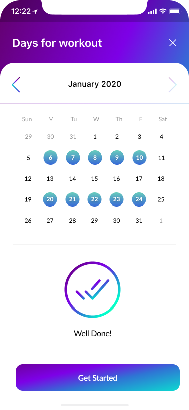
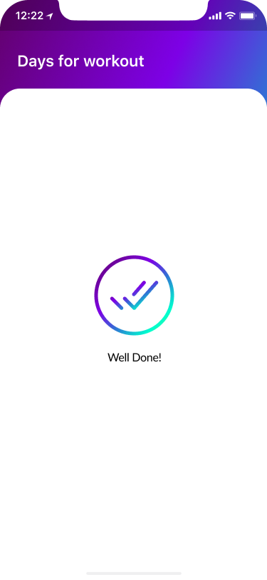
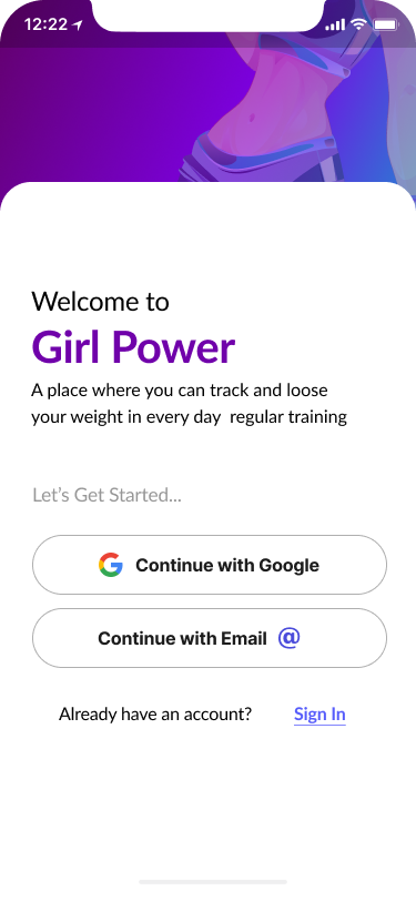
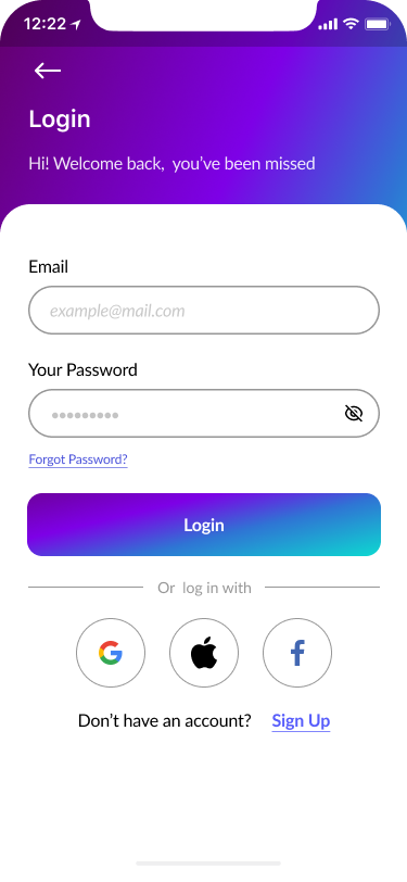
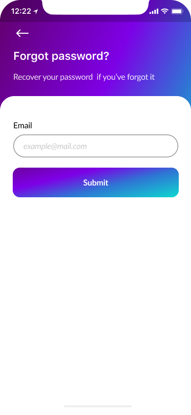
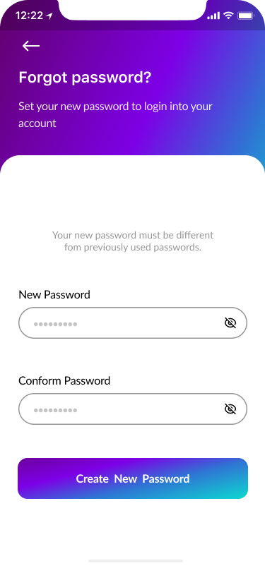
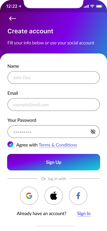
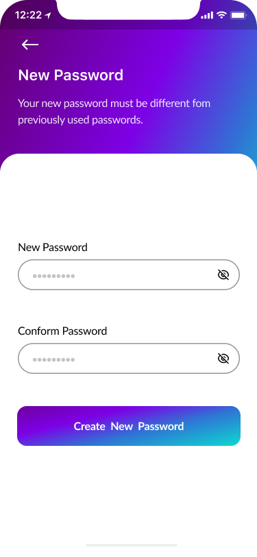
- Sign In, Create Account, Verify Code, New Password 40%
Part of the onboarding was the registration process to create a proper relationship with our users and to help them understand what should they do to to perform desirable actions.
We focused on a few screens for successful onboarding:
- Sign in
- Create an account
- Verify code
- New password
- Welcome page.

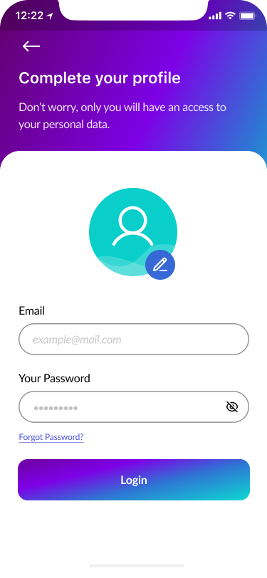
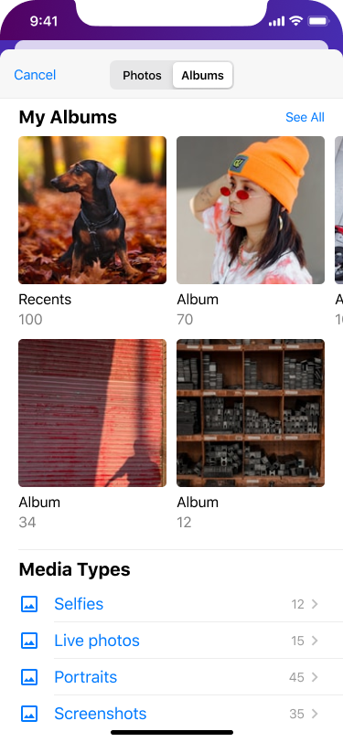
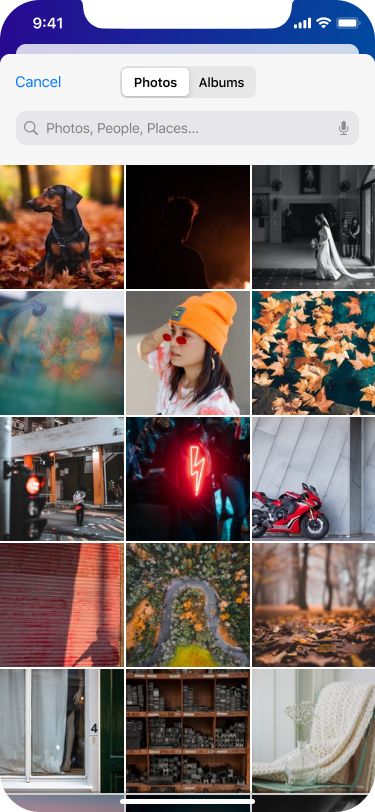
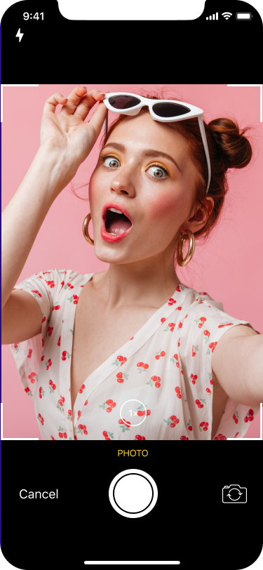
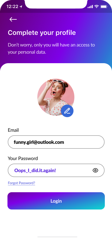
- Complete Your Profile 60%
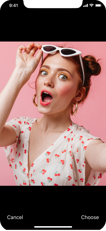
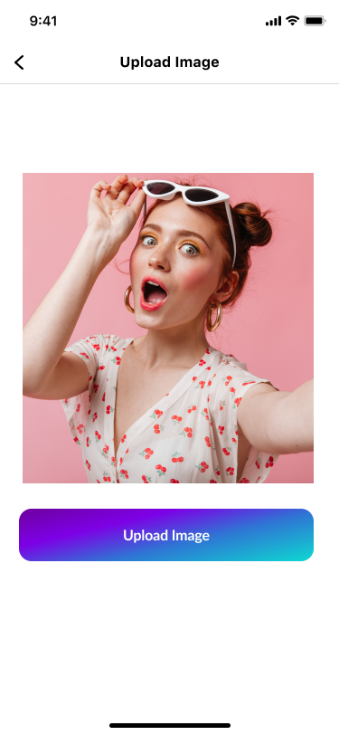
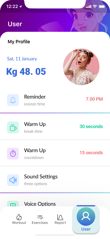
Part of the design thinking process was to model user behaviour and ask them to fill out their profile while they were doing the login process.
Users could upload their own photos or take selfies. Consequently, the account will become more personalized.
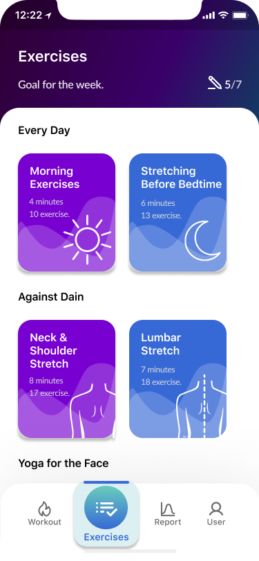
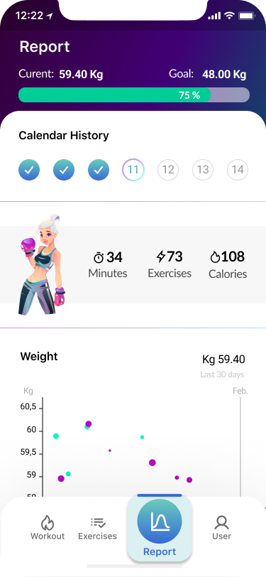
- Home Screen 70%
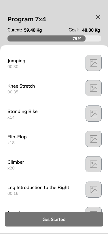
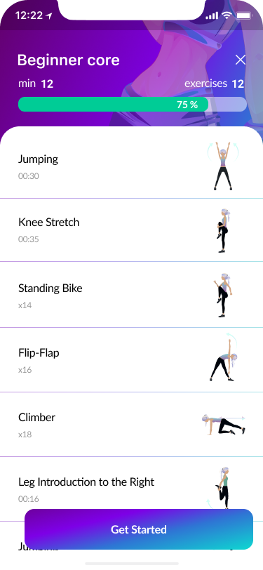
- Workout process 90%
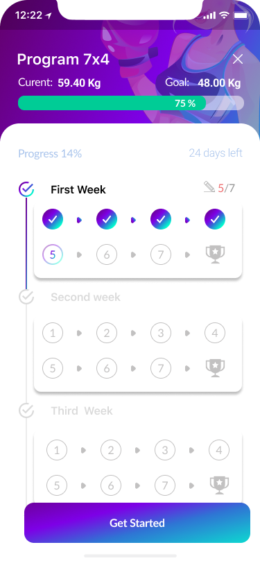
Part of the design thinking process was to model user behaviour and ask them to fill out their profile while they were doing the login process.
Users could upload their own photos or take selfies. Consequently, the account will become more personalized.
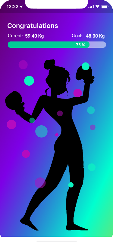
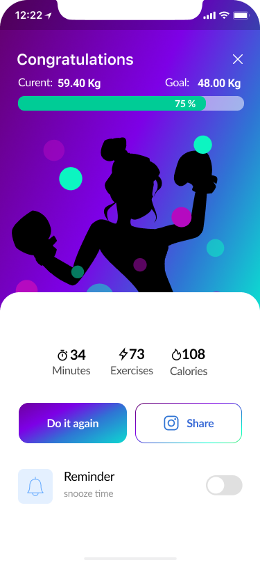
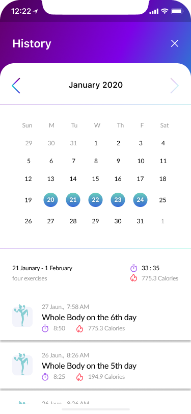
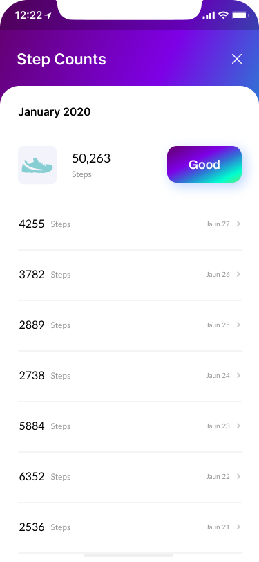

- Feedback Screens 100%

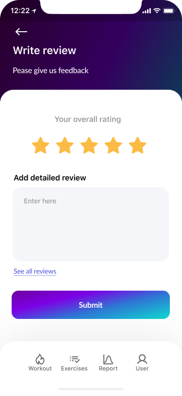
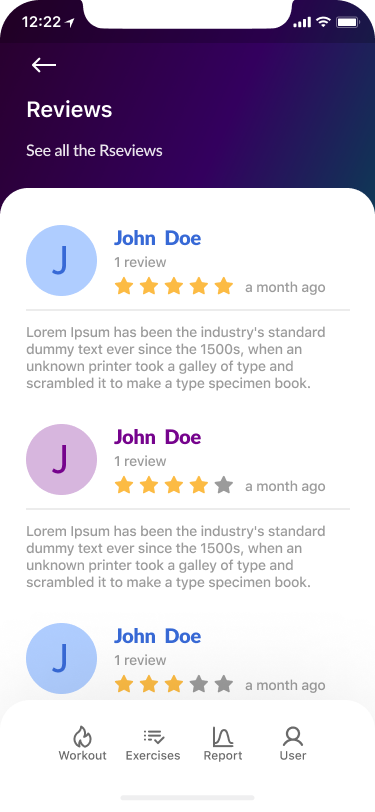

After completing the high-fidelity prototype, we conducted an A-B testing research. That increased the direct and indirect success of completed tasks to 1 1/2 points for each one.
