Landing page design for
Modern Furniture advertisement.
Mission
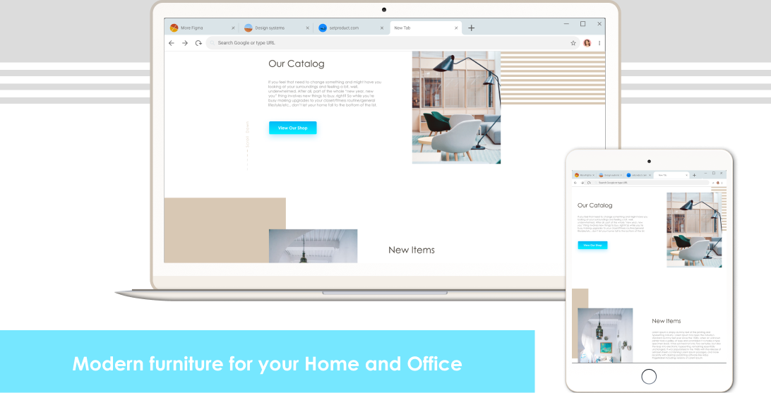
The task was to create a design of the target page for the modernized furniture so that visitors could quickly get all the necessary information in a form convenient for them.
Process
Empathize
Define
Ideate
Design
Test
Re-Design
Prototype
Test
Dev Handoff
Working with a front-end developer
The challenge and goals
The Modern Furniture company asked me to create a unique, attractive and light design for their landing page.
I focused my design thinking process on fundamental principles, heuristics, and approaches to make the design more effective. All information should be presented in a way that is easier to understand and use.
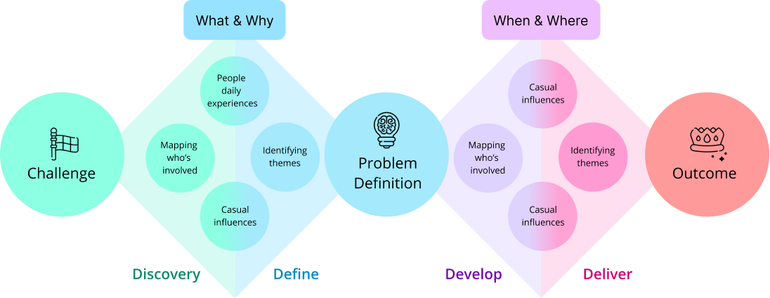
I have applied the double diamond process in my design journey.
Design thinking and double diamond of the process
My role
UX/UI Designer
The Solution
Since potential buyers are the only people who will use the page and decide everything by testing it, a user-centric approach I prioritized for a successful and profit-oriented design solution.
Tools
Figma,
Google doc,
Adobe Suite,
Kanban
Protect Duration
2 weeks
Research
UX Research Plan
Competitor Analysis
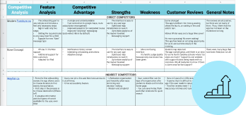
I created a UX research plan in a google doc and according to this plan I conducted a competitor analysis no reveal all strengths and weaknesses of the direct and indirect competitors.
The research plan included
The first week:
- User research/competitor analysis/affinity diagram
- User and Stakeholders interviews
- Problem definition
- Ideation
The second week:
- Information Architecture
- UI Style Tile Design
- Low-Hi fidelity design creation/testing
- Hotjar/Google analytics data
Define
Affinity Diagram
User Insights
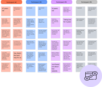
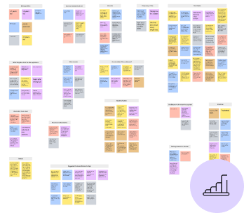
While working on an Affinity Diagram and User Insights, I realized that it is very important that the user should be familiar with the product and can use it on the first contact.
Result:
- User goals should be easily achieved by adding intuitive navigation.
- The interface should be easy to remember on subsequent visits.
Develop
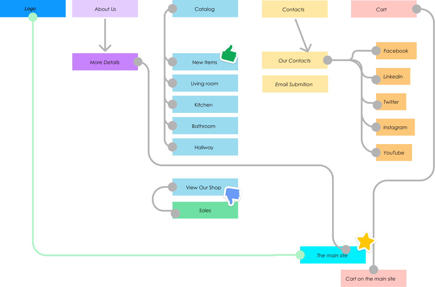
Information received from users began working on Information Architecture and the UI Style Tile design.
Information Architecture
UI Style Tile Design
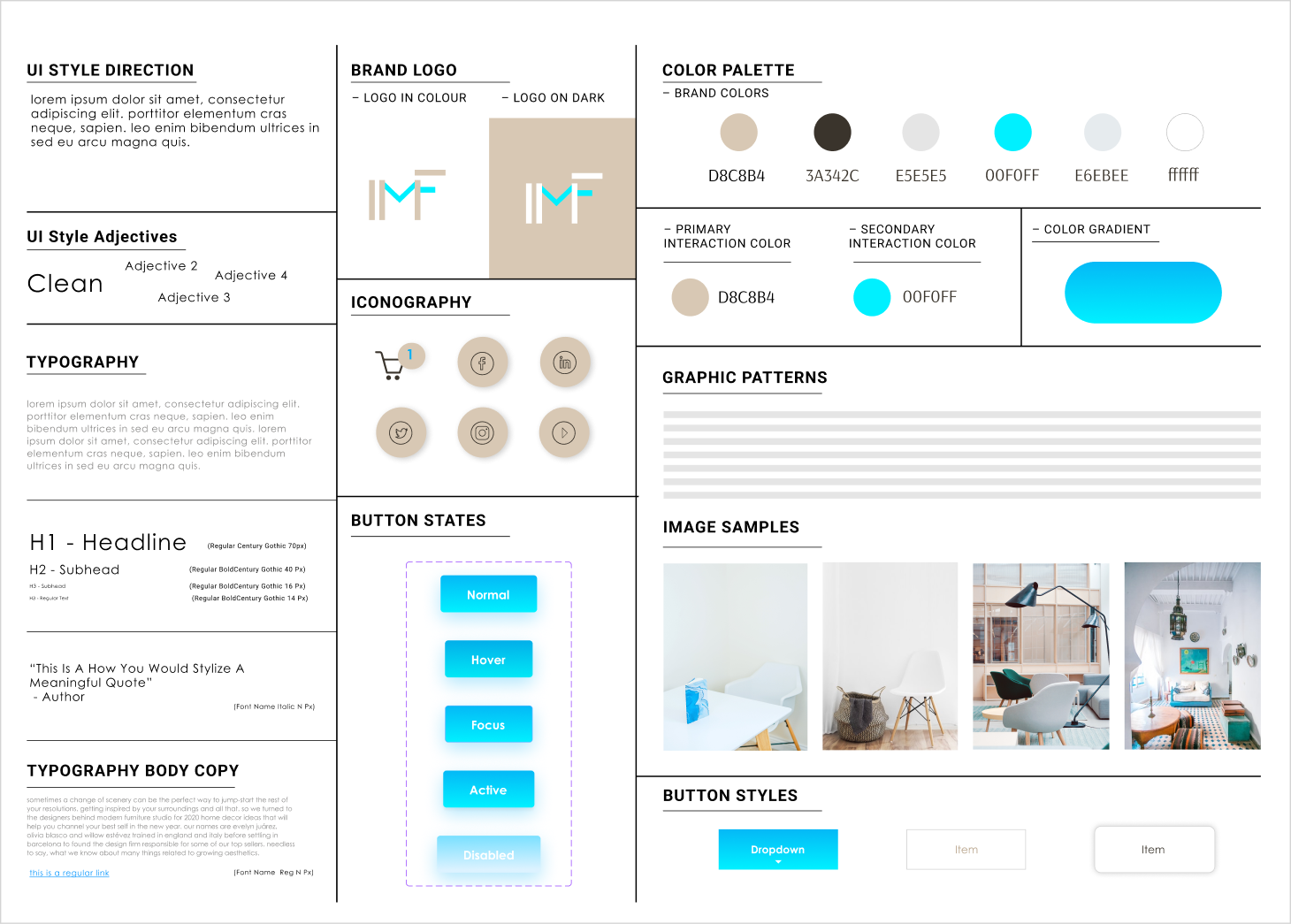
After creating and successfully testing a low-fidelity prototype I started working on a hi-fidelity solution based on the main components from the UI Style Tile
When developing the design, adaptive capabilities for tablet and mobile versions were taken into account
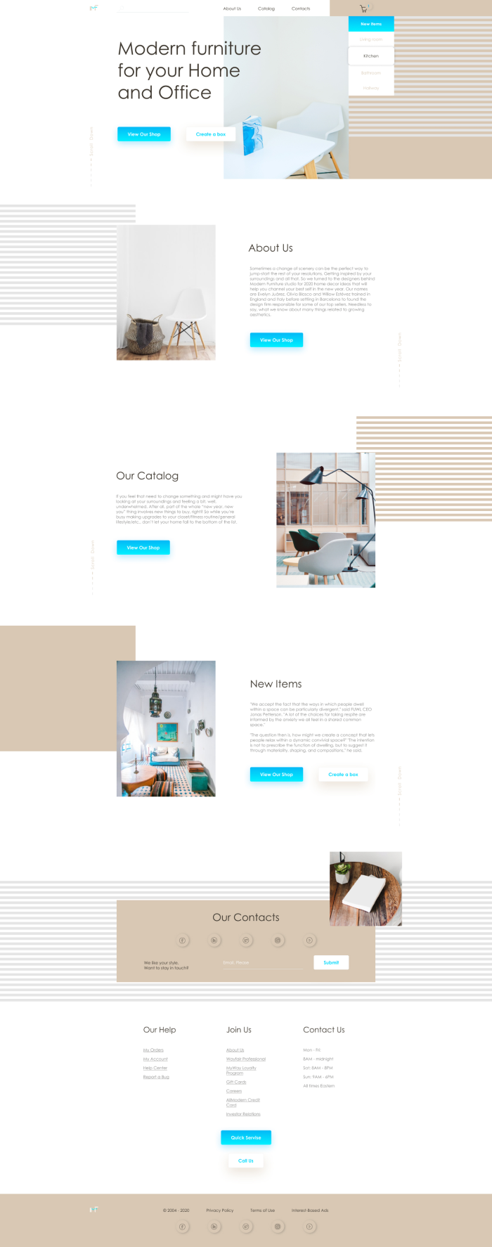
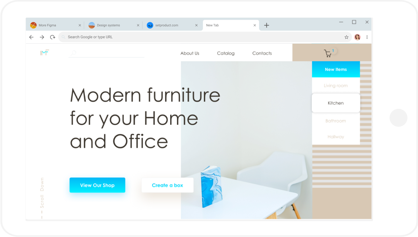
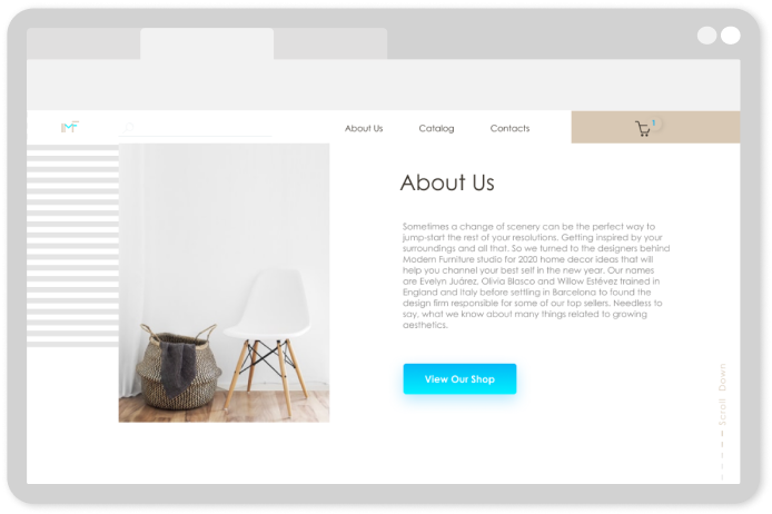
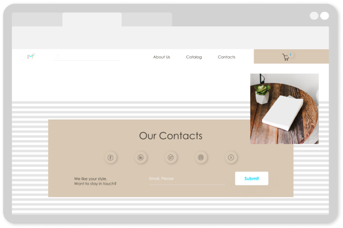
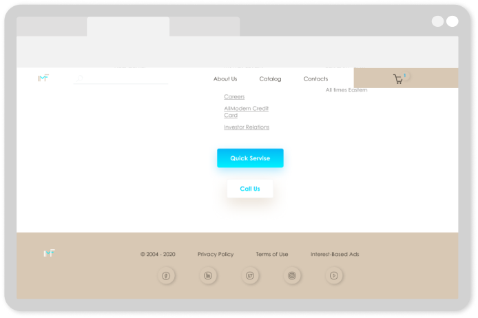
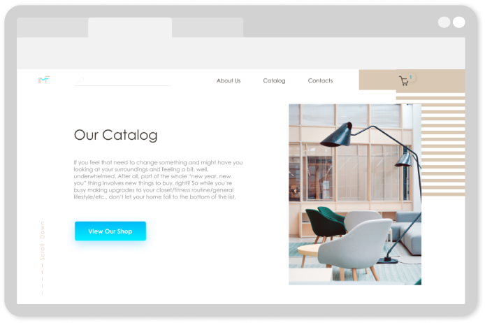
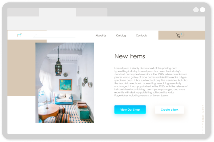
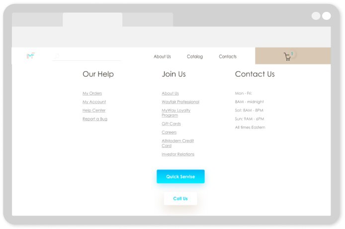
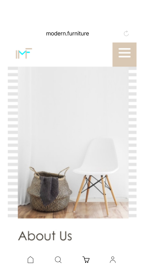
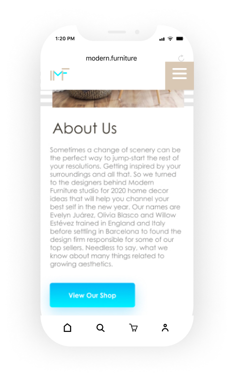
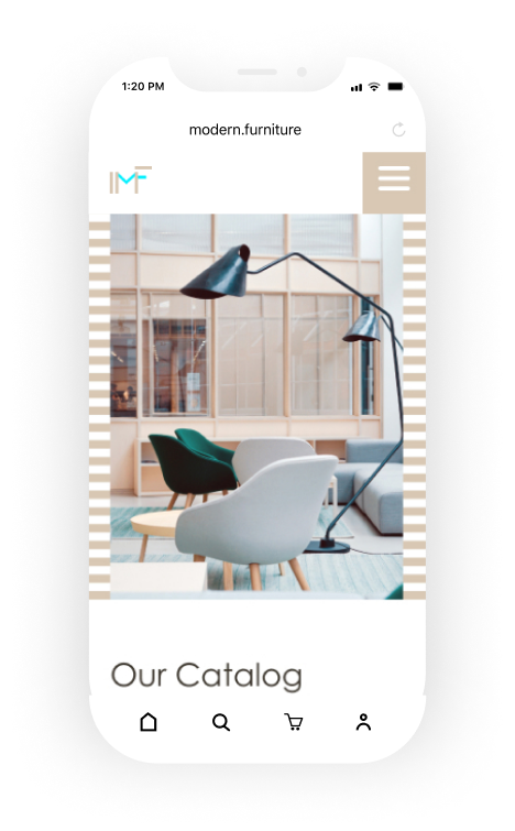
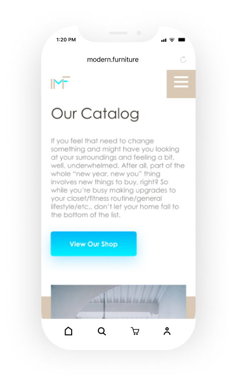
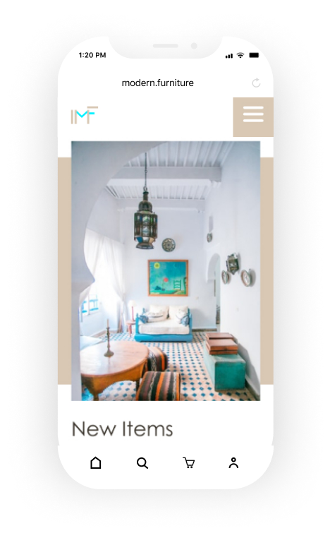
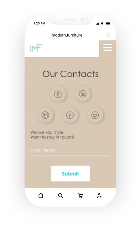
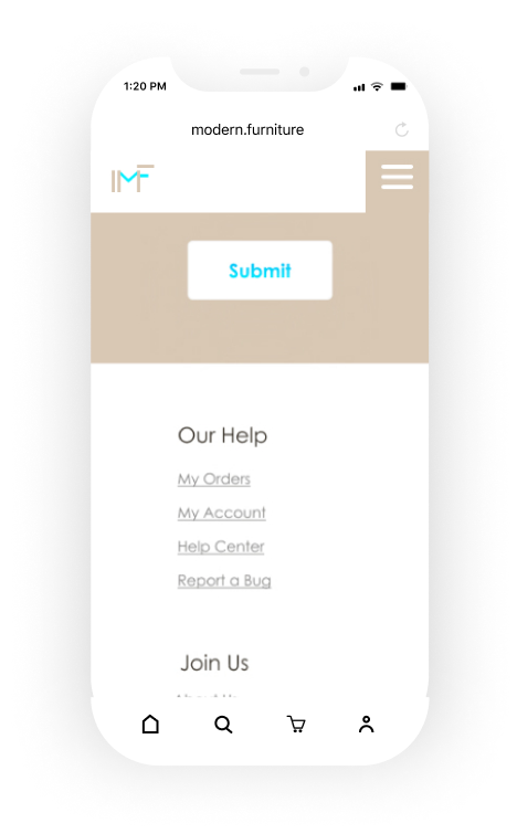
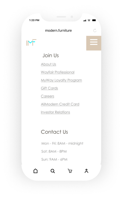
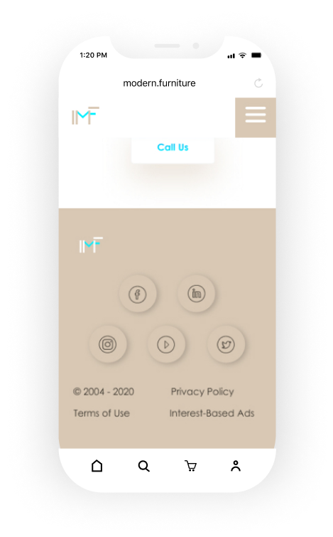
During creating a high-fidelity prototype I used different tools for checking accessibility in my design solution to make sure that it is usable for people with disabilities.
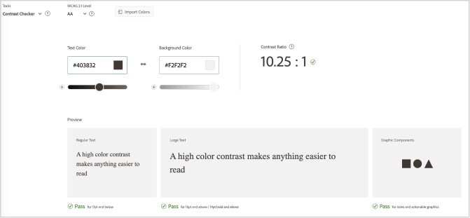
Contrast Checker on color.adobe.com has shown that our project has passed the test

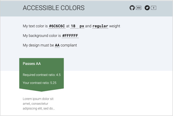
I ran the website’s colours’ HEX codes through the contrast-checker website.
I used accessible-colors.com which was also successful.

We used Guerrilla User Test (5-10 minutes for each person)
This was important for our user-centred interaction design to evaluate the product and finalize our success rates and the result showed 98% success completion of all tasks.
Thus, when creating the page has been improved UI brand experience, accessibility and usability.
