Landing Page
Redesign
for online banking
Mission
I present to you a brief overview of the project that I did for the Fair Fintech digital financial services bank. In this project, much of the design focused on re-evaluating the user experience and improving the usability of the existing page.

Process
Empathize
Define
Ideate
Design
Re-Design
Prototype
Test
Dev Handoff
Problem
Initially, the landing page was full of content without any logical hierarchy that would be boring for users and confusing because it is true that users don’t like to read a big chunk of content text at one time.
It was hard to find focus on the screen when using this page, certainly lacks a clear visual hierarchy in the layout made the User Experience confusing in terms of finding the necessary information fast.
Certainly, taking into account Jakob’s Law of the Internet User Experience I approached redesigning the website page with a few steps.
My role
UX/UI Designer
working for the bank
The Solution
Providing stakeholders with a complete redesign solution for their existing landing page. The existing design system was widely used, new ones were developed and improvements were made to create a single product.
Dedicated to development.
Tools
Figma,
Google doc,
Adobe Suite
Protect Duration
1 week
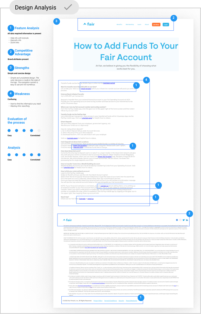
Understanding and exploring the issue.
I started by analyzing information about the content of the entire page, determining the analysis of the gap between the current and desired state, and taking into account that the user interface is perceived as overwhelming by text and difficult to use.
The analysis showed that there is no visual logical hierarchy on the page, which would allow the simplest way to correctly convey information from the page to the user.
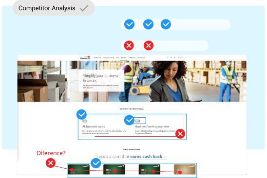
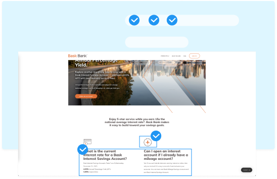
To make sure we’re using the right user experience approach, I took into account Jacob’s Law, which states that users expect to see the same logical experience and interface elements. That’s why we did a quick analysis of similar competitor pages to see what their experience looks like and understand their strengths and weaknesses.
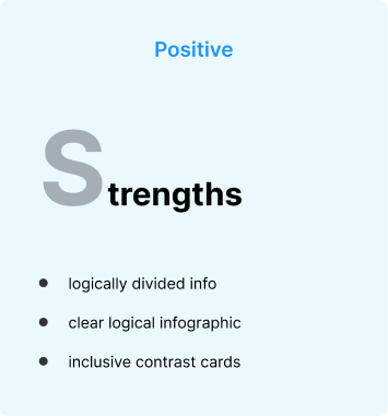
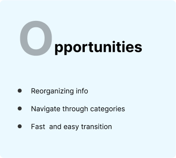
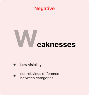
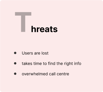
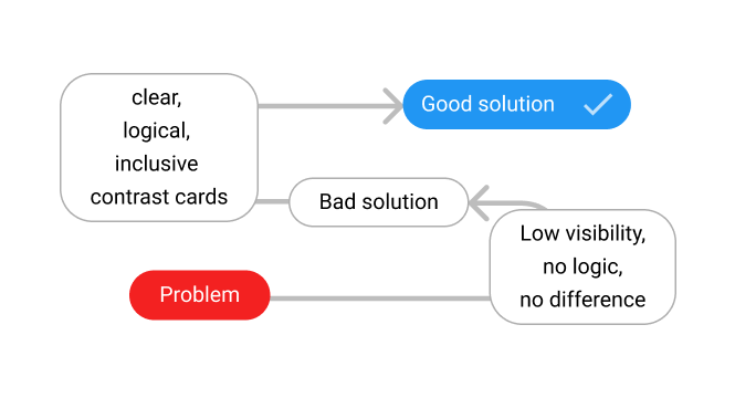
Inversion method
We used inversion because we need to see the problem from a different angle. It helped us to see a different perspective and imagine the worst-case scenarios.
1. Question: What would be the worst decision/solution in this situation?
Low visibility, no difference between categories, no logic.
2. Question: Why would it be bad?
Users get lost, overloaded call center, wasting time.
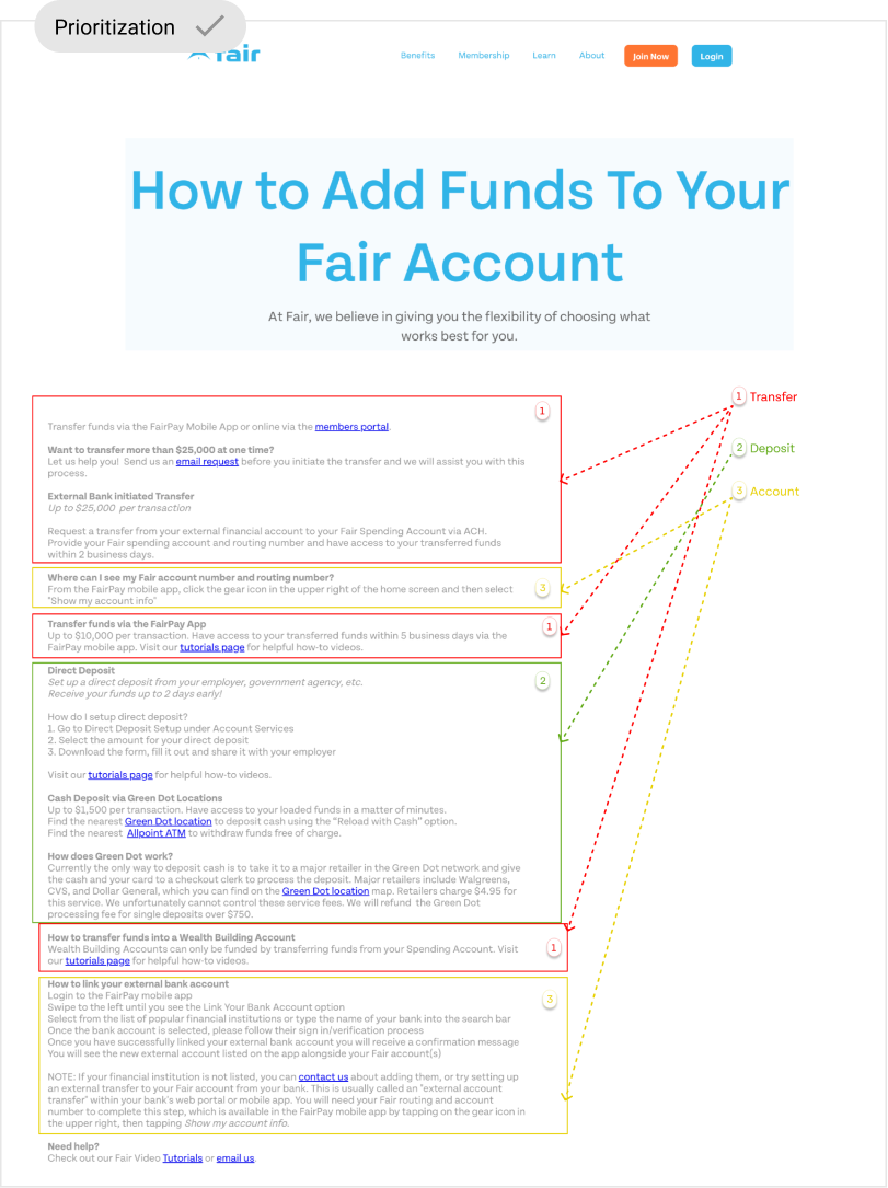
Sorting
I reordered the contents of the existing page dividing the main topics into sub-topics of financial transactions. So, I got 3 primary financial manipulations: Transfers, Deposits, and Bank Account sections.
Due to very short timelines and the fact that stakeholders will only be waiting for me to make high-fidelity design prototype decisions, I had to skip the wireframe part and start working on creating the landing page.
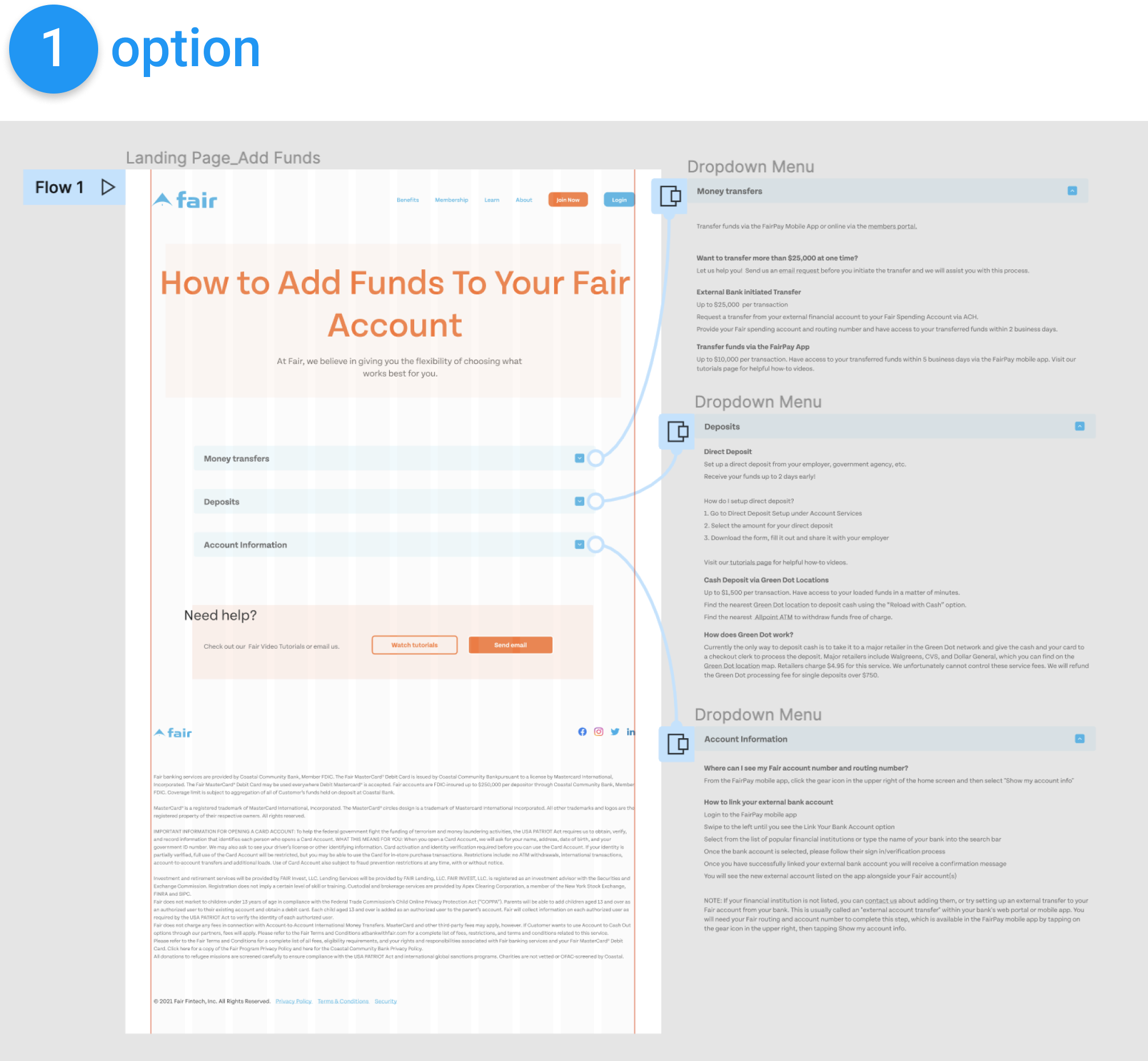
Materialized information
By dividing and presenting the information in a way that makes it easier, more logical, and faster for the user to find the right topic, I reordered the information and created two options for review by the stakeholders of the bank.
In the first option, I came up with a dropdown menu option. To allow users to select a topic that logically led to the required information. In this way, it is possible to get rid of not unnecessary and confusing information that could overload the user.
Also, that would create usable space on the page:
- Improving text legibility
- Organized the page content
- Created focus and emphasis
- Produced the right content structure
- Improved the user experience of the website
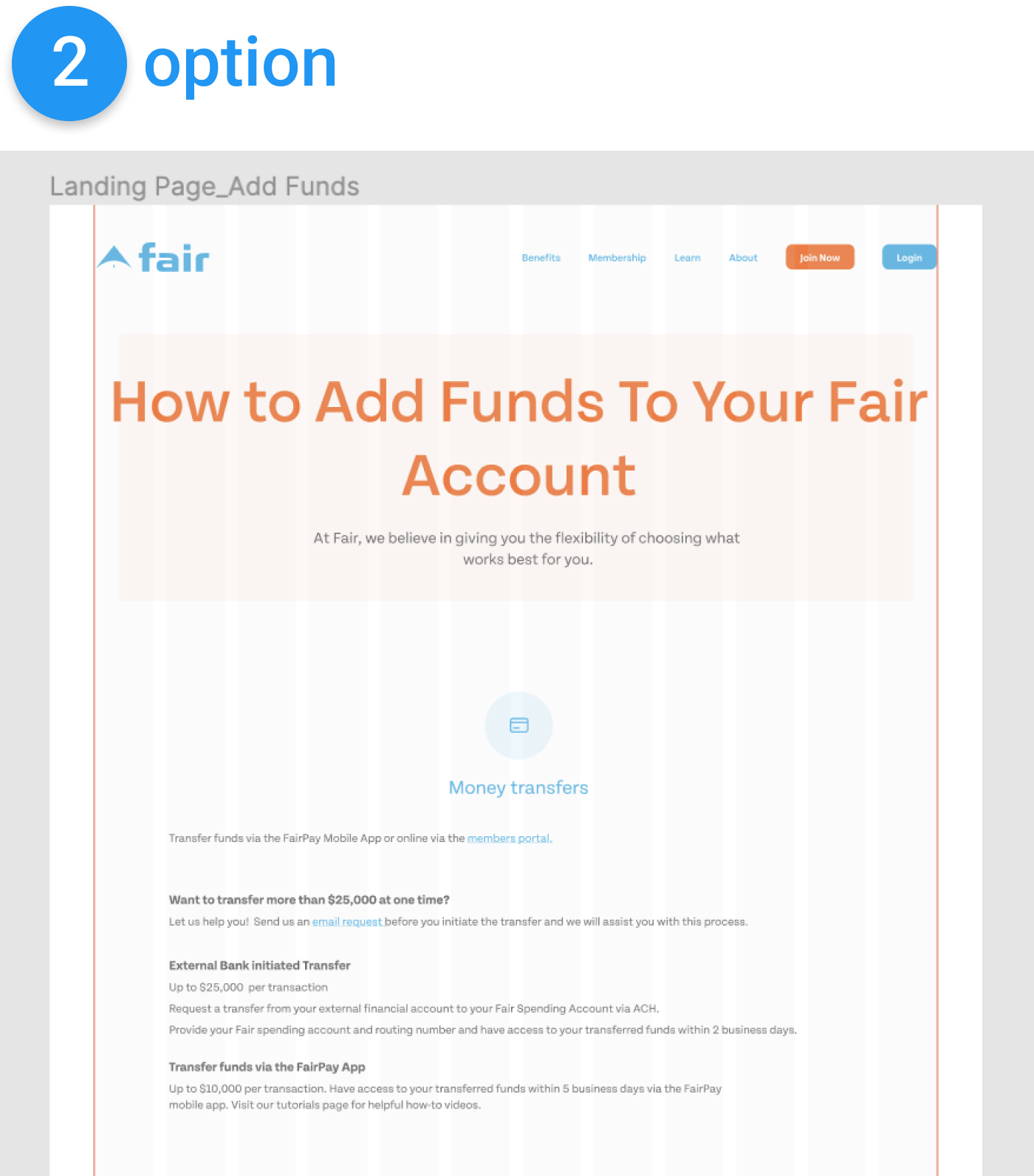
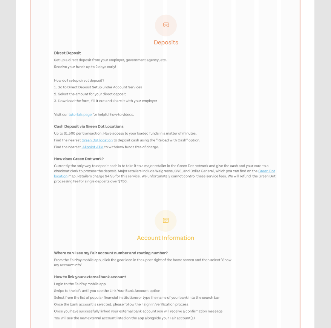
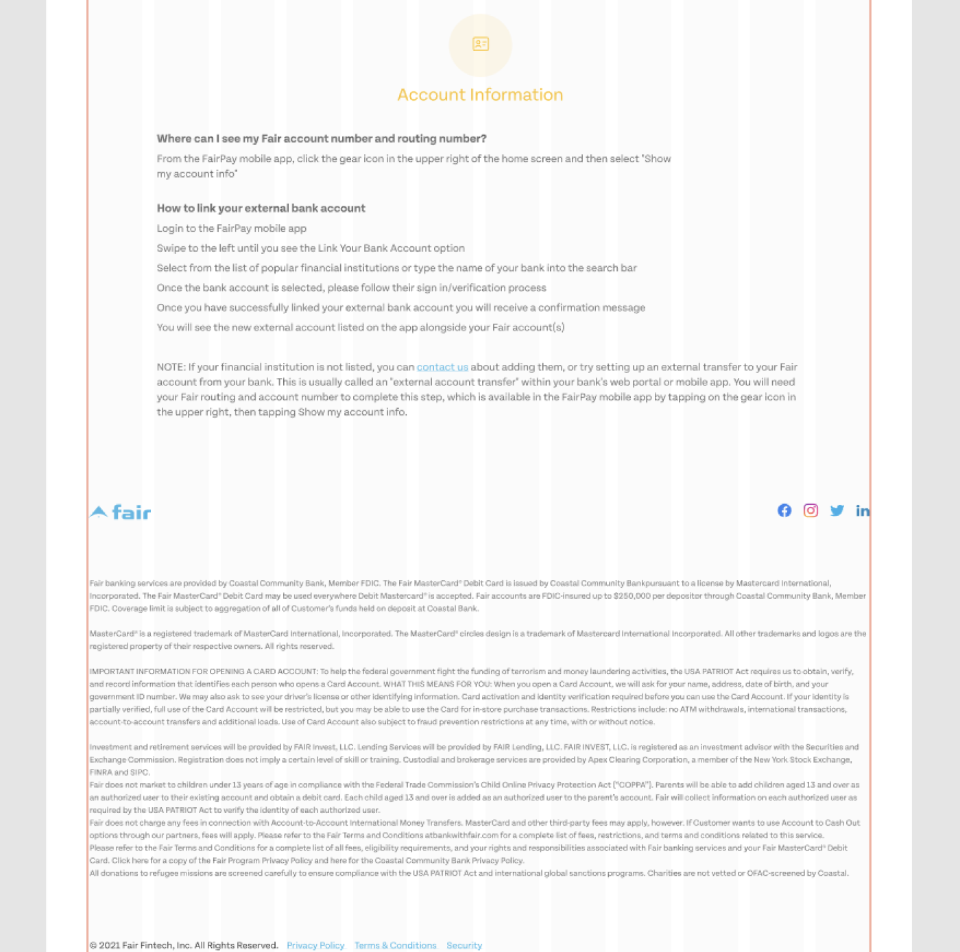
The second is to visually separate different topics of the text using thematic icons to quickly find the information the user needs. Also, divide the text into paragraphs, which will make it easy to read.
Reviewing and brainstorming
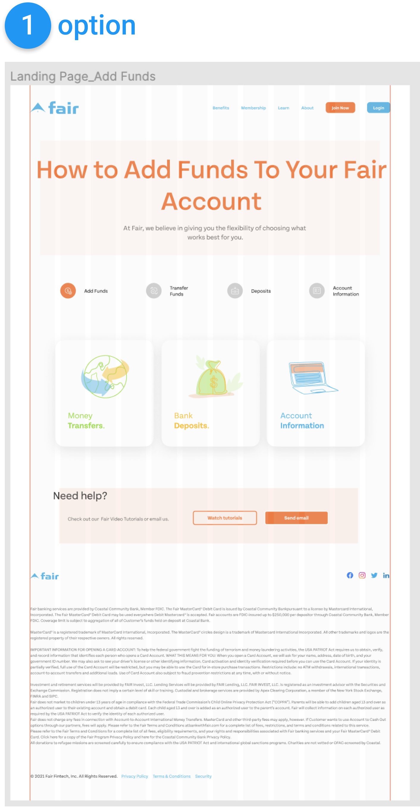
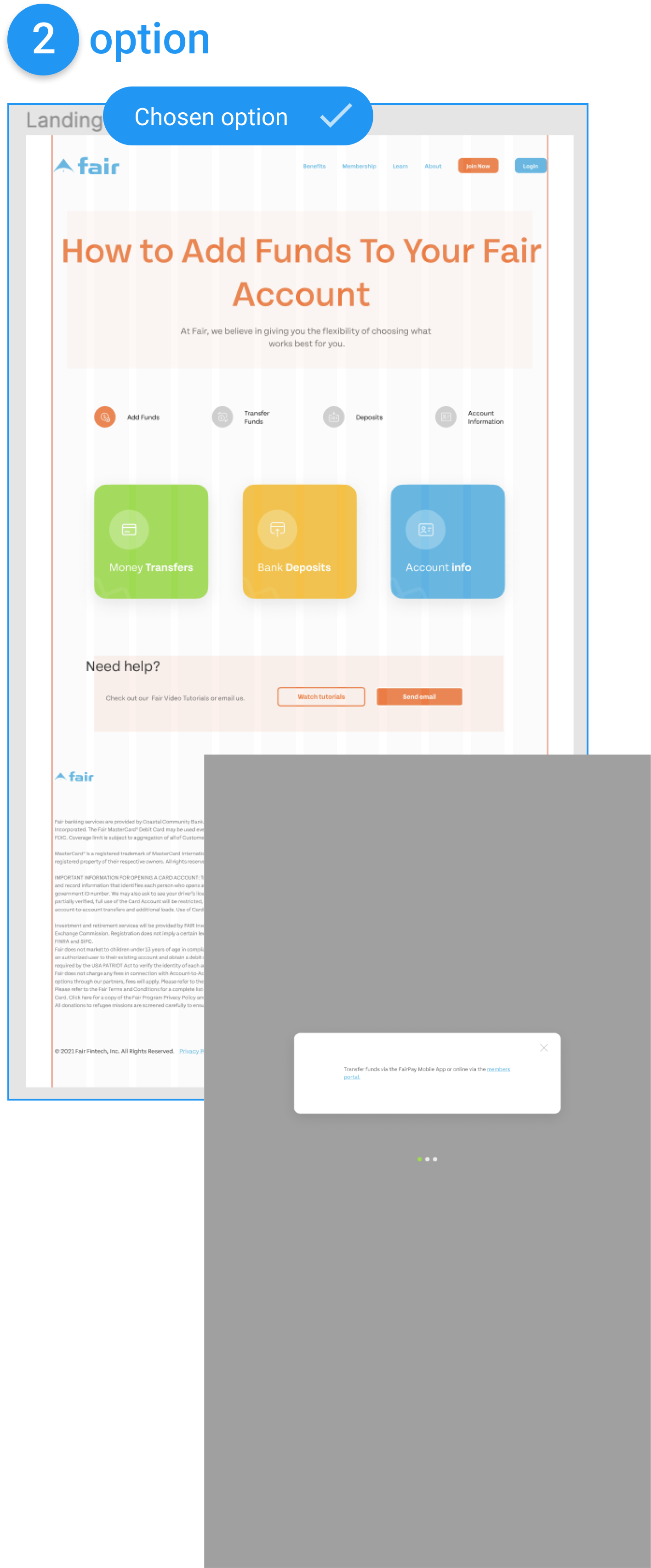
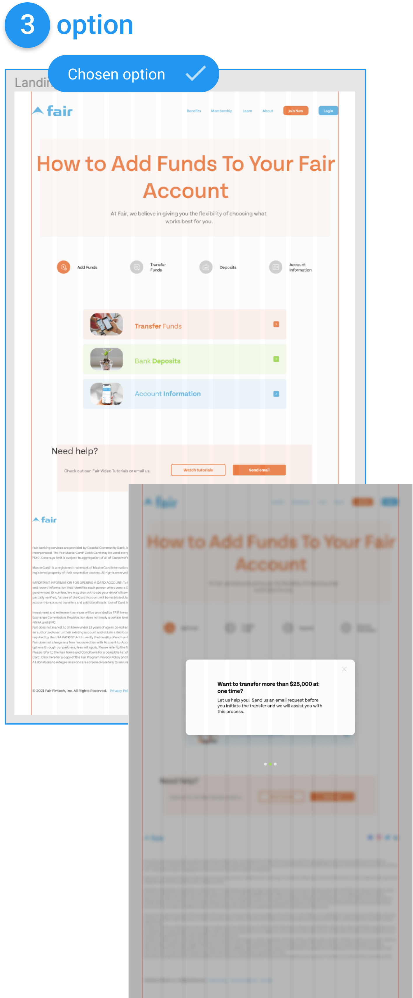
In our meeting, we’ve done some brainstorming and created a quick competitor analysis after that heuristic evaluation the result brought us to the decision that needs to do some flashcard options, so I created three solutions to the problem.
As a result of the meeting, the second option was chosen as the main base, but it was still decided to go with a combination of options two and three.
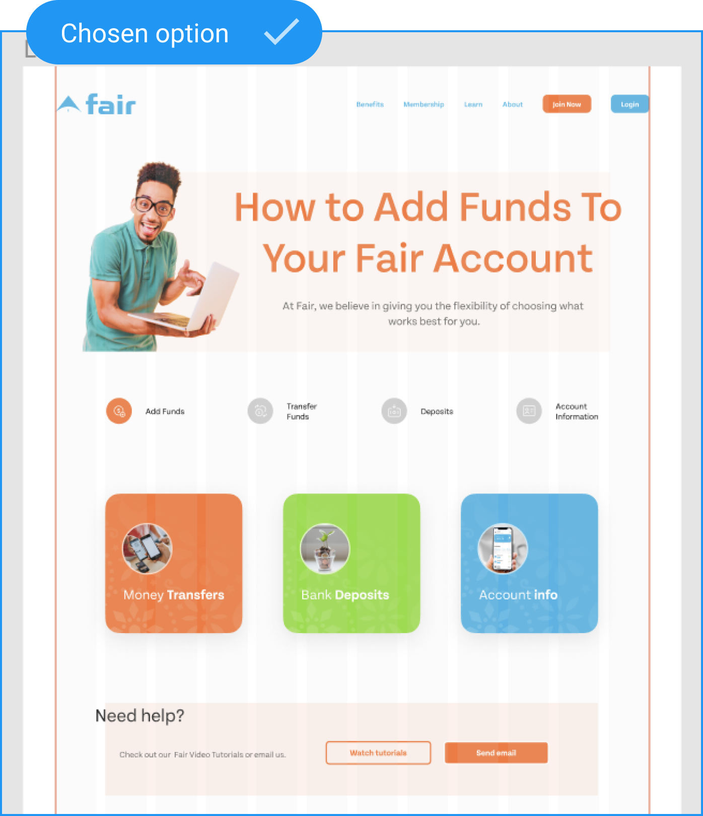
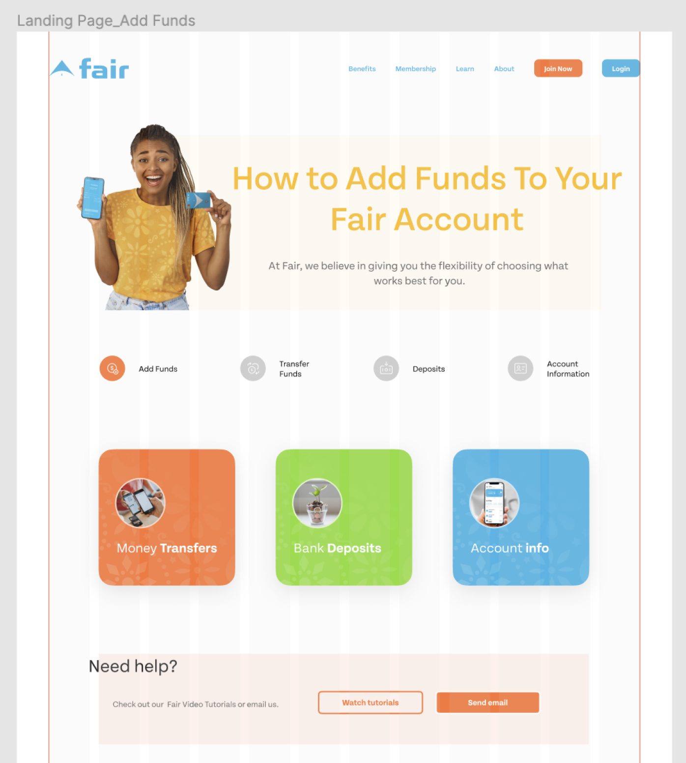
For the first banner, I used our guy that basically exists on lots of our print materials and emails that I also created for the bank.
However, I was craving to change him to some different person, so I created two options of the page.
Despite this, at another meeting, we returned to the guy option.
With the option that was chosen. And in prototype mode, you can see how each one card leads to a different page. Each page corresponds to a separate individual topic that the user selectsю Of course, all the work was done using components for ease of use.
Therefore, after testing the final prototype with our potential users the results have shown that it has an intuitive strong architecture design constitution that includes keeping all the visual identity, sustainability, and culture of the brand.
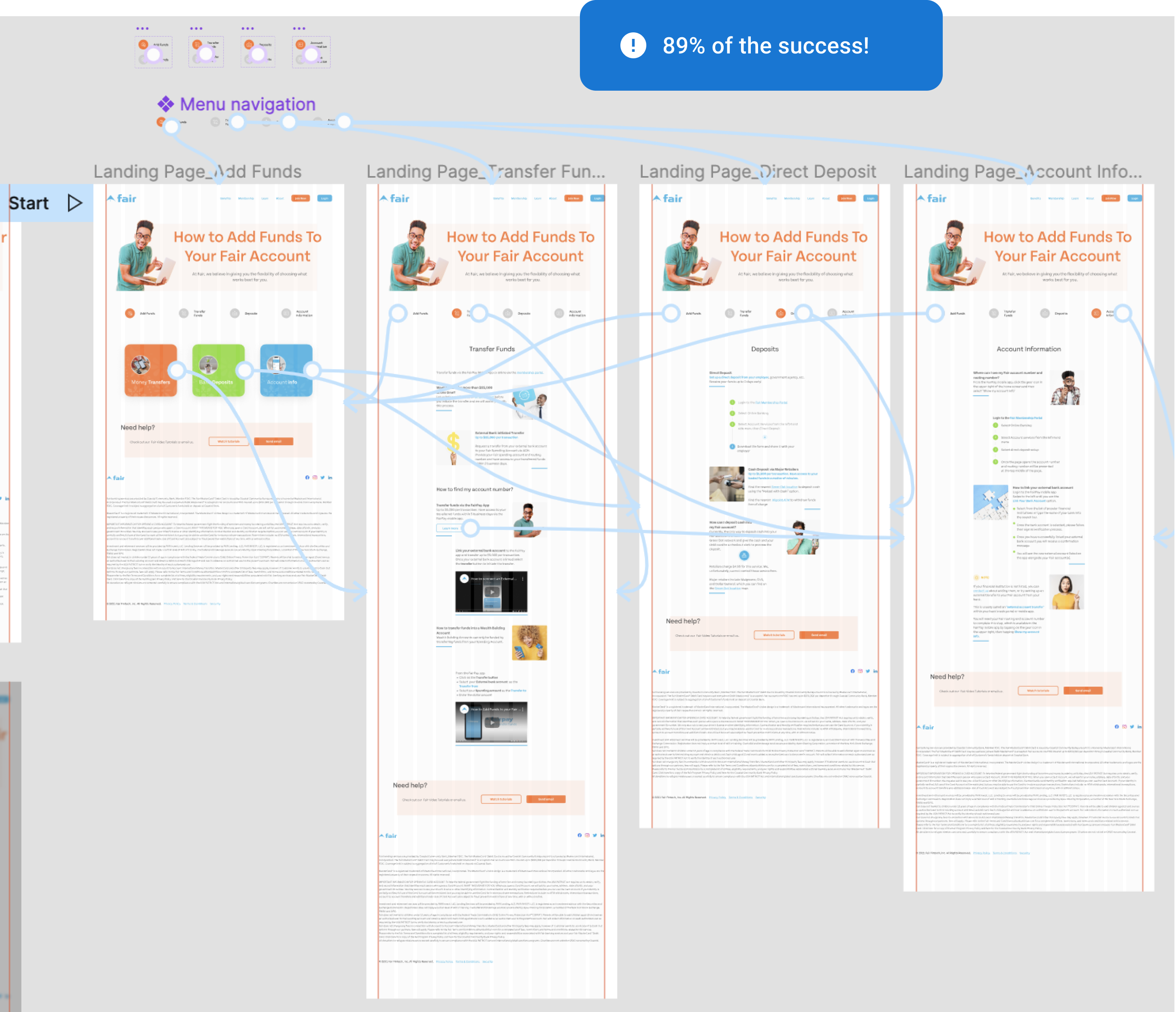
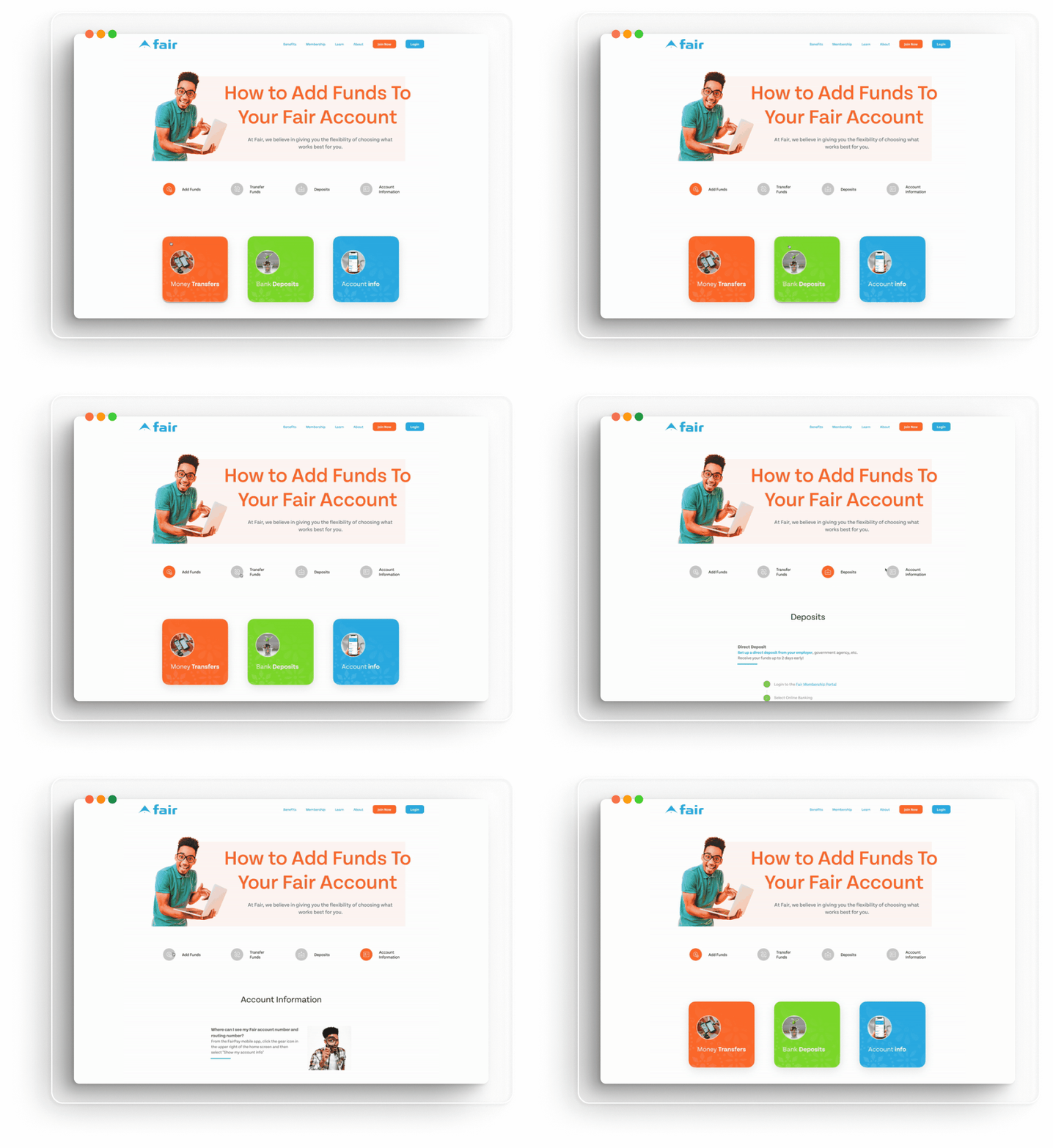
As a result, the project was approved by the stakeholders for further implementation.

Are you interested in cooperating with me? Contact me easily
